Master communication and networking and you will master anything you put your mind to.
– Brett Iwanowicz
3 Costly Mistakes Newer Investors Need to Understand w/ Brett Iwanowicz
Brett Iwanowicz is closing just under two deals per month on average, but it wasn’t always this way. Brett struggled with anxiety, feelings of inadequacy, and low-self esteem. It took him a long time to decide what he wanted in life and find the momentum to get him there.
Today, Brett is living life on his terms. By surrounding himself with the right people, building credibility through video, and figuring out exactly what he wants his life to look like, Brett is carving out the life of his dreams. Today, he is sharing his early mistakes so you can learn how to avoid them.
Read the Full Show Notes Below…
Brett Iwanowicz is a property wholesaler in upstate New York. His journey is not unlike many others in that he has battled insecurities, fear, and a lack of direction.
While it took him a few years to get where he wanted to be, he used his pain to propel him into new directions that gave him the ability to carve out his dream lifestyle.
Today Brett is sharing 3 of his greatest rookie mistakes and how they led him to where he is today.
1. Understanding Your Budget
When Brett started his wholesaling business, he knew it was important to set a budget. What he didn’t know, is that when it comes to marketing, you’ll want to budget for at least a year of implementing the same technique.
Let’s say you choose direct mail, don’t dive in, feel dissatisfied with the results, and put the rest of your time, money, and energy into something else. Stay the course. Create a sustainable budget that will help you build that initial momentum.
2. Understanding the Mind of a Seller
Successful people aren’t always the smartest, but they are always the friendliest. Once Brett realized that he didn’t need to be “smart” to get into real estate, everything changed.
What he realized, is that in order to be successful, he needed to be the nicest one. He changed his mindset and went full-steam ahead!
3. Understanding Your Strengths and Weaknesses
Brett has always struggled with numbers, which stopped him from really getting out there sooner. His fear of talking numbers kept him away from the closing table more times than he would like to admit.
He conquered this by surrounding himself with the right people, His peers taught him and put him in connection with people who can help. Once he had a little money to his name, Brett hired a coach and focused on personal development. His coach taught him how to plan and set goals.
Finding Your Mission
Back when Carrot was first getting started, I set a lot of goals for myself and wasn’t hitting any of them. I felt defeated so put the goals away until we moved a few years later. Once I read them over, I laughed
I had hit all of those goals that had seemed too far-fetched at the time. For Brett, it took him several years to live his life by design. But he never gave up. He knew what he wanted, created a plan, and did the work. You can too.
Carrot Websites Hold More #1 Search Rankings Then Any Other Real Estate Websites
Carrot sites are built to perform. We’ve found that Carrot leads not only convert 7x higher than other lead sources, they also bring in 2.5x more profit per deal.
Watch the demo to get a full walkthrough of what Carrot can do for you.
Take a Free Demo of Carrot Today!
Don’t settle for a website that’s just a “glorified business card.” Leverage Carrot’s Lead Generation Hub to attract, convert, and close more deals!
Getting your real estate business online is the easy part. But what happens next? Most website providers will get your site up and running, but then leave all the real hard work up to you. Without understanding what it takes to elevate your real estate investor website to the next level, you might as well be handing potential customers a glorified business card that has little chance of generating high-quality leads.
With Carrot’s real estate marketing platform you’ll never be left to handle all the ins and outs on your own. As you’ll see in our interactive demo, we’ve simplified the web building process with Visual Editor technology so even novices can create their own high-converting website that acts as a Lead Generation Hub. Utilizing Evergreen marketing strategies combined with effective SEO tools like Keyword Explorer and Content Packs, watch your Google ranking skyrocket as you gain the competitive edge. Tie in some world-class support and professional services, and soon you’ll see why Carrot is the industry leader for attracting the right site traffic, converting highly-motivated leads, and closing more deals than ever before.
One lost deal from an under-performing website can cost you upwards of $10,000. So the question is: How many deals can you afford to lose?
Ready to amplify your online lead generation with Carrot?
Start with a high-performing website
Carrot websites are built with performance and conversion in mind. With site templates pre-built with SEO-friendly content to help you attract a specific type of lead and designs optimized for desktop and mobile, Carrot makes it easy to build a high-performing website that actively works to attract and convert leads for you, whether you’re an experienced online marketer or just getting started.
Build online authority and credibility
To break out the cycle of hamster wheel marketing and chasing down leads, you need a solid online marketing strategy. But not everyone has the tools, time, and expertise to do what it takes to build online authority with content marketing and get their website on the first page of Google search results. Carrot makes it easy with an entire suite of tools aimed at doing just that — improving your SEO ranking with automated blogs, keyword tracking, and other time-saving online marketing tools and done-for-you services.
Backed by a team dedicated to your success
Whether you’re just getting started or are a real estate marketing pro, we know everyone could use a little — or a lot — of help now and then. That’s why we have an entire team of product and real estate experts ready to help you with all of your questions. From troubleshooting to strategy building, Carrot has your back.
The tools you need, nothing you don’t.
Launch your website, boost your SEO, and manage your leads.
High-Converting Website
Easily Edit Your Content
SEO Rank Tracker
Landing Page Builder
Website Analytics
SEO & Marketing Strategy and Trainings
Email & Live Chat Support
CRM lead manager
Access to the Carrot Community
Industry Leading Security & Hosting
Optimized for mobile leads
59% of Carrot member leads come from mobile devices. Carrot site templates are optimized to provide the best mobile experience for your visitors and to convert your mobile traffic into leads!
Carrot isn’t just a website — it’s a Lead Generation Hub.
How hard is your website working for you? It may be pretty, but is it helping you stand out in your market and build online authority to generate consistent — and qualified — leads?
Other website providers:
Looks pretty
Creates an online presence
Outranks your competition’s organic search results
Tested and optimized to convert traffic into leads
Supports content marketing to build online authority
Provides training and support to help you dial in your online marketing strategy
Supports businesses that offer multiple services and need to attract different types of leads
Backed by a team dedicated to your site’s performance
VS.
Carrot’s websites:
Built to rank in organic Google search results & AI
Optimized for all devices — desktop, mobile, tablet
Uses industry-leading best practices to convert more leads
Loads fast to keep visitors’ interest and engagement
Builds online authority for better search results & trust
Supports many types of real estate and local business providers
Provides training and support from our team of product and marketing experts
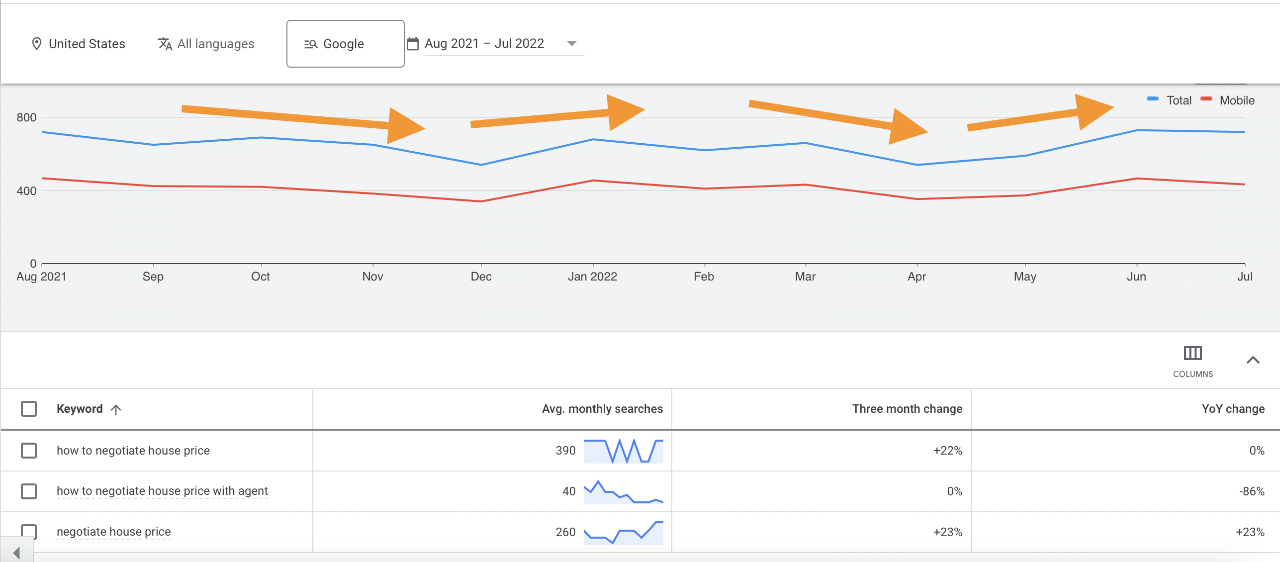
Real estate negotiation is a hot topic. Every month, according to Google, there are 700 searches for phrases similar to “how to negotiate the house price.”
Couple that with 63.3% of businesses with no formal negotiation process having decreased net income… you have a MAJOR opportunity.
How to negotiate house price Google Search trends
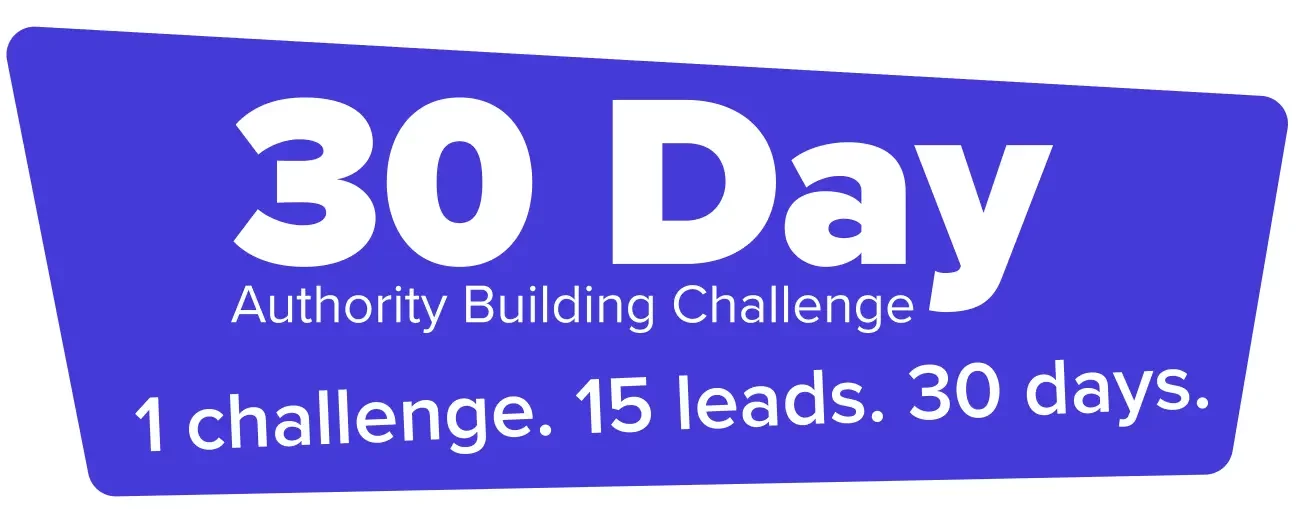
Join Our 30 Day Authority Building Challenge: Dominate your market, build a consistent and predictable lead flow, and earn more income.
When it comes to negotiations, specific tactics work overtime. So we’ve compiled a list of some common real estate negotiation strategies.
But we all know the price is not set before diving in. And neither is a seller’s immediate inclination to work with or not with you, the real estate agent or investor.
They could call you ready to sell but a few days later lose interest. Or they could call skeptically and leave the call prepared to sign.
How you negotiate with sellers and buyers determines these outcomes: what you say, what questions you ask… even how you talk.
We spoke with some experienced real estate investors and agents and asked them how they negotiate with sellers to close more (and more profitable) deals. We threw in some of our advice from decades of combined experience.
Keep reading to get real estate negotiation tips!
Or you can download our real estate sales negotiation playbook by clicking below — it’s got proven-to-work scripts, six questions to ask on every call, and a fool-proof seller scoring system.
The Pre-Negotiation: Base-Setting For The Verbal Negotiations
The first thing we’d like to mention is the pre-negotiation before diving into the 20 real estate negotiation tips our three experts offered.
Before you get on a call with a seller for the first time, they have some preconceived notions about who you are, what you do, and what your business is like. They’ve unknowingly gathered this information through your offline marketing materials (direct mail, bandit signs, etc.) and online marketing materials (your website and digital advertisements) and perhaps through referrals from a friend or family member.
Maybe, they come in thinking that you’re desperate for deals. Maybe, they come in thinking that you’re trustworthy and level-headed. Maybe they come in having no idea about what you do but are curious about how you might be able to help them.
Whatever they believe, for better or worse, it’s a direct result of the brand you’ve created.
That’s why building a well-respected brand in your community is so important. It makes sellers more likely to trust your opinions, value your input, and answer your questions honestly, making your job as a salesperson much easier.
But how do you set the stage for effective and profitable negotiations?
Here are some quick tips…
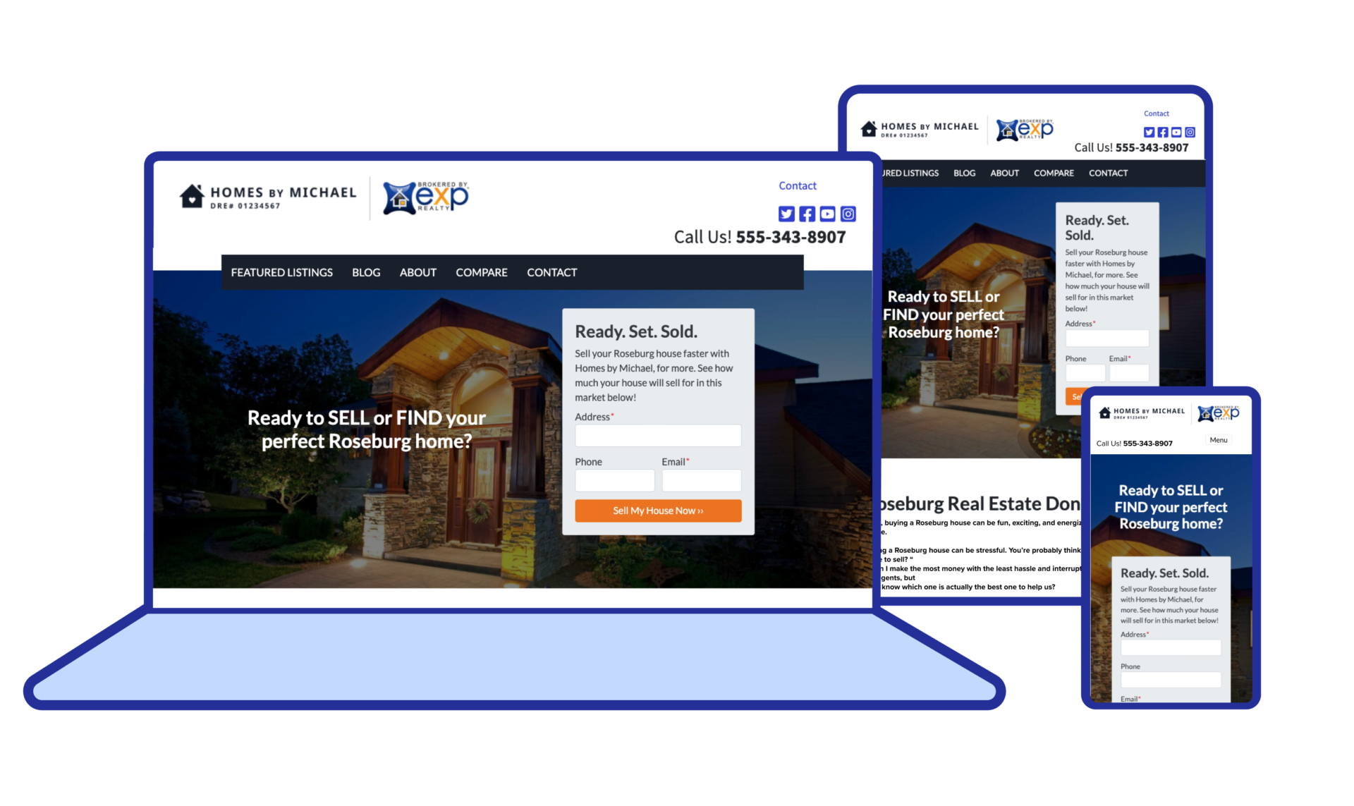
Add Credibility To Your Website — When someone visits your website, you want to build as much credibility as possible… as fast as possible.
This means including testimonials from past happy sellers, emphasizing that you’re a local real estate investor, showing your online reviews, being honest about your process, and sharing your company’s vision and mission.
Video testimonials are particularly effective. Here’s an example from a Carrot member (Carrot websites provide a lot of space for adding credibility and, for that reason, are the highest-converting websites in the industry!)…
Set The Tone — With the colors, words, and font you choose for your offline and online marketing materials; you’re creating a tone of voice for your brand. Maybe it’s stoic and professional.
Or maybe it’s casual and fun. Or maybe it’s kind and lighthearted. Or maybe it’s hasty and irreverent. Whatever the case, beware of the tone you create… because callers will expect that same tone when speaking with you on the phone.
Be Honest — One of the best ways to differentiate yourself from the competition is to be upfront and honest. Being dishonest will almost always backfire. It’s better to tell people who you help and how you can help them so that the right people dial your number in the first place.
20 Real Estate Negotiation Tips from 3 Negotiation Experts
1. Don’t Ask For a Price Right Away
This first tip comes from John Martinez, the founder of REI Sales Academy.
To avoid spending too much time talking to tire-kickers, many real estate investors will ask the seller for their lowest price within the first five minutes of the call.
John recommends not doing that. He suggests that investors focus on price only after you’ve sold the seller on yourself and your business (more on that in the next tip).
Why?
First, once you’ve spoken to the seller about your process and built some trust, the number they gave you will probably change… so why use it at all?
Second, hearing a seller request a high price will usually make the salesperson (you or someone on your team) feel unmotivated to continue the call. They likely won’t operate at the same level of salesmanship.
So while it might sound counterintuitive, it’s best to leave the price for last.
2. Sell Them Before You Make an Offer
This tip also comes from John Martinez, and it’s similar to the first tip… but about your offer.
You don’t want to hear the seller’s number until a little bit later in the call (as mentioned above) to build trust before discussing the price.
The other side of this coin is that you don’t want to make an offer until you’ve built trust and sold them on yourself and your business.
The real lesson of these two tips is that you don’t want to talk about price until the seller trusts you — a discussion of price is virtually useless, and negotiations even more so if the seller doesn’t trust you.
Additionally, holding back the price discussion will give you more time to gather valuable information on why the seller is selling, what motivates them, and why they’re selling to you. That information, in turn, will give you “ammunition” for the price discussion…
“I know that price is lower than you were hoping for. But do you think getting out of your tough situation is worth it?”
3. Be Open & Honest
The more honest you can make the discussion between yourself and the seller — the more open they are to share pertinent information with you — the easier it’ll be to negotiate.
Period.
Have you ever negotiated with someone, for example, where it felt like there was no way you would agree… but you didn’t know why?
Like there was some big unseen brick wall between the two of you?
That’s usually because the seller hasn’t told you something — maybe they’re not the real decision-maker, maybe they need a certain amount of money to pay off additional debt, maybe they’re going through something that they haven’t shared, or maybe they’re too emotionally connected to the home.
Whatever the case, most of those hurdles can be overcome if they’re out in the open… if you can discuss them honestly and with empathy for their situation with the seller.
Here are some of the questions John recommends asking to pull out important (potentially hidden) information…
Ask the homeowner if they can hold the house for another 5+ years and what that will mean for them.
Can they make the repairs themselves to resell at a higher price? And what will that look like for them?
You’ll also want to address any concerns influencers bring up, including the seller’s family, CPA, attorney, etc.
4. Allow The Seller To Squeeze Every Dollar Out Of You
The seller wants to get as much money for their home as possible. And you want to pay as little for their home as possible.
So it might sound counter-intuitive — and again, this is advice from John Martinez — to allow the seller to squeeze every last dollar out of the deal.
But there’s a difference between getting hustled and allowing the seller to get as much money for their home as possible.
After all, the seller wants to feel like they’re getting an excellent deal — like they’ve negotiated as far as possible and gotten the best home offer.
For that reason, starting with your max offer is a bad idea.
Instead, start by offering $20,000 or $30,000 lower than (depending on the value of the home) your max offer. Then if the seller balks, offer ways for them to increase their offer — maybe you give better deals to veterans, or maybe they get a better deal if they move out faster or if they sign papers within 24 hours, or maybe they get a better deal if they clean out the home before moving.
“I can offer you an extra $10,000 if you sign the papers within 24 hours.”
“I can offer you an extra $5,000 if you clean out the home before you leave.”
This will give the seller room to feel like they’re negotiating with you and squeezing every last penny out of the deal when, in reality, you’re in control of negotiations the whole time.
5. Don’t Provide Options; Give Your Expert Recommendation
Maybe I’m alone in this, but I love when I go to a nice restaurant and ask for recommendations, and the waiter or waitress tells me what I should order.
Better yet, when I go to restaurants with tastings menus, I don’t have to decide what to eat.
I get to trust the food experts.
Just like the seller gets to trust you, the real estate expert.
Maybe you have a “menu” of real estate services that you offer — buying for cash, selling on the MLS, listing homes, etc. But just because you offer all of those services doesn’t mean you should offer all of them to everyone.
You shouldn’t.
There is such a thing as having too many choices (think of the last time you and your significant other were trying to decide where to eat for dinner), and you don’t want to put the seller in that position, giving them “analysis paralysis.”
Instead, determine the service that would benefit the seller and only offer it to them (unless it later becomes clear that some other service would be more fitting).
You’re the expert, after all.
And they want your opinion about what they should “order.” Tell them your recommendation and leave your other services on the bench.
6. Extract Information
This next tip comes from Steve Trang, real estate investor, agent, and creator of “The Perfect Seller Appointment Scoring System“ (which you can access inside our free guide!).
In the last tip, we discussed offering the seller something that fits their situation.
But that’s not something you’ll be able to do until you’ve asked questions and extracted pertinent information.
This is your first goal on any call — to learn about the seller, why they called you, why they want to sell their home, what problems they’re facing, and how they think you can help.
The more you know about the situation, the easier it’ll be to work with them.
So ask a lot of questions.
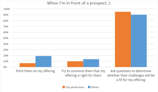
Top-performing salespeople ask questions more than they try to pitch or convince…
Here are some top questions you should ask sellers (you can get a complete list in our free sales playbook!)…
How are you hoping I can help you?
This is a great home. Why would you consider selling to an investor like me?
Who else has input on the sale of your home?
Who will be impacted by the sale of your home?
7. Set Rules
So far, we’ve talked a lot about building trust with the seller, being honest and transparent, and asking questions to understand where the seller is coming from.
But before any of that happens, Steve Trang recommends setting some “ground rules” for the discussion before the discussion begins — this will allow you to maintain control of the conversation and keep it progressing in a productive direction.
What does he mean by “ground rules”?
First, Steve will let the person know how the conversation will go and what they can expect. He’ll ask for their consent to continue the conversation and that they’re transparent.
Here are a few of his rules…
If I make you an offer, I ask that you’re comfortable with telling me “no” if the price doesn’t make sense.
If you like my offer, you agree that you’ll put it in writing.
Saying you need “time to think about it” is against the rules. Instead, you can tell me “no”.
Additionally, if the client gets off-topic during the conversation, Steve will ask them to pause and to write down everything they were going to say. Then he’ll ask a new question to progress the conversation.
This might seem intense.
But it’s an effective way to progress the conversation and build respect. And if done right — with empathy and kindness — it can be highly effective for closing deals.
8. Look For “No”
It probably sounds a little odd to try and get the seller to say “No” to you, but according to Jim Camp, the author of Start With No, that’s precisely what you should do.
Here’s how he explains it…
“‘no’ gets you past emotional and trivial issues to essential issues. We want decision-based negotiation, not the emotion-based waste of time known as win-win.”
And again…
“Embrace ‘no’ at every opportunity in a negotiation. Don’t fear the word; invite it. You do not take it as a personal rejection because you are not needy. You understand that every ‘no’ is reversible.”
When you allow the person to tell you “no”… when you try and get them to say “no,” you create opportunities to address their largest objections, to discuss the real worries and concerns that are stopping them from working with you.
You allow for progress to be made in the negotiations.
Price anchoring is just one example of this.
That’s when you intentionally make the seller a massively low-ball offer to find their bottom price — for a home you’re willing to pay $100,000 for, you might start by offering $40,000 or $50,000 to see how they react…
“Oh, heck no. I wouldn’t take a penny less than $80,000.”
Works like a charm.
9. Nail Your Branding
Branding is an essential part of any marketing strategy.
86% of consumers say authenticity is crucial when deciding what brands they like and support.
81% of consumers said they need to be able to trust the brand to buy from them.
Using a signature color can increase brand recognition by 80%
It takes about .05 seconds for people to form an opinion about your website.
The consistent brand presentation has been seen to increase revenue by 33%.
Now those stats are mainly referring to the e-commerce industry.
But if people care so much about working with authentic and trustworthy brands when buying a pair of sneakers online, how much more do they care about it when buying or selling a home?
Real estate amplifies the need for branding.
HOWEVER…
That doesn’t mean you have to build a super professional and formal website so that people will think you’re the bee’s knees — remember that authenticity is one of the key things people care about.
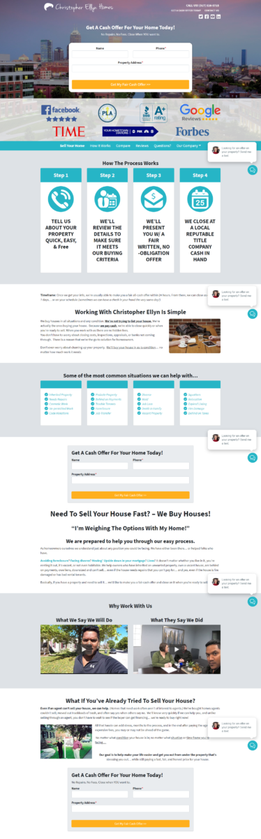
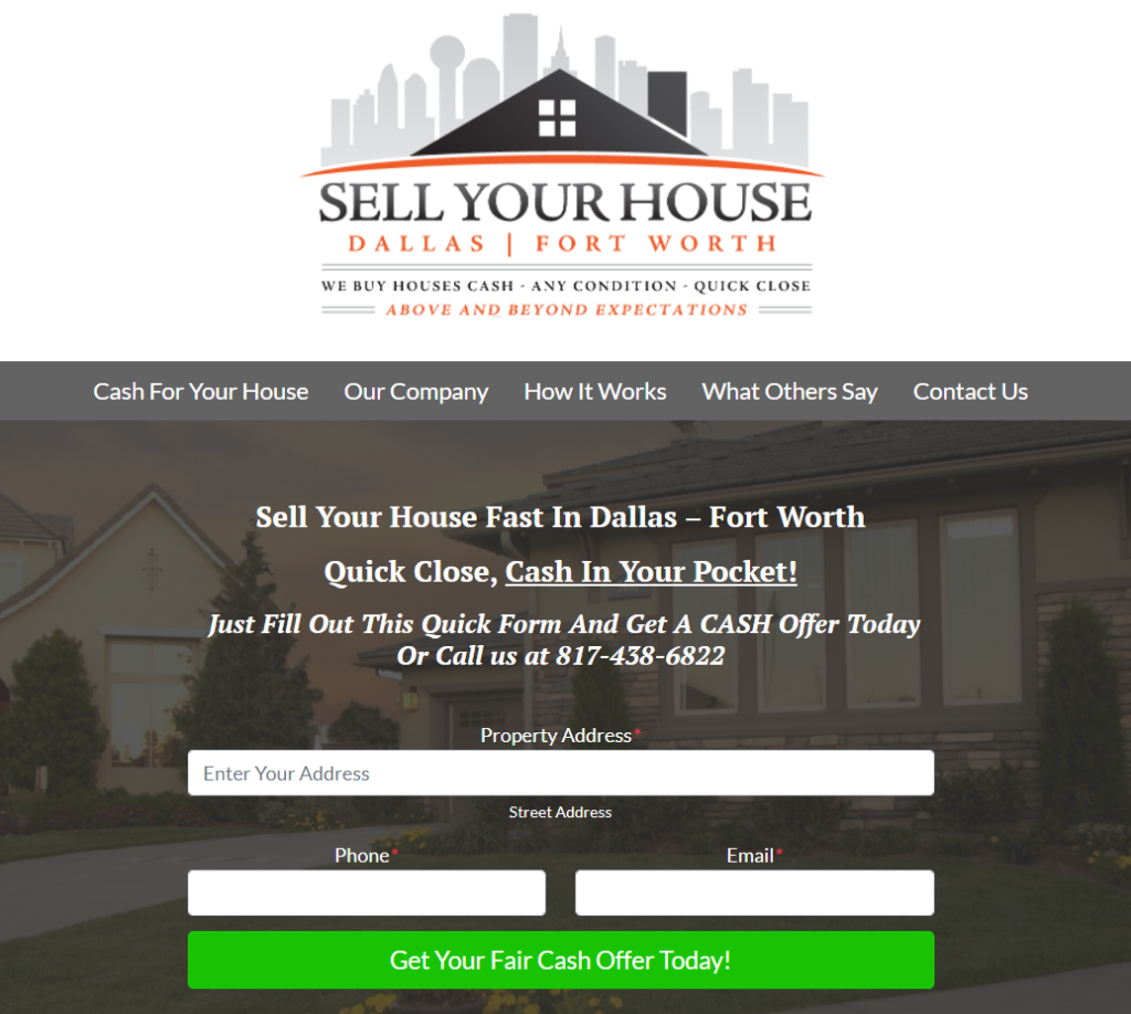
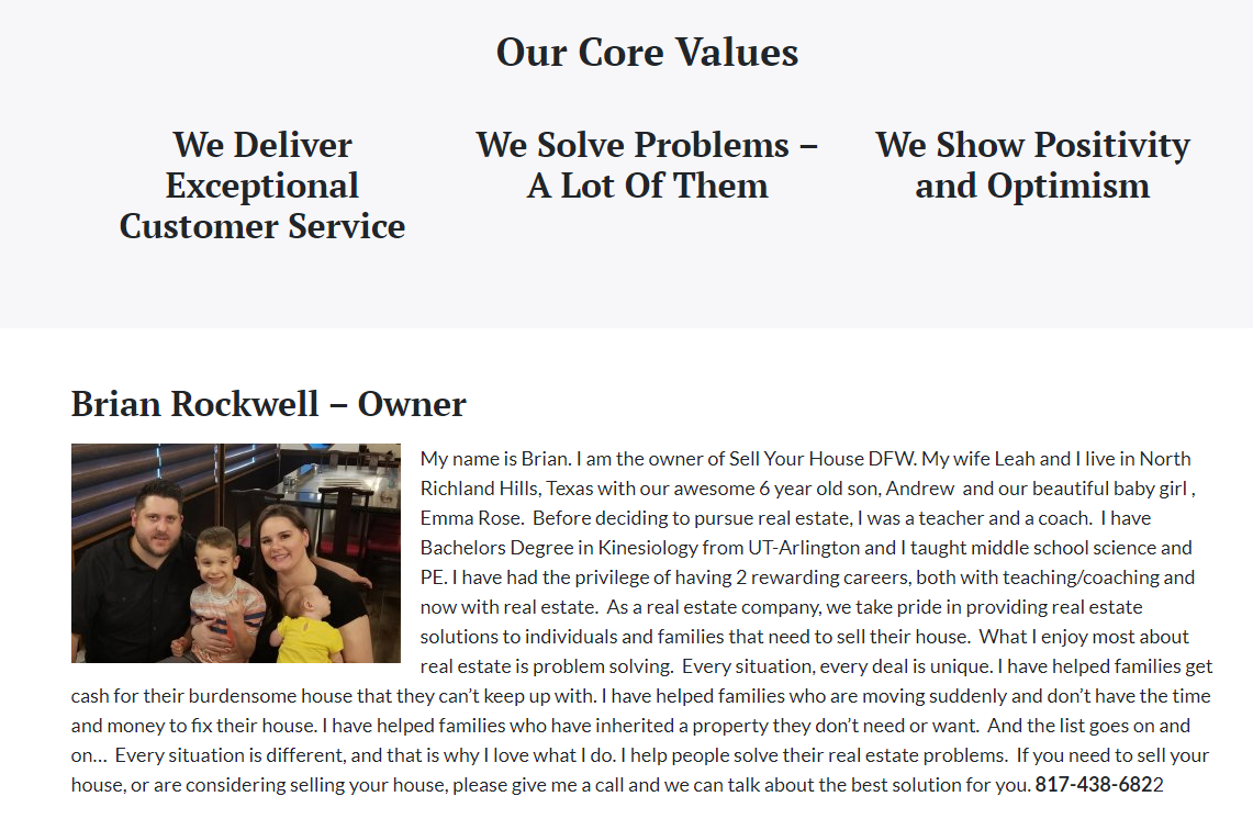
One of our favorite examples of authentic (and practical) branding comes from a Carrot member, Brian Rockwell — he’s an investor in Dallas and Fort Worth…
His homepage is clean, to the point, and semi-casual…
And his “Our Company” page takes authenticity and personability to a whole new level, with a picture of him and his family and the company’s core values…
This might not be a direct negotiation tip, per se — but your online branding sets the tone for negotiations. It helps determine how much people trust you and see you as the expert before you speak with them. That’s super important.
10. Use Scripts
If you’re an expert salesperson who knows your target market extremely well and you’ve been doing this for a long time, then maybe you don’t feel the need to use scripts.
That’s fine.
But maybe you’re not a total expert yet… or you’re leading a team of salespeople who still have some stuff to learn.
Either way, scripts can help.
We’re not saying that you should stick to scripts even when the conversation takes some unexpected turns — as a salesperson, you need to be adaptable — but it’s good to have a script in front of you. That will help keep the conversation moving in the right direction if it gets off the rails.
And you can click below to get your free negotiation playbook & scripts — stolen straight from the desks of expert investors and agents ;-)
When negotiating with a seller whose home is in distress, you might think that pointing out the problems you’ll have to fix — smoke stains, broken windows, trashed lawn, etc. — will help the seller understand why your offer is what it is.
And to some degree, that’s true.
You want to be honest with the seller about your costs so that they have more realistic expectations for what you can offer them.
However, it’s essential to be careful about bringing those things up.
The homeowner is likely attached to their property — maybe they inherited it from now-deceased parents, or they used to live there themselves.
Either way, there are emotions involved.
So instead of saying, “Look — your home is in terrible condition” or something similar, stick to the facts and avoid emotion: “We estimate that we’re going to spend about $XX,XXX to fix up the home. That’s why our offer is what it is.”
12. Trust The Follow-Up
As a salesperson, people are going to tell you “no.”
It’s bound to happen, so it’s best to become comfortable with that word.
The good news is that most deals happen during the follow-up process, especially when you’re making lowball offers.
People will say “no” initially because they’re surprised and upset. But then they’ll think about it. Maybe you send them a text message and an email or give them a phone call.
After a few months, they still haven’t sold their house on the MLS.
Now they’re ready to sell to you.
And if you’ve followed up consistently (say, a couple of times a month), they know how to reach you.
Ryan Dossey once told us that he closes 90% of his deals during the follow-up process, not during the first phone call.
So follow up consistently and trust in the process — most of your deals are yet to come.
13. Learn to Blank Slate
This tip comes from Jim Camp’s great sales book: Start With No
In that book, Camp suggests that every salesperson should have a “blank slate before entering into a negotiation.”
Take a deep breath and let go of all opinions, biases, emotions, and preconceived notions about how the negotiations should go.
He said…
“Your ability to blank slate is directly related to your ability to rid yourself of expectations and assumptions, two very bad words in my negotiation system.”
Why?
Because expectations and emotions add an unnecessary wild card to the negotiation table — if you’re too emotional, you might make a bad deal… if you’re frustrated from something that happened earlier, you might lose your patience… if you’re too opinionated and outspoken, you might miss out on getting vital information from the buyer or seller.
So before you negotiate, take a deep breath and remind yourself that you don’t need this deal and will just see how things go.
There’ll be many more deals in the future.
14. Understand The Numbers
Of course, “blank slating” doesn’t equate to being unprepared.
Before you negotiate with a buyer or seller, you should know the details of the deal as well as possible — how long the person has owned the home, how much equity they have, why they want to sell, your max offer, how much it’ll cost to fix up, etc.
Those numbers are critical for real estate negotiation because they’ll help you negotiate.
If, for example, the seller asks for an explanation of why your offer is so low, you can explain the math to them.
Knowing why they want to sell and/or how much equity they have can give you insight into their behavior if they shy away from your initial offer.
So yes, you want to blank slate.
But you also want to be as prepared as possible.
15. Include an Escalation Clause
As a buyer’s agent, it’s important to be as efficient and effective as possible. Your clients don’t want to spend the next 6 months looking for a home…
They want to find one that fits their desires, put an offer down, and close the deal.
To keep your clients happy, it’s in your interest to help give every offer they make a good chance of being accepted.
And that’s why you might consider including an escalation clause when the market is competitive — this says that if someone else offers more than your client’s offer, they’ll make a new offer that’s $5,000 or $10,000 more than the counter-offer.
Of course, you’ll want to clear this with your client first.
But it can be an effective way to help your clients secure a home.
16. Try To Meet in Person
Technology has made it super easy to “meet” with sellers.
You can text them, email them, or call them.
Heck — virtual wholesaling is now possible as well!
But still, nothing is quite as meaningful or powerful for negotiations as meeting in person — that is (and will always be) the quickest way to build rapport and show buyers or sellers that you value their time and respect them.
If you invest in a state where you don’t live, it might even be worth hiring a salesperson in that area to meet with sellers or buyers for you.
There’s a lot of power in face-to-face interactions.
So whenever possible, do negotiations in person.
17. Leverage Closing Costs
For real estate investors and agents, closing costs can be a helpful asset during negotiations.
Since closing costs are immediate and relatively expensive, many buyers and sellers would like to avoid them.
As an investor, reminding people that you will pay all closing costs can help push them over the edge. For example…
“I know that the offer is a little bit lower than you want, but keep in mind that I’m going to pay all closing costs for you — that would usually be somewhere around $10,000 — also keep in mind that I’m going to buy your house as-is and close in just a couple of weeks. Real estate agents aren’t able to do that.”
As a real estate agent, closing costs can be used during the negotiation phase between buyers and sellers to increase or decrease the home’s total price.
Buyers might offer to pay closing costs for a slight discount on the price of the home, and sellers might offer to pay closing costs for a slight increase in the price of the home.
It’s a vital real estate negotiation tactic to keep in mind.
18. Use an Expiration Date
Expiration dates are an effective negotiation strategy for agents and investors to keep in their back pocket.
Agents can add expiration dates to offers or counter-offers to increase the buyer or seller’s response speed. And investors can use expiration dates to increase urgency around their cash offers…
“If you sign the papers within a week, I will offer you $10,000 more. But you have to sign by Friday.”
For humans, urgency is a powerful motivator.
And offers without urgency result in people procrastinating on making a decision — or being wishy-washy with what they say.
That’s why expiration dates are so helpful.
19. Use Affirmative Language
Salespeople with a positive outlook and attitude often achieve better results — so stick to the bright side as much as possible.
InPower Coaching offers the following examples of “affirming language”…
“I appreciate everything you have offered, especially [example concession they’ve made], and I’m glad you like [example concession I’ve made]. Would you be willing to include [request]?”
“I understand you’re wanting X, Y, Z, correct? If this is true, I’m happy we can give you X and Y, but unfortunately, we cannot do Z for [reason].”
Notice how those statements keep things optimistic?
That’s because when you stay optimistic — and treat problems, concerns, or objections as though they’re overshadowed by more important benefits (in attitude, not in words) — the person listening to you will often follow suit.
They’ll be more optimistic and start seeing the value of what you’re offering.
So practice staying positive.
20. Use Storytelling
When someone has an objection, what do you say?
Imagine, for instance, someone saying, “Well, how do I know that you’ll be able to close in two weeks?”
You could look them in the eye and say, “Trust me. I will.”
Maybe that’s persuasive enough.
Maybe it isn’t.
Another option is to get in the habit of telling stories to overcome objections.
Here’s an example.
If the seller says, “Well, how do I know you’ll be able to close in two weeks?” I could respond to that by telling a story…
“Funny you say that. I was working with a homeowner last week who was in a real bind to sell. If he didn’t sell within two weeks, he risked getting his home repossessed by the bank. It was a huge mess. And reasonably, he asked me the same question. He said, ‘How do I know you’ll close in time so I don’t lose my home?’ — I’ll tell you what I told him.
I’ve worked in this market for a long time- I’ve helped buy and sell hundreds of homes — and never once have I missed a deadline. The service I offer sellers like yourself IS selling fast… and if I can’t do that… well, I don’t have much of a business, do I?“
That’s a lot more convincing than just asking someone to trust you.
So get in the habit of telling stories, and your negotiations will be far more effective and lucrative.
Final Thoughts
At least part of your success as a real estate agent or investor depends on your ability to negotiate, which means communicating clearly, listening well, building trust, and even knowing when to walk away.
You can use the 20 real estate negotiation tips above to become a better negotiator. For more resources and real estate marketing materials, click on the link!
Get Your FREE Sales Negotiation Playbook & Scripts!
By now, you’ve probably heard about Google’s upcoming Core Web Vitals update and are wondering what it means for your site, where you should be looking to learn more, and what you should be doing to prepare.
Back in June, we provided a brief overview of the Google update (officially titled the “Page Experience Update”) and an introduction to Core Web Vitals – the metrics playing the most prominent role in the update.
Recap:
The Page Experience Update is introducing Core Web Vitals to Google’s search ranking algorithm for the first time. Core Web Vitals are a series of pagespeed scores relating to how quickly a page loads, how quickly that page is interactive, and how stable that page is visually. Google started introducing elements of this update to their algorithm in mid-June, with the goal for it to play a full role by the end of August 2021.
Over the past several months, our Carrot Engineering Team has been identifying, optimizing, and improving features and elements that directly contribute to better user experience and site speed metrics.
As that work continues to make our sites faster and better than ever, we’ve compiled some of the most common questions, issues, and misconceptions we’ve seen as a resource for you to be ahead of the game on your end.
DO Understand Testing Tools
We get this question a lot: how do you test your site speed and Core Web Vitals and what tool should you use? At Carrot, we recommend using Google’s PageSpeed Insights Tool because – regardless of which tool you choose – the most important consideration is that you be consistent.
To us, using Google’s own tool makes the most sense. If you’re using the Chrome Browser, the Lighthouse Tool in the Developer Tools is another great option.
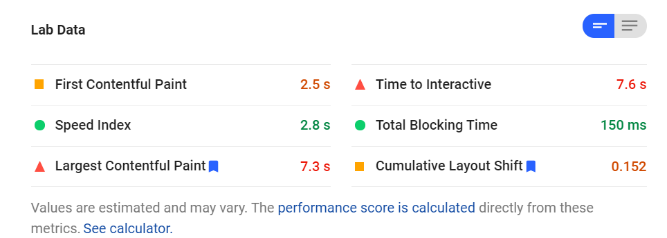
That said, we always want to be sure that our members understand the differences and caveats between those snapshot scores provided by tools and the scores that are actually being used in Google’s algorithm. Google differentiates them into two categories: lab data and field data.
Lab Data – Provided By Testing Tools
Lab data is exactly what it sounds like – data collected in a lab, or in this case, a single snapshot report performed by Google’s PageSpeed Insights Tool or any other third-party testing tool.
It uses your own browser or another emulated device to load your website in a simulated environment and capture the key metrics that contribute to Core Web Vitals and Page Experience. These scores are meant to be consistent baselines and are not necessarily reflective of actual user experience.
Just like in a real lab, you want to control for all variables when running experiments and tests on your website. Google’s page speed tool (and most other tools) do this by loading your site on a simulated older generation smartphone with only a 3G connection to determine mobile “site speed” scores.
This is meant to represent the absolute baseline and used as a tool for debugging any performance issues with your site. It’s useful for looking at where you can improve your scores, but it’s not useful for understanding real user experience. Most users are on newer mobile devices with better connections and WiFi.
Their experience is better than in the simulated snapshot and contributes to field data – the real scores used by Google’s search ranking algorithm.
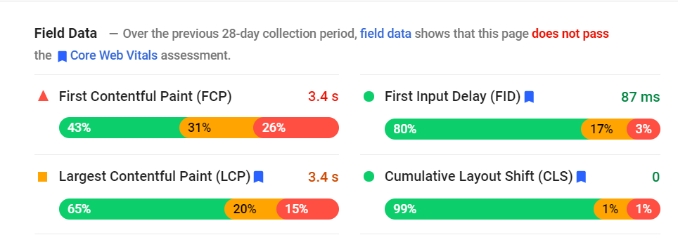
Field Data – Provided By Real User Experience
Like we said above – field data is what Google is actually introducing to their search algorithm. It represents the actual user experiences collected by the Chrome User Experience Report (or CrUX) when users visit your site. Google then looks at the 75th percentile of those scores, and that’s your actual “score” used by their algorithm.
Just like with Google’s more commonly-known ranking indicators, we lose visibility and transparency the closer we get to the algorithm. So while snapshot lab data scores can be accessed whenever we feel like running a tool, user experience field data is more ambiguous and inaccessible.
There are two primary areas where you can gain insights about your real user experience scores if your site has sufficient traffic/data for Google to generate reports. That’s in the Core Web Vitals tab of Google Search Console or at the top of reports in the PageSpeed Insights Tool.
For individual URLs, you may see an error – “Field Data — The Chrome User Experience Report does not have sufficient real-world speed data for this page.” This means that there is not enough CrUX data available to generate a representative anonymous view of your performance.
If you find this to be the case, no sweat – you just need more visitors, and the best way to do that is by focusing on generating great content first.
This leads us into our next section…
DON’T Stop Focusing On Content
Under no circumstance should you stop what you’re doing to generate great content and drop everything to focus on Core Web Vitals.
Here’s some guidance directly from the source – Google…
“While page experience is important, Google still seeks to rank pages with the best information overall, even if the page experience is subpar. Great page experience doesn’t override having great page content.” – Understanding page experience in Google Search results
In other words, page experience and site speed scores are just other ingredients in the complex recipe Google uses to produce search results and rankings.
Relevant, useful, informative, and high-quality content will continue to outperform competitors and other websites – because, at the end of the day, a visitor is seeking content first. Page speed is just another supplemental measurement.
At Carrot, we have always excelled on the content side of things. That’s our bread and butter! So while Google’s Page Experience Update is certainly something to keep an eye on now and in the future, we highly recommend that you continue leveraging our tools and investing your time, resources, and creative efforts to produce high-quality, relevant content above all else.
Another note: Core Web Vitals will only apply to mobile search results. Across our network, we see that nearly 40% of inbound traffic (and leads!) to Carrot sites still occur on desktop. Those desktop search results will not be impacted by this update at all. That’s why content is still so important.
DO Take A Minimalist (And Mobile First!) Approach To Design
Because this update applies solely to mobile search, it underscores the importance of taking a mobile-first approach when looking at your website content and design. Let’s face it – mobile has taken over.
As we mentioned, 60% of traffic across our Carrot network occurs on a mobile device. Keep that in mind when thinking about how to layout and implement content on your site. Sometimes, less is more.
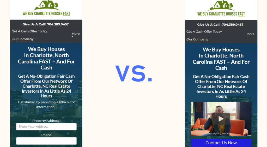
We recently did a series of conversion tests that reiterates this point. We found that simply reducing the amount of content in a website’s main hero section and form, could increase conversion rates by up to 50%!
This test confirmed our theory that by reducing the clutter that a visitor sees, they will be more likely to engage with the lead form.
The same principle applies to site speed and performance. Each additional element that you include on a page requires additional resources to process, render, and place that element on the page. That results in additional time that it takes the page to load.
In the left image, the form is prominent and the page isn’t blocked from loading by resource-heavy elements. In the right image, there are more elements to load, and the form is pushed “below the fold.”
The most common abuses of this also often incorporate some of the most resource-heavy elements – like pictures and videos placed all around the page, or high up near the top of the page.
While we encourage you to continue creating great content to highlight your credibility and experience, we also encourage you to be mindful of how, and where, you deploy that on your site. Run snapshots before and after adding it and see how it impacts your scores.
At the end of the day, the goal of your site is to generate leads. With so many users now browsing on their phones, it increases the importance of improving user experience in more ways than just site speed.
By taking a step back and considering how some of your content elements might be drawing attention away from conversion elements or impacting a visitor’s experience on your site, you’ll also be guaranteed to improve your site speed metrics at the same time.
DO Take Image Optimization Seriously
While we are on the content note, we understand that there are naturally going to be images and graphics you want to include to help highlight your experience and improve your site aesthetic.
We highly recommend being cognizant of the various ways to ensure you aren’t overburdening your site’s speed and performance when adding images.
Just like with content elements, too many unnecessary tracking scripts and third-party codes can also overburden your site and negatively impact your Core Web Vitals scores.
The same concept applies: each script or code snippet you add requires more resources to execute.
We get it – some tracking scripts like Google Analytics, Google Ads, and the Facebook pixel might be necessary for your marketing if you’re making ad-buying decisions based on those metrics. In this case, you have to consider it a trade-off.
In exchange for gaining visibility into those tracking metrics and insights, you’re negatively impacting your site speed marginally. Which is more important to you? In most cases, those tracking analytics will outweigh site speed.
If you aren’t heavily and consistently using these tracking tools, perhaps consider what you really need and what you can get rid of. Over time, the addition of individual scripts and code snippets can naturally bloat if not routinely audited for only the most necessary scripts. This is one of the most common variables we see when reviewing customer site speed report results.
Note: This also applies to any additional third-party scripts and services like chatbots, call tracking, etc.
Finally, DON’T Freak Out…
Core Web Vitals and Google’s Page Experience Update are certainly complicated, but by taking the time to understand the basics and paired with our Engineering Team’s work to optimize your site, you’ll be ahead of most site owners.
Screaming Frog analyzed 20,000 URLs last year, and only 12% of mobile sites and 13% of desktop sites passed the Core Web Vitals assessment. There is a lot of work for everyone to do, and we’re committed to continuing to provide you with the resources and updates you need.
We’re thankful for a great community of members who are really supporting what we’re doing here at Carrot to help transform the way high-achieving real estate agents and investors use the internet to grow their real estate business.
How to Create A Follow-Up Machine That Sells While You Sleep in 4 Steps with Mark Skowron
What message are you sending to your prospective leads? How are you connecting, building trust, and following up?
Mark Skowron is an investor and agent who uses carefully crafted copy to close an extra deal each and every month.
Today we will talk about sequencing, frequency of contact, and what you can say to build instant trust and rapport. Most importantly, you will learn how to turn a small investment of your time upfront, into a potential $240k per year in extra profits.
Read the Full Show Notes Below…
Mark Skowron spoke at a recent CarrotCamp, and I was blown away by his creative use of copy. He approaches his investment business in a unique way, building relationships through genuine, carefully crafted content.
When looking at Mark’s auto-response sequence, you aren’t going to find the same generic stuff that you see from the average investor. Instead, you will see a mixture of social proof, testimonials, lifestyle, and maybe a few pictures of his pugs.
What Mark has built requires a bit of work upfront, but now runs on its own. His automated email sequences lead to an extra deal per month, resulting in thousands of dollars in additional revenue. Here are 4 of the things Mark includes in his copy that lead to deals.
4 “Musts” to Include for Better Copywriting
#1 – Social Proof and Testimonials
You’ve likely heard us talk about adding testimonials to your Carrot site. Whether they are written or in video form, you’ll want to try to get a positive review from every client you work with. Including these in your copy, on your website, and on social media is a great way to build trust and rapport.
Setting up profiles to help build social proof will help to establish credibility. Make sure you have somewhere you can send your clients to – Google, Porch.com, and the BBB are all great ideas.
#2 – A Connection Piece
When creating his sequence for follow-up texts or emails, he isn’t hammering the seller with sales information, offer numbers or the same generic jargon we hear all of the time. Instead, he will use a lot of connection pieces – stories, anecdotes, and situations that his target reader will be able to relate to.
You can use pictures of your dogs, share information from your church, or talk about working out. Whatever you are into, don’t be afraid to share it!
#3 – Teamwork and Cause
Another way to build connection and trust is by highlighting members of your team or causes you support. You can talk about a contractor you work with or a local charity you support.
Sharing these personal aspects of your life and business will help people to better get to know you and what you are all about. You will be seen as a real person as opposed to another faceless buyer who simply wants to “buy your house.”
#4 – Fear of Loss
You can’t buy every house you see. Let your sellers know that you only have a certain amount of time/funds and need to get an answer right away. There are other houses out there, and it’s important that the seller knows that could miss out on your offer if they don’t act right away.
The sense of urgency, combined with the fear of loss, will help your seller more quickly make the decision that will be of the greatest benefit to them in the long run.
Pattern Interruption
In addition to the 4 types of content listed above, Mark also recommends throwing some pieces in there that will disrupt usual thought patterns.
This could be an unexpected joke, a surprising fact, or a bold statement that will cause the reader to look twice. Sprinkle a few of these pieces into your automated sequence grab attention and get people thinking.
Knowing Your Audience
When creating any piece of content, you’ll want to get yourself into the conversation that is happening in a seller’s head. Who is this buyer? Can they really close? What will they do for me? Your content should address these questions rather than going on and on about what you can do.
Figure out who you are trying to reach, and provide the answers that they are looking for. Build relationships, get to know them and be the solution your clients need.
This year’s real estate market has been strong, with high interest in housing across all regions of the country. The strengthening economy and a demographic shift are fueling this growth — and millennials reaching their peak homebuying years have led to increased demand for homes nationwide.
However, there’s another major trend in today’s market: housing inventory is at an all-time low. Simply put — there aren’t enough homes for everyone, so housing prices are skyrocketing and competition is fierce.
Low mortgage rates combined with an increase in work-from-home opportunities due to the Pandemic have fueled greater demand for suburban houses — and buyers are buying up these properties quickly as they come onto the market. Some buyers make offers without even seeing the property in person or including contingencies in their bids, just to win a bidding war with other eager homebuyers.
There’s also an increase in demand among millennials due to the historically low mortgage rates; however, many of them can’t find what they need within their budget. The drastically rising home prices are making affordable housing scarce.
Despite the increasing number of sellers due to increasing home prices and low-interest rates, limited construction activity earlier due to COVID-19 and high lumber prices, and pent-up demand for housing, housing demand is still drastically outpacing supply. So competition continues to be fierce for new homes hitting the market (or being sold off-market) making retail seller leads more elusive — and more valuable — than ever.
These numbers are, of course, offset by the looseness of the definition of “active,” as well as the fact that some real estate agents help to sell homes, while many are purely focused on buyers or simply have an active, but unused, license.
Additionally, we could potentially see over a million evictions in the coming months, while at the same time giving millions of people the means to get into a home. This is fueled by:
The passing of President Biden’s first-time homebuyer credit. This first down payment tax credit “will help families offset the costs of home buying and help millions of families lay down roots for the first time,” according to President Biden’s campaign website.
What does this mean for real estate agents today?
It means that every lead and listing counts and the real estate agents who succeed are the ones that consistently market, generate leads, follow-up, and build high-flying reputations in the area(s) where they operate.
Don’t get us wrong. Today, inventory is low and competition is high. But the market has been through many similar fluctuations in the past and there are no indications that the market won’t balance back out. In other words, you’re in a good industry.
Here’s how, at Carrot, we’re helping real estate agents stand out in their markets and snag listings.
The Carrot Solution
Since CEO Trevor Mauch started Carrot, we’ve made it our mission to always innovate and evolve our software to stay ahead of the real estate market and anticipate our members’ future needs to help Carrot members see success.
It’s the foundation of our company vision — to “inspire and empower real estate professionals to gain true freedom and make a greater impact with their businesses.”
That means building awesome software that helps real estate professionals build authority online today while always staying a step ahead of your online lead generation needs in the future.
One recent innovation inspired by current market trends that we are super excited to launch is our all-new Carrot Agent Seller Site Template that’s designed to help today’s agents attract and convert more retail seller leads.
Our new site features fresh seller-focused content built from top-performing Carrot Agent sites, a modern design to help you stand out online, and — of course — Carrot’s proven SEO and conversion methodologies to attract and convert more seller leads in today’s highly competitive, low inventory real estate market.
How do we know it works?
Because the all-new content strategy is cultivated directly from our highest performing Agent members’ websites…
These sites received astronomically more traffic than the average agent site — across all channel groupings. The average agent site received 664 visitors in Q2. The top-performing Agent sites had 10X more visitors.
These sites converted all traffic between 2X to 5X better than the average agent site.
These sites converted organic traffic 215% better than the average agent site.
And we ensured the new design put you as the Agent at the forefront to help you strengthen your personal brand in your local market and build credibility with more social proof and happy client testimonials.
So we figured… If it works for them, it could work for you!
Check out a screenshot of the image below!
How does it work? Sellers opt-in, you get notified, you call them and do what you do best… voila!
Cool, right?
But that’s just one example of how we’re making it easier for agents to find listings.
Carrot members also get…
Tons of other tools that will help you drive traffic and generate leads in your specific market — UTM builder, SEO Keyword Rank Tracker, SEO Checker, and more!
Access to industry-leading trainings, support, and strategy from our team of product and real estate experts!
But you don’t have to take our word for it!
Check out some of the testimonials below from real estate agents using our software…
“This is much more than a web hosting company…it’s a complete marketing and training program. Carrot has helped our Real Estate Team develop a complete marketing strategy. For the first time…ever…we can see how all the pieces fit together in a cohesive marketing strategy. The results have been an increase in exposure, online leads, and the ability to measure ROI! The training, support, coaching, and customer service have been amazing.” – Tom Townsend
“Carrot has impacted my business so positively! I love the property websites, landing pages, SEO rankings, blog, and overall design of the site. I also love the landing pages that I use to drive traffic from ads that I run. And my favorite is to watch the increase in Google rankings with the more relevant content we produce. Really great web host!” – Shemeika Fox
That’s all for now!
We’ll let you know when we’ve got more cool innovations to share that’ll help you grow your business in a scalable and realistic way.
To your success!
Want to learn more about our new seller site? Check out here.
Unlock Our Newest Agent Site Template
Join Carrot and Access Our Brand New Agent Seller Site Template Today
“The only way to build authority is through content.”
If you’re serious about generating leads, real estatetestimonials can be a key content element because they are unbiased comments that prompt visitors to give you their contact information.
Key Takeaways
Quality testimonials establish trust and authority when formatted correctly with real names, photos, and specific details rather than vague statements or just initials.
Video testimonials represent the highest level of effectiveness as they capture nonverbal communication and emotions that text alone cannot convey.
Ask strategic questions like “What problem did you need to solve?”, “Why did you choose us?”, and “What surprised you?” to gather compelling testimonial content that addresses prospect concerns.
Even a slight increase in conversion rates through properly formatted testimonials could mean thousands of additional dollars in monthly revenue for your real estate business.
Key takeaway: 123% increase in leads for sites with personalization.
We compared a batch of our CSU member’s motivated seller sites over 6 months to see the difference in the lead count.
Now, there are, of course, other factors that play into site conversion. It’s also a great reminder that great-looking sites still need the personalization element to round out.
We compared member sites WITHOUT personalization on the homepage (no testimonials, photos of the member, etc.) and homepages CONTAINING testimonials (1-3) and a personal photo in the about section.
The result?
PROOF: 123% increase in leads for sites with personalization!
Our most engaged members create the most content and get the most leads.
Using real estate testimonials on your site in text or video, you introduce content that will authoritatively promote your business.
You should be using real estate testimonials to help establish credibility and authority. Quality testimonials increase conversions because they aren’t looked upon as sales pitches. If they come across in an unbiased voice, they will build trust. You’re using real people to show success in your service.
In the end, your testimonials will convert more visitors into buyers and sellers if you use them correctly.
According to a study… “Testimonials and case studies are considered the most effective content marketing tactics.” In short, in a crowded market like today, great testimonials for real estate agents and investors formatted correctly can boost your leads and deals. They help add credibility to an untrusting world.
Additionally, as those values go vertical, many aspiring wholesalers start flipping houses, making for increasingly saturated online spaces.
But before panic sets in, breathe. It’s not as bad as it sounds… well, but it’s also an opportunity. It’s a chance to flex your real estate muscles, to stand head and shoulders above that semi-debilitating clutter, to be the solution rather than contribute to the problem.
What I will teach you will apply whether you’re an investor, buyer, seller, or agent.
I will teach you how to build credibility by leveraging testimonials that shine.
Let’s dive in!
What is a Real Estate Testimonial?
A real estate testimonial relays a story from a current to a potential client. The shorter, the better (unless you sacrifice quality). You don’t want an hour-long testimonial.
When a client has a great experience, let them share it. Get real testimonials. Potential clients experience shopping anxiety — you know, that feeling before buying something that says, “It costs too much. It’s not good enough. How do you know it’s what you want?” — and testimonials are one way of shooting down this discouraging devil.
The testimonial says, “Other people have worked with this company and had a good experience. I probably will, too.”
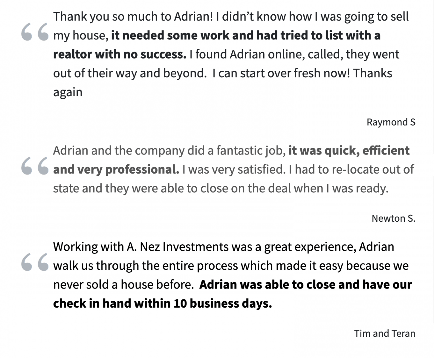
Here are some examples from one of our member sites:
Example Real Estate Testimonials
Why are high-quality testimonials such a big deal?
If used correctly, testimonials for real estate agents and investors are important for website visitors (and your conversion rate).
They can…
Completely eradicate concerns that prospects had about working with your business.
Build immediate trust for who you are and what you do.
Convince prospects to give you their information via an opt-in form or call you on the phone directly).
Consider that 88% of consumers claim that they read at least 10 reviews before deciding whether they can trust a company or not (and they have to trust you if they’re going to work with you) or that 88% of people trust online testimonials just as much as personal recommendations from a friend.
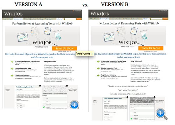
To prove just how powerful testimonials can be (at least the conversion rate side of things), Unbounce reported on an A/B test. Ideal for testing, Version A and Version B are identical save for one difference: Version B includes a testimonial above the website’s opt-in form.
In the end, Version B increased the conversion rate by 34%.
Let’s put that in perspective for a wholesaler’s website.
Imagine you drive 1,000 website visits every month, generating 100 leads per month on your website (a 10% conversion rate — typical for Carrot websites), and you close 1 in 25 leads. That means you’re doing about 4 deals per month at, let’s assume, $10,000 profit per deal.
Boom — you add a glowing testimonial to your website and increase your conversion rate by 34%, from 10% to 13.4%.
Now, you will get more than 130 leads per month with the same amount of traffic (1,000 website visits). And since you close 1 in 15 to 25 leads, you’ll now do more than 5 deals monthly with the same amount of website traffic.
By putting a testimonial on your website, you added $10,000 in monthly wholesale fees (from $40,000 to $50,000 per month).
And the same goes for real estate agents. You can increase your conversion rate and monthly income by adding excellent real estate testimonials to your website.
Of course, I’m not promising that you’ll get exactly those results. I’m just trying to illustrate how powerful a slight boost in your website’s conversion rate can be on your business revenue (at Carrot, we provide high-converting websites out-of-the-box for our members)… and that testimonials can help you achieve that slight, powerful boost.
But… all of this depends on using high-quality testimonials.
You Might Be Doing It Wrong
Most people have testimonials helpful in taking up website canvas, but little else.
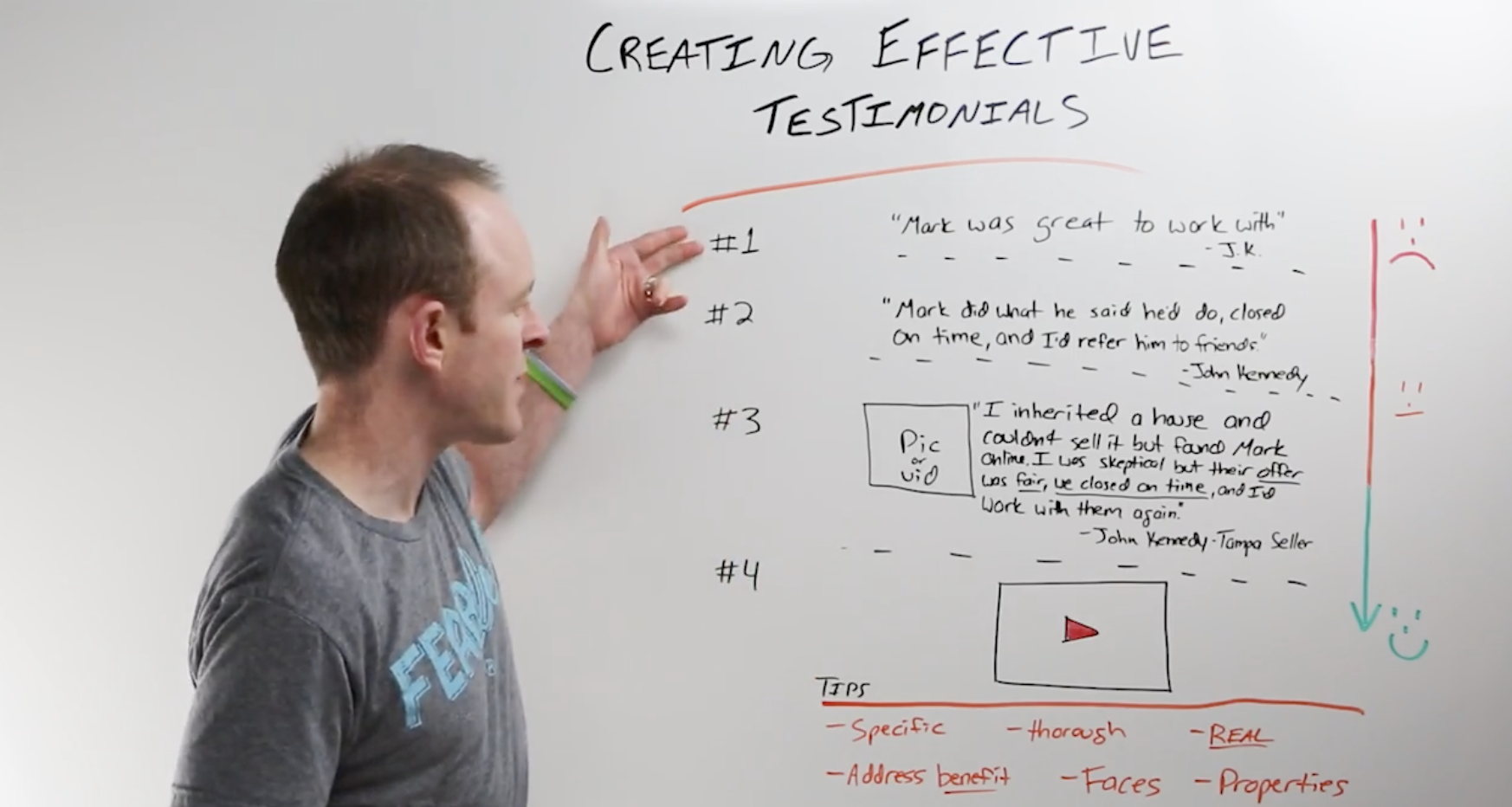
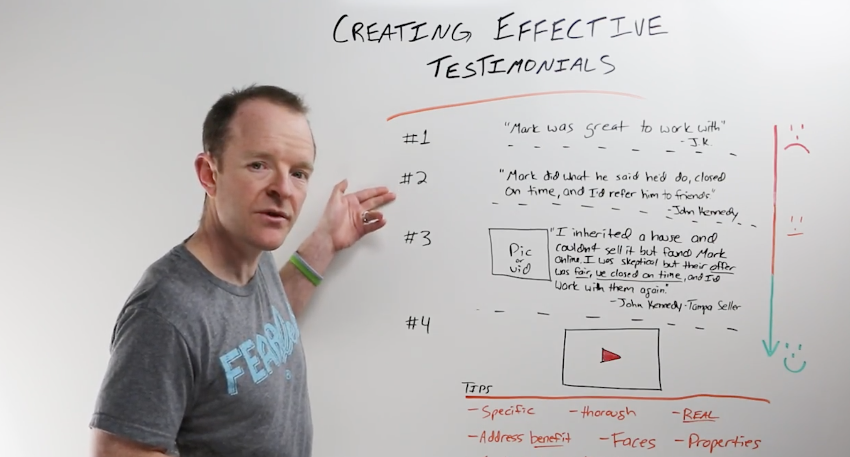
To avoid spitting lousy devil killers, I will walk you through the four levels of a quality real estate testimonial. Unfortunately, most people are stuck in levels one and two.
Level 1: The Basic Real Estate Testimonial
The first level is your most basic testimonial:
“Hey, Mark was great to work with. – J.K.”
If a level one testimonial is on your website, it’s best to take it down. It’s not helping. There are no specifics. It doesn’t say what Mark did for you that was so great. It doesn’t say how Mark did it.
It doesn’t end there if this lack of context isn’t enough. The signature says, “J.K.,” the client’s initials. Although the testimonial is made a joke by the initials J.K. (if someone has these initials, don’t even get their testimonial…), initials, even without such inconvenient letters, are impersonal and potentially create distrust in the viewer.
A testimonial doesn’t always help your reputation. Level one testimonials, particularly, can damage it.
Level 2: Be Specific
Level two is better, but still in the sad zone 😢
Do not use painfully vague real estate testimonials.
“Mark did what he said he’d do, closed on time, and I refer him to friends. – John Kennedy”
It says Mark is reliable, timely, and good enough to get a referral. Level two is getting more specific.
When a testimonial is ambiguous, it can work against building trust for your business and create unease in the prospect’s mind. If this testimonial is real, why isn’t it more specific?
Notice, also, that the testimonial used the person’s name, John Kennedy, not his initials. However, skeptics abound even with a real name and an honest, mildly-specific testimonial. The more specific, the better… and fewer critics.
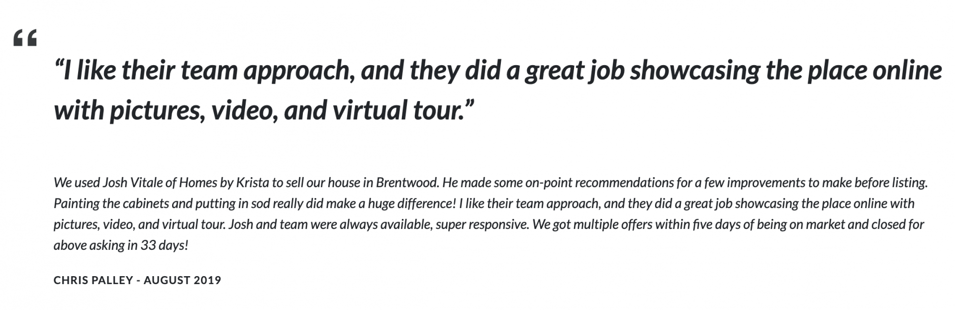
Here’s a sample of a good review for a real estate investor:
“Best Decision I’ve Ever Made!!! I was in a situation where I needed to get out of my house ASAP and Colby came through for Me!!! Nobody else will ever beat his services and I’m relieved I don’t have the financial stress any longer!!! I will forever be grateful for what he did for me!!!”
But specificity isn’t all that counts toward your level. Even if your testimonial is true, you must convince people it’s true. It’s all thanks to that crowded real estate space with no shortage of lies and deceit.
Level 3: Be Real
Unfortunately, being authentic isn’t enough in our world of “alternative facts” and reality television.
It’s tempting just to write your real estate testimonial under an alias name and throw it on your website to increase the conversion rate. It sure would take a lot less time, and it might even boost your conversion rate if you’re a great writer.
But chances are, the testimonial you’ll receive from someone who authentically loves your service will be far more powerful (and conversion-boosting) than something you throw together yourself. Plus, people can usually tell when a testimonial is fake.
You have to convince people you’re authentic.
How?
Well, levels three and level four testimonials seem more believable simply because they include a visual and they’re a bit more specific:
“I inherited a house and couldn’t sell it, but found Mark online. I was skeptical, but their offer was fair, we closed on time, and I’d work with him again. – John Kennedy – Tampa Seller”
Viewers will look at an image or video, and immediately, the dud of a testimonial becomes impactful.
The image could be a picture of you and the prospect at the closing table or their face. It could be you shaking their hand or a short video of them discussing the process.
Your only goal is to make it real, to make it believable. Don’t forget to include a short bio for the testimonial giver; tell the viewer who’s recommending you. Even something as short as “John Kennedy, Tampa seller.”
Here is an example of a good testimonial with an image of the client and the investor:
“Thank you for all your help and walking me through the mess I got stuck with. You explained everything and went over the contract step by step; never once did your answers change. You gave us all the information we needed and we could see you were serious about what you do. If someone asks if I know who could help them, I would not hesitate to name you as a reference as you are an honest person. Once again, thank you so much.” – Louise R. Friel
Level 4: Record Video Real Estate Testimonials
If you want to climb to the testimonial pinnacle, make a video. Record a video of the whole process of your client, recommending you, emotions, and all.
Video captures something text cannot: the human ability to communicate nonverbally. And that’s a powerful prospect.
Here are a few examples of good “real” written testimonials:
2nd Chance Investment Group
“Like many others in this unstable economy, and after looking into other organizations, such as Keep Your Home California, I exercised my options by contacting Second Chance Investment Group in Chino Hills, CA. It was the best phone call I could have made. Now I am doing better than ever – free of debt. And moving forward with a clear mind. Thanks, Ray Foster and Second Chance. Keep up the good work.” – Sheryl Brown-Pearce
Townsend Realty Group
“Townsend Realty Group has been the finest company to work with as we sell our home in Canton. We have sold several homes and have never had such a professional and compassionate company guide us through the process. Their realtors are always a phone call away and are readily available to help in any way. Their team made some great recommendations for selling our home, and they also helped us avoid pouring lots of money into getting the home ready for the market!” – Ray and Patricia Massengale
Florida Cash Home Buyers
“Thanks to all the fine people I have dealt with in the past 2 to 3 weeks. I especially like to thank Annette with the law firm. She was very helpful in processing the closing paperwork. Alejandro kept me aware of my need to show the property to various people. Thanks again to all that helped with the sale and closing.” – Glenda Skaggs
Video Real Estate Testimonial Examples
Here are a few examples of good “real” video testimonials:
Let me end with one final tip…
You Need to Ask Good Questions
Don’t forget to set yourself up for success at the gate. You must ask the right questions to get a high-quality real estate testimonial.
Here are some questions to ask to get POWERFUL testimonials:
What problem did you need to solve,and did we solve it as you expected? — You want to pull out the pain they were experiencing before working with you. What were they going through? Could they even sleep at night? What was the emotional pain like? How stressful was the situation?
Why did you choose to work with us? — You want to understand better what made them decide to solve their stressful situation by working with you. What was going through their head? What was the final straw that made them give you a call?
Why did you choose us instead of some other company? — Why not somebody else? This question will help illustrate your USP and what sets you apart from competitors in your market.
What was your favorite part about working with us? — Being on the other side of that stressful situation, what was the client most enjoyed most during the time they worked with you? It could be how fast you closed or how easy it was.
What surprised you about working with us? — Asking this question can get the client talking about the thing they loved about working with you that was the most unexpected (i.e., how you went above and beyond for them).
Elements of an Effective Real Estate Testimonial
To recap, these are the elements necessary for a killer testimonial. Check these off your list before posting.
Be specific
Be authentic
Be thorough
Emphasize benefits
Include a picture of a face, or better yet, record a short video
Short bio
Ask good questions
Where to Place Testimonials on Your Website
There are several options for placing testimonials on your website. Some investors dedicate an entire page to reviews or testimonials, while others prefer to sprinkle one or two on their homepage and other landing pages. However, it’s important to remember that buyers and sellers researching and wanting to know you better are more likely to visit your reviews page, “How it works” page, or “Our company” page.
Placing testimonials on your reviews page can be especially powerful, as this is where potential customers will go to read about the experiences of others who have used your products or services. You may also want to consider creating YouTube videos showcasing your business on your homepage and city landing pages, as this has been shown to increase search engine rankings correctly.
While you may not see many people watching these videos on your landing pages, once they are shared on your reviews page and other platforms, they can be highly effective in building trust and credibility with potential customers.
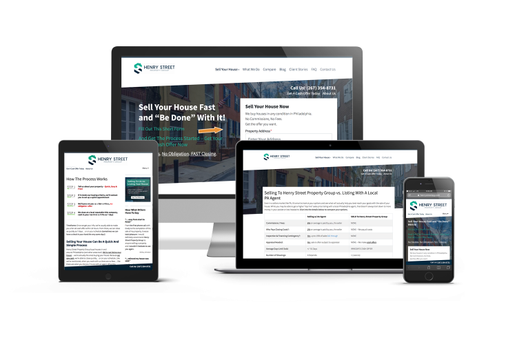
Here are a couple of examples of how Carrot members use testimonials:
Kind House Buyers – Reviews Page (scroll on the image to see the full page)
Simply Sold Testimonials Page (scroll on the image to see the full page)
Suppose you’re uncomfortable on video, email past clients the questions above and ask for their answers. Call a friend and ask them to vouch for your character if you can’t think of any clients who’d give you a testimonial.
As your business grows, you’ll get better real estate testimonials, improving your conversion rate even further. But it’s a process.
Testimonials can increase conversion rates if you use them correctly, and there are very few instances where a testimonial would hurt your conversion rate.
So work with what you have.
So embrace it; get some testimonials and add them to your website. Remember, a slight increase in conversion could mean thousands of dollars per month for your business.
You’ll agree that sifting through endless real estate agent marketing ideas is challenging. It’s tough to determine which tactics will generate the highest volume of quality leads while keeping your sanity.
When people think of buying or selling a home, you want them to think of your name. You want them to give you a call. And you want them to work with YOU.
Of course, that’s easier said than done.
Many other real estate agents in the area are fighting for the same attention.
Fortunately, you don’t have to win all the attention to dominate your market – just most of it.
And the best part is…
You don’t even have to leave your computer to get started.
30 Real Estate Agent Marketing Ideas to Win More Deals
I will show 30 real estate agent marketing ideas for dominating your online market in this article.
Instagram is an incredible place to share your listings and get noticed! For real estate agents, Instagram provides a whole new world of opportunity.
With over one billion monthly active users on the platform, there’s no better time than now for you to join in with all these people looking at beautiful pictures daily.
Whether showcasing properties or providing helpful content like tips for staging homes, something here is suited ideally for you!
Most real estate agents become a part of the online “clutter” in their markets when they toss up a website that gets lost in the shuffle. Building a focused and optimized website will help you cut through that clutter with content marketing and adding your industry expertise.
A website will attract more of your favorite clients by using it as an Evergreen Marketing tool.
You can reduce or eliminate relying on cold calling, direct mail, Zillow, and the marketing that’s burning you out when done right.
Service as an educational tool. Add community resources, FAQ, and contact information. Educating buyers or sellers and explaining how real estate agents provide their services can build trust and rapport and earn more business.
Facebook’s LIVE video feature is useful for more than recording your kid’s birthday party. You can also use it to do a LIVE walkthrough of house listings you’re trying to get attention for.
After all, one of the most time-consuming parts of your day is house showings, so why not show a house to your entire Facebook audience with a single LIVE video?
Plus, 70% of homeowners want to list with a real estate agent who does some video marketing to sell their home. This might be your dead-simple, don’t-have-to-hire-a-professional way of integrating video marketing into your service.
Just create a healthy cadence and get in front of your social media audience more regularly.
The more people see your face online and hear you talk about their problems and your solutions, the more familiar your market will be with you.
Video is increasingly important in content marketing for social media. More people are choosing to consume information through video.
Here are some ideas for Facebook live videos to work into your real estate marketing:
Host virtual open houses.
Discuss your community market with a local specialist.
Livestream auctions.
Interview customers for success stories.
Interview a partner or someone you work with… such as an interior decorator.
According to the National Association of Realtors, social media has become a significant way to acquire clients and close deals. Here’s a snapshot of their report:
77% of realtors actively use social media for real estate in some capacity.
47% of real estate businesses say social media results in the highest quality leads vs. other sources.
99% of millennials and 90% of baby boomers begin their online home search. As opposed to in-person referrals.
It’s powerful. Perhaps there’s no better way to generate consistent word of mouth around your brand name and service than by staying in front of your audience.
5. Partner with Other Real Estate Agents in Your Area
As the market gets increasingly competitive and the economy takes a slight downturn, collaborating with other professionals in your market might separate the winners from those who starve.
Don’t be afraid to collaborate with other real estate agents and investors in your area to make the most of the market that you find yourself in.
Sometimes, the best way to dominate your market is to team up with those already dominating it.
6. Message 100 Friends on Facebook and Tell Them What You Do
If you want to generate word of mouth, send messages to your friends on Facebook and tell them about what you do. Maybe you’re offering a new service that you can announce to people, or perhaps you want to say to people that you’re currently looking for new clients.
Either way, a Facebook message can go a long way in generating word-of-mouth for your business within your target market – especially if you personalize each message.
7. Set Your Email Signature to Explain What You Do
If you’re like me, you send at least 3-5 emails daily. Believe it or not, every one of those emails is an opportunity to gently advertise what you do and who you are.
By automatically setting your email signature to populate with business-card style information, you remind people of your company every time you send an email.
Like your email signature, your social media bios are waiting to be exploited for market domination. When someone clicks on your profile to find out more about you (and trust me, they do), you want them to quickly know who you are and what your business does.
A quick bio that describes your real estate expertise ensures you don’t miss lead-gen and word-of-mouth opportunities on your social media profiles.
You might be thinking… “why would listening to a podcast help your online marketing?”
Often, becoming the most successful real estate agent in your market is simply believing you can do it and believe you are the best.
I know it sounds cheesy, but the mindset is crazy powerful for building the business of your dreams and pulling in more leads than you can handle. And a podcast is a great way to regularly test and refine your mindset.
Here are some benefits of listening to podcasts:
Your imagination kicks in.
You learn new marketing tactics.
Your multi-tasking skills will be enhanced.
Your listening skills grow.
You can learn more about people and gain empathy as an agent.
10. Optimize Keywords on Your Website for Search Engines
The most thorough way to dominate your market is to be the first result prospects see when they type “real estate agent” or “sell my home fast” into Google.
If you’re not on the page when people do that, you have a very small chance of being a significant force in your market.
Carrot SEO Keyword Ranking Tracker
People go online to find everything, including a real estate agent to work with. You need to show up at the top of Google results. And to do that, you need to optimize your website to rank in search engines via strategic keyword placement.
If you want to increase the number of leads and deals you’re getting quickly and have some money to invest, then PPC might be a great option.
Whether you choose Facebook or Google Ads (the two most popular options), PPC can generate more leads immediately, increasing your business profitability and market authority.
Did you know that any website’s “About” page is the third most-viewed page? People don’t just want to know what you do or how you do it; they also want to know who you are.
By spending a little time on your “About” page bio – adding core values, a mission statement, and personal pictures – you’ll stand out from competitors who didn’t spend extra time on their “About” page.
Weekly (or monthly) blog posts on your website give you and your audience something to discuss. They give you something to share on your social media pages and give your audience something to discuss.
That’s good – the more interactions you have with people in your target market, the more people will view you as the real estate expert in their area.
Plus, publishing consistent blog posts can also help with your Google rankings and build trust with people who arrive on your website.
Don’t have time? Hate writing? No problem! Create a VideoPost! You could have amazing content to share in 10 minutes.
Upload a video and receive a transcription for your content. Creating content that helps you stand out from the crowd is easy.
14. Record a Case Study Video with a Past Customer
Case studies, or we like to call them, “customer success stories,” are powerful. When prospects arrive on your website, they ask themselves, “Can I trust this person to solve my problem and have my best interest in mind along the way?”
How they answer that question will greatly determine whether they decide to work with you.
The good news is that you can help them answer that question by filming and publishing case study videos of people you’ve worked with in the past and their good experiences.
15. Make Your Phone Number Easy to Find on Your Website
When someone on your website is ready to take action, the last thing they want to do is send them digging for your phone number. To avoid losing leads who want to call you on the phone, put your phone number somewhere on your website that makes it easy to find.
This alone might not dominate your entire market. But when you’re playing against big competitors, details matter.
16. Use a Low-commitment Opt-in Form on Your Website
When someone arrives on your website, you want to make it easy for them to take the first step.
At Carrot, we’ve found that a simple form like the one above with address, phone number, and email is a great starting place. It’s enough to qualify the person (having three different fields) but not so much that it’ll stop someone seriously interested in your service.
By putting a form like this on your website, you decrease the amount of lost quality leads to your website and increase your market domination – even if just slightly.
Words matter. And perhaps nowhere do words matter more than when you’re trying to convince someone who doesn’t even know you to work with you.
Often, the real estate professional who writes the best sales copy and speaks directly to their target market will win the day. Consider spending more time on your website’s sales copy to ensure every word is compelling and persuasive.
If you’re a real estate agent, posting high-quality photos on your website, Facebook page, and house listings is critical. Several studies have shown that high-quality photos can increase how quickly a home sells and what price it sells for.
It will take more than pictures to sell a house, but this is one piece of marketing that can’t be overlooked.
Many real estate agents miss the importance of taking quality pictures. This is one simple way you can beat your competition.
20. Encourage Reviews on Your Company’s Facebook Page
People trust reviews just as much as they trust recommendations from friends. Think of your own experience: before you buy a movie, eat at a restaurant, stay at a hotel, or buy a book, you read the reviews.
And how much BIGGER of a decision is buying or selling your home? Sure – people won’t decide entirely if they will work with you based on your reviews, but your reviews (or whether you have them) will play a big part during the prospect’s early decision-making process.
Facebook is a great place to collect and advertise those reviews.
One of the best ways to convince people that you’re the best person to solve their problem amidst a whole sea of competitors is by targeting them specifically. Rather than simply having a website that targets your city, create different landing pages that target different parts of that city.
There’s probably an entire pool of prospects interested in river-side houses, houses by the golf course, wooded homes, or mountains.
By niching your market down even further with market-specific landing pages, you can speak directly to those people and increase their chances of working with you.
Craigslist is a great place to find buyers and sellers. Mainly because it’s one of the first places that many people go when they start looking for a piece of real estate to buy. Plus, the ads are free to post.
Post consistently with pictures of the homes or property you’re marketing; voila, you’re battling on one more front that your competitors are probably ignoring.
A sales script for your phone calls and email follow-up doesn’t just increase efficiency; it can also increase sales. By thinking about your prospects’ pain points and what makes them tick before getting on a call, you can avoid losing a deal because you forgot to say something important until after the call.
Phone calls are still a big part of the real estate marketing strategy, and how you handle yourself on the phone (with efficiency and salesmanship) is critical to your success.
Tom Ferry shares five proven sales scripts for every real estate agent who needs to gain confidence and win more business.
24. Delegate “Busy Work” to an Executive Assistant
If you want to build a company beyond solopreneurship, you must delegate “busy work” to someone else. “Busywork” is the stuff that has to be done, but it doesn’t need to be done by you. Someone else can take it over relatively quickly and have the same impact.
To grow your business and focus on more important things, outsource the “busy work” to a VA or in-person assistant.
The one who knows their market best dominates the market.
The truth is the agents and investors who know their market the best – who they are, what they like, how they think, how they talk, and where they hang out – are the ones who will dominate their market.
Why?
Those people will most easily sell their services to the market. They understand the market’s pain and strategically position their service to serve it.
Study your market if you’re at a loss for beating your competition. Visit forums, Facebook groups, and pages, or make phone calls and ask relevant questions.
Once you know it, establish credibility and connections by posting market snippets on social media or an email newsletter campaign.
There’s no better way to inject child-like life into your marketing strategy than purchasing a remote-controlled toy.
Drones aren’t just great for having well-deserved fun; they’re great for business. 83% of people selling their homes prefer to work with an agent that uses drones. High-volume realtors use drones 3.5 times more than their low-volume counterparts. Lastly, homes with aerial images sell 68% faster than homes with basic images.
Really, that’s no surprise when you glance at the beautiful photos these flying playthings can capture.
But which drone should you buy? There are many options, and you want to get the best bang for your buck.
Truthfully, I don’t know. I’ve never bought a drone, so I hesitate to tell you which one to buy before I’ve tried it out.
But what type of drone should you use? Here is a list to get you started. Remember that that article probably has affiliate links throughout the list, so take those recommendations with a grain of salt.
Ultimately, I’d trust Amazon reviews above all else (they’re harder for people to tamper with).
27. Create a Google Profiles Account
Most of you have probably already created a Google Profiles account.
But if you haven’t, you might miss out on easy-to-capture SEO traffic. For example, these are the results that Google Profiles can generate for your website.
Perhaps the best part about these results is that they draw the eye even more than normal top-of-page Google results. It’s a great way for your business to cut to the front of the SEO competition, especially if you have more five-star reviews than anyone else.
BONUS TIP: Generating reviews for your Google Business Profiles account is another marketing strategy you might consider implementing. Contact your past customers and ask them to review you on your Google Business page.
If you don’t already have a Google Profiles account, go to the landing page and click “Manage Now” to get started.
28. Create an Infographic
More than likely, you’re not a designer.
But that doesn’t mean you can’t dip your toes in design. In fact, it can be fun to try something you’ve never done — especially when that something has as much lead-generation potential as an infographic.
Here’s an infographic describing why visual content is so powerful.
Said more simply, people love visual content. And an infographic is a more visual and easy-to-digest blog post. Here, for instance, is an infographic that some real estate agents created.
But how the heck do you develop an idea for your infographic? And how do you actually design it?
Well, it’s all easier than you think.
Once you’re done creating it, promote it on your social media channels, email list, and blog.
You might think running a webinar is just for the world’s self-proclaimed B2B coaches and gurus, but it doesn’t have to be. Running a webinar on a topic that appeals to your audience is a great way to build digital relationships and start relevant discussions about how you can help people buy or sell a home.
Accordingly, here’s a far-from-exhaustive list to get you started hosting your very first webinar.
What not to do when buying your first home
X tricks to sell your house for its highest possible value
Should you list your house with a real estate agent?
How to stage your house to sell crazy fast
Remember, though, that most people prefer to watch a webinar for only between 30 minutes and 45 minutes. So try to keep yourself to that time limit and advertise it as being that long in the first place.
In terms of technical webinar setup, this guide by SmartBlogger will show you how to do it for free (skip to the “How to Run Webinars Like a Pro (Without Spending a Dime)” part).
And before you actually do your webinar, test everything and ensure it’s all working how you want it to. There’s nothing quite as embarrassing or frustrating as technical difficulties during a webinar presentation.
Once you’ve assembled your webinar, start collecting sign-ups via Facebook ads, emails, and maybe even guest posts on other blogs.
30. Create a Zillow Profile
You can’t afford to miss out on the opportunity of Zillow. With over 245 million unique monthly users, it gives you an audience for your business that is much larger than any other solution in this space!
You need a profile because when potential clients find listings they are interested in and see that no one has listed them yet at their contact information, chances are high they’ll want to reach out with questions – which means if you’re not sharing those listings through profiles on sites like Zillow. Someone else will be getting all these new leads instead.
To dominate your market, you have to change what you’re currently doing – what you’re doing to generate leads and revenue is great for where you’re at, but it’ll never take you where you want to go.
That’s the truth about everything in life. If you want to go somewhere new, you must make some changes.
What do you think? What has been key for your real estate agent marketing? Which tools and strategies do you use? Please share your thoughts, knowledge, and questions in the comments below!
You do not need to know everything to get into this game. You do not need to know everything to be good at this game. What you need to know is that you need to be comfortable and remember you are talking to a human being.
– Pace Morby
9 Magic Negotiation Phrases Guaranteed to Turn Sellers into Your BFFs
I challenge you to find anyone who gives more in this industry than Pace Morby. His energy, enthusiasm, and eagerness to learn something from every transaction have helped propel his investing career in a highly competitive market.
In part 3 of our series on negotiation, I sat down with Pace to talk about how he connects with clients to win more deals, even when he isn’t paying the highest price.
You’ll learn what to say, what to ask, and how to show credibility even if you’ve never done a single deal.
Read the Full Show Notes Below…
Pace Morby is one of my favorite guests to have on this show. We share a similar philosophy, of putting people first and bringing humanity back into business.
Pace works in a highly competitive market but is able to have a higher lead to close ratio because of his innate ability to connect with others.
This episode is packed with great info including 9 of Pace’s tips (Paceisms) on what to say when to say it, and why.
Paceism #1 – Give the Seller a Magic Wand
When negotiating with a seller, before giving your number, ask them what their number is. If they say they don’t know, have them pretend they have a magic wand. What would the scenario look like for them then?
This way you will get them to open up, learn their motivations, and how much they are hoping to get from the sale.
Now that you have given them the power to create any scenario, they are more willing to give you the number that will get them to sell.
Paceism #2 – Catch Me Up To Speed
This is a phrase Pace uses on almost every single one of his calls or meetings. When sitting down to discuss a property, ask the seller to “catch you up to speed.”
This is an open-ended question, that doesn’t come across as too salesy.
If they aren’t sure what you mean, you can ask how long they have owned the house, what they like about owning, and what they dislike about owning the property.
Paceism #3 – What Are You Being Offered?
Asking this question immediately addresses the elephant in the room if the seller hasn’t yet told you they are working with other buyers.
If you don’t discuss this upfront, you will be up against a silent enemy the whole time.
Plus, it will encourage the seller to be honest with you straight out of the gate.
Paceism #4 – I Want to Learn From You
Pace goes into every deal with a desire to learn something from the seller. He knows that he doesn’t need to be intimidated because it is simply another person on the other end of the line.
In many cases, the seller is older, and even when they don’t wish to sell, he will make it a point to learn more about them, their property, and how they came to own it. In a recent transaction, Pace was able to get $50k worth of training from a mobile home park owner, all in a simple one-hour conversation.
If they have owned the investment for 30 years, that’s 30 years of information they can share with you.
Building this sort of relationship also builds trust, which in the case of the mobile home park, turned into a deal for Pace, even though he wasn’t making the highest offer.
Paceism #5 – Talk About Craigslist
One story Pace often tells is about Craigslist. Everyone has likely sold something online. He will say… “You wouldn’t sell a car on Craiglist without listing a price would you?”
If you listed your car for sale and said to “make me an offer,” you would likely get very low replies. It is likely their largest asset.
If they wouldn’t request offers when selling a car, why do it for a house?
Paceism #6 – Find the Bunnies
When Pace first started, he didn’t even know what an assignment contract was. All he knew was that on his first deal, he had to buy the house for a certain price or he wasn’t going to be able to make any money.
His offer was well below what the seller wanted, but as he was leaving he asked if she needed anything else, moving, packing help, or anything else that goes along with a sale.
This stayed with her and when she was unable to find a home for two pet bunnies, she gave Pace a call. With the help of his Mom, he was able to rehome the bunnies and save the day. The next day the seller called him back and said she wanted to sell her house to him.
Why?
Because she trusted him more than the other guy. Pace advises all his students to look for all of the problems that they aren’t seeing. Find the bunnies.
Paceism #7 – Getting Abducted
Pace has an alien logo on a lot of his stuff and there is a good reason why. He does a lot of creative financing deals and in many cases, the seller will ask him what he will do if he cannot make his payments.
In response, he will gently remind them that he defaults, it may be the best thing that has ever happened to them. And that the only way this would happen is if he were to be abducted by aliens.
Paceism #8 – Planting the Seeds of Doubt
We know what would happen if Pace was abducted by aliens, but what would happen if one of those other direct buyers were abducted by aliens. What is to protect you if all of a sudden a buyer is unable to follow through on their contract to buy outright?
Pace will talk about earnest money, inspection times, and remind the seller that many of these so-called investors are people who have gone to one seminar and are trying to get rich from their mom’s basement.
After planting these seeds of doubt, he will go on to show them his website, testimonials, and the public record of how many properties he has purchased with his LLC.
Paceism #9 – Going Off the Script
People want to have a real conversation, not a scripted, formal speech that has been said a hundred times over. For example, Pace recently met with a seller who pulled up in a Chevy, he pulled up in a Ford.
Instead of introducing himself, he broke the ice by opening with, “you’re not going to kick me off of your property because I pulled up in my Ford are you?”
Instead of the same forgettable chit-chat, Pace opened with some humor to ease apprehension and humanize the experience.
Pace and his team are building a better reputation for the real estate investment industry because they truly care about the person on the other end. It is through this approach of building relationships that he has been able to stop hustling for more leads and instead close more of the ones he is already getting.