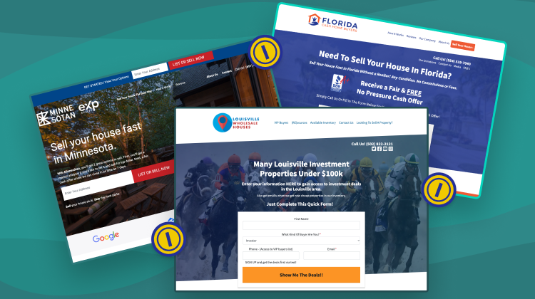
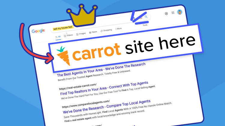
You’re spending a hard-earned marketing budget on your PPC campaigns…
Every penny counts. More importantly, every click counts.
Real Estate Investor PPC Report 600+ highest profit motivated seller keywords
Download NowThe worst thing that can happen is a lot of people click on your PPC ad (costing you money), but none of those people become a lead or turn into cold, hard cash for your business. That would make your PPC campaign a waste of time and money.
This is why where you send people (i.e., the landing page) when they click on your ad is so critical.
If you send prospects (even motivated sellers) to a low-converting landing page, you might still get some leads, but you won’t get as many as you could (how hard is it to hit the back button and click on your competitor’s website instead?).
Sadly, one lost deal could be between $10,000 and $50,000 down the drain, depending on your business model…
And that’s not money you’re willing to lose.
At Carrot, we’ve generated millions of online leads for real estate investors and agents. During that time, we’ve learned a thing or two about building a high-converting landing page.
Let’s talk.
What is a landing page for real estate PPC?
A landing page is just marketing terminology for the page you send people to in a marketing campaign.
In the case of Google Ads, it’s the page people go to when they click on your ad. For example, if I click on this result…
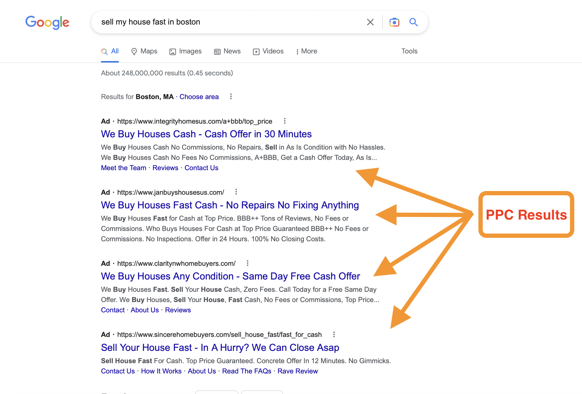
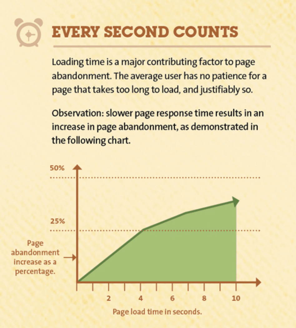
The reason that optimizing your landing page is so essential is because it helps determine the effectiveness of your ad campaign. If the page people go to after clicking on your ad is irrelevant, unpersuasive, or even takes too long to load, they won’t stick around and will not become a lead.
Here’s a table summarizing the key differences of full webpages vs PPC landing pages:
| Feature | Webpage | PPC Landing Page |
| Purpose | Informational, brand awareness | Lead generation, conversion-focused |
| Target Audience | Broader audience interested in real estate | Highly targeted audience, e.g., motivated sellers |
| Content | Diverse content: bio, services, blog posts | Focused on a single offer or call to action (CTA) |
| Navigation | Extensive navigation to other website pages | Limited or no navigation to avoid distractions |
| Call to Action (CTA) | May have various CTAs | Strong, clear CTA to capture leads |
Now that you know what a landing page is and why it’s important, let’s talk about 7 elements of every landing page that impact conversion.
7 Elements You MUST Have for High-Converting PPC Landing Pages to Maximize Lead Generation
Element #1: Simple Opt-In Form
Every real estate website (agent or investor) at Carrot needs a high-quality, easy-to-fill-out opt-in form.
And we don’t just believe that for no reason: it’s science. We’ve run hundreds of A/B tests on our member’s websites to determine whether opt-in forms perform better than a “Call Now” CTA (they do) and what types of forms perform the best.
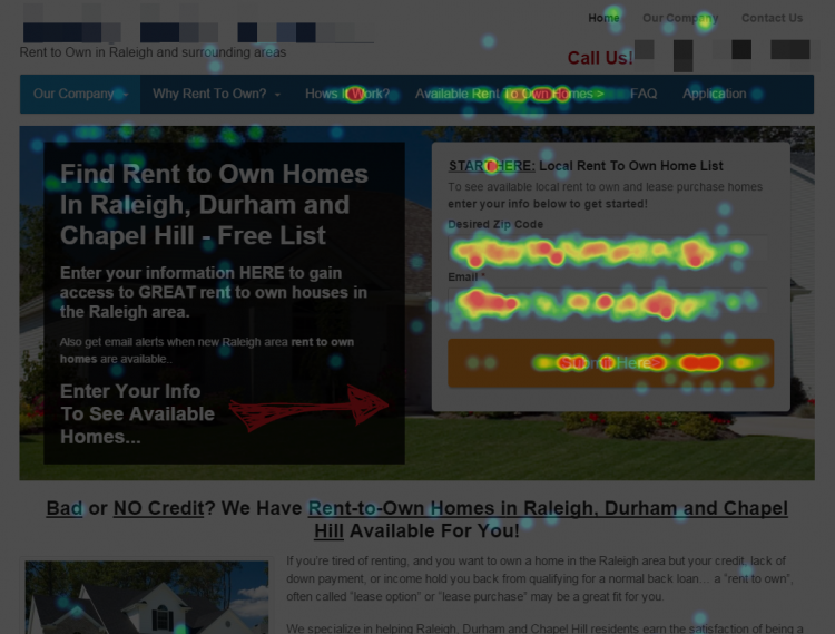
From one test we ran, we found that our member’s sites had almost a 30% conversion rate!
Here’s the heatmap from the test…
And here’s the data…

If you want a high-converting landing page right out of the box, our Carrot sites already have all the elements mentioned in this article baked right in. Or, if you want to build one yourself (no biggie!), here’s what you’ll want for your opt-in form…
- Keep it simple and only have 3-4 fields for people to enter their information.
- Set up text message notifications for when a lead opts in so you can follow up fast (Carrot does this automatically!)
- Ensure that the form you use is above the fold — meaning when people land on your website, it’s the first thing they see.
- Have a big, clear button that’s a different color than everything else on your website.
High-Converting Element #2: Clear & Actionable Content
When it comes to capturing motivated sellers, clarity and action are key. Your landing page copy should be clear, concise, and laser-focused on the benefits you offer.
Why is clear content important for seller-focused landing pages?
- Motivated sellers are in a time-sensitive situation. They need to understand your value proposition quickly and easily. Dense text blocks or overly technical jargon will only deter them.
- Focus on Benefits, Not Features. Don’t just list your services; explain how you solve seller pain points. Highlight the benefits of selling to you, like a fast cash offer, a hassle-free process, or the ability to avoid costly repairs.
- Action-Oriented Language: Motivate sellers to take the next step. Use strong verbs and clear calls to action throughout your landing page copy.
Best Practices for Persuasive Landing Page Content:
- Keep it Short & Sweet: Stick to short paragraphs and bullet points for easy readability on any device.
- Local Market Data: Showcase your knowledge of the area. Highlight relevant local market data, like average sales times or cash buyer trends, to demonstrate your expertise and ability to deliver a quick and smooth sale.
- Focus on Seller Benefits: Use clear language to explain how you address their specific needs and challenges. For example, “We understand the stress of inherited property – get a fair cash offer and avoid costly repairs.”
- Testimonials & Social Proof: Integrate positive testimonials from satisfied sellers to build trust and credibility.
Remember: Your landing page copy should be a conversation starter, not a novel. Focus on clear communication, highlight the advantages of working with you, and guide sellers towards taking action (e.g., requesting a cash offer).
High-Converting Element #3: Compelling Headline
Your headline is like the golden sign outside your investor open house. It needs to grab attention, pique interest, and clearly communicate the value you offer. Real estate investors are busy, so a strong headline is crucial for making them stop scrolling and engage with your landing page.
Here are some key ingredients for crafting compelling headlines for real estate PPC landing pages:
- Clarity: Keep it clear and concise. Investors should instantly understand what your offer is.
- Relevance: Ensure the headline aligns with your target audience and the specific investor segment you’re targeting (e.g., flippers vs. buy-and-hold investors).
- Benefit-Driven: Focus on the benefits your offer provides. What problem do you solve for investors? How can you help them achieve their goals?
- Location-Specific (for Real Estate): Highlight your local expertise and cater to the specific market you serve. This personalizes the message and resonates with investors familiar with the area.
Example:
Let’s say you specialize in helping investors buy rental properties in a specific city. Here’s an example headline that incorporates these elements:
- “Tired of Making Repairs? Get a Fair Cash Offer Today (Sell Your Rental Property Fast!)”
This headline is clear, relevant to buy-and-hold investors facing repair hassles, emphasizes the benefit of a quick cash offer, and targets investors specifically in your city.
High-Converting Element #4: Equally Compelling CTA
Your call to action (CTA) is the moment of truth on your real estate PPC landing page. It’s where you convert curious visitors into qualified leads by prompting them to take a specific action.
A strong CTA is essential for maximizing your lead generation efforts. Here’s what makes an effective CTA for real estate investors:
- Clear Action Verbs: Tell investors exactly what you want them to do. Use strong verbs like “Download,” “Schedule,” or “Get Started.”
- Prominent Placement: Make your CTA button stand out visually. Use contrasting colors and place it above the fold (visible without scrolling).
- Relevant to Investor Goals: Your CTA should align with the value proposition you’ve presented and address the investor’s specific goals. Don’t ask them to “Learn More” if they’re ready to “Schedule a Consultation.”
Examples:
Consider these CTA examples tailored to different investor goals:
- “Download Your How to Stop Foreclosure Guide” (Clear action verb, relevant to distressed property investors facing foreclosure)
- “Schedule a Free Consultation to Find Your Perfect Investment Property” (Prominent placement, addresses buy-and-hold investor goals)
- “Get a Fair Cash Offer Today!” (Strong verb, urgent tone for investors seeking a quick sale)
Remember: A/B testing different CTAs can help you determine which ones resonate best with your target audience.
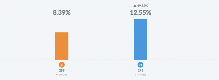
From one test we ran at Carrot, we found that “Get My Fair Cash Offer” converted 49.55% better than “Click here to continue.”

Here are the exact percentages…
Giving people what they already want isn’t just less work for you; it converts better, too.
High-Converting Element #5: Trust Signals & Social Proof
Securing motivated sellers hinges on establishing trust. This is where trust signals and social proof come into play.
- Trust Signals: These are visual cues that demonstrate your legitimacy and expertise as a real estate professional. They act as a digital handshake, assuring house sellers you’re a reliable and trustworthy partner to help them achieve their goals.
- Social Proof: This leverages the power of “herd mentality.” By showcasing positive experiences from past clients (especially sellers in your local market), you demonstrate the effectiveness of your approach and encourage others to take action.
Why are these important for real estate investor landing pages targeting sellers?
House sellers are entrusting you with a significant financial decision – selling their property quickly and efficiently. By incorporating trust signals and social proof, you significantly increase the likelihood of converting website visitors into qualified leads.
Examples of Trust Signals:
- Security Badges: Display logos indicating secure transactions and data protection.
- Professional Licenses & Affiliations: Showcase your real estate licenses and relevant professional memberships.
- Awards & Recognition: Highlight any industry awards or recognitions you’ve received.
Social Proof in Action for Real Estate Investors:
- Seller Testimonials: Feature quotes and success stories from satisfied sellers, particularly those in your local market.
- Case Studies: Showcase real-world examples of how you’ve helped sellers achieve their goals (e.g., “Sold John’s house in X days above asking price”).
- Logos of Trusted Partners: Display logos of reputable companies you work with, like title companies or closing attorneys.
Remember: Social proof should be authentic and verifiable. Encourage seller reviews on trusted platforms like Google My Business or industry-specific sites.
By strategically integrating trust signals and social proof on your real estate investor landing pages, you build trust with potential sellers and establish yourself as a proven resource to help them achieve a smooth and successful sale.
High-Converting Element #6: Image That Paints Desire
Real estate is a visual business, and the same applies to your landing pages targeting motivated sellers. High-quality visuals are crucial for capturing attention, conveying information effectively, and ultimately, convincing sellers to choose you over other options.
Why are visuals important for seller-focused landing pages?
- Attention Grabbing: Compelling visuals instantly capture attention and make your landing page stand out. In a sea of competing offers, strong visuals are the first impression that can convince sellers you’re the right buyer for their property.
- Emotional Connection: The right visuals can evoke emotions and build trust with your audience. Use high-quality photos of beautiful homes you’ve helped sell or inspiring visuals of happy sellers receiving a fast cash offer. This creates an emotional connection and positions you as a solution to their situation.
- Transparency & Trust: High-quality visuals demonstrate professionalism and transparency. Showcase problem-free solutions: for example, pictures of smooth walkthroughs or happy sellers signing paperwork. This builds trust and reassures sellers you’re a reliable partner in their sale.
Examples of Effective Visuals for Motivated Sellers:
- High-Resolution Property Photos: Showcase attractive, professional photos of the types of properties you buy (e.g., single-family homes in need of repairs, inherited properties).
- “Before & After” Photos: If you specialize in renovations, highlight your expertise with “before & after” photos showcasing the transformation potential of properties.
- Fast Closing Videos: Short testimonial videos featuring sellers who received a quick cash offer can be incredibly powerful. These visuals demonstrate your ability to deliver a smooth and efficient sale process.
- Data & Charts: Use data visualizations (e.g., charts showing average closing times) to communicate your commitment to a fast and hassle-free experience for sellers.
Remember: Don’t underestimate the power of visuals. Invest in high-quality photos or consider using high-resolution stock imagery that resonates with motivated sellers and showcases the types of properties you typically buy.
High-Converting Element #7: Quick Load Speed
In today’s mobile-driven world, ensuring your real estate investor PPC landing page is mobile-friendly is no longer optional – it’s essential. Here’s why:
- Mobile Dominates Real Estate Searches: A significant portion of motivated sellers initiate their search for solutions (like cash buyers) from their smartphones. If your landing page isn’t optimized for mobile viewing, you’re missing out on a huge pool of potential leads.
- Seamless User Experience: Mobile users expect a smooth and intuitive experience. A mobile-friendly landing page ensures clear navigation, easy-to-read text, and properly sized buttons for seamless interaction on any device. Frustrated sellers on clunky mobile pages are more likely to bounce and seek alternative solutions.
- Faster Lead Generation: A responsive landing page loads quickly and functions flawlessly on mobile devices. This translates to faster form submissions and quicker lead capture when motivated sellers are ready to take action.
Benefits for Real Estate Investors:
By prioritizing mobile-friendliness, you unlock several advantages in the competitive real estate market:
- Increased Lead Generation: Capture leads from a wider audience of sellers who are searching and making decisions on their phones.
- Improved Conversion Rates: A user-friendly mobile experience keeps sellers engaged and more likely to convert on your call to action (e.g., requesting a cash offer).
- Enhanced Brand Image: A mobile-optimized landing page demonstrates professionalism and a commitment to providing a convenient experience for sellers, potentially positioning you as the go-to buyer for their needs.
Remember: Don’t just assume your landing page is mobile-friendly. Use Google’s Mobile-Friendly Test tool or other resources to check responsiveness and ensure a smooth experience for sellers on any device.
At Carrot, we’ve optimized all our member’s websites to be fast. Here are the results of one being run through a speed test.
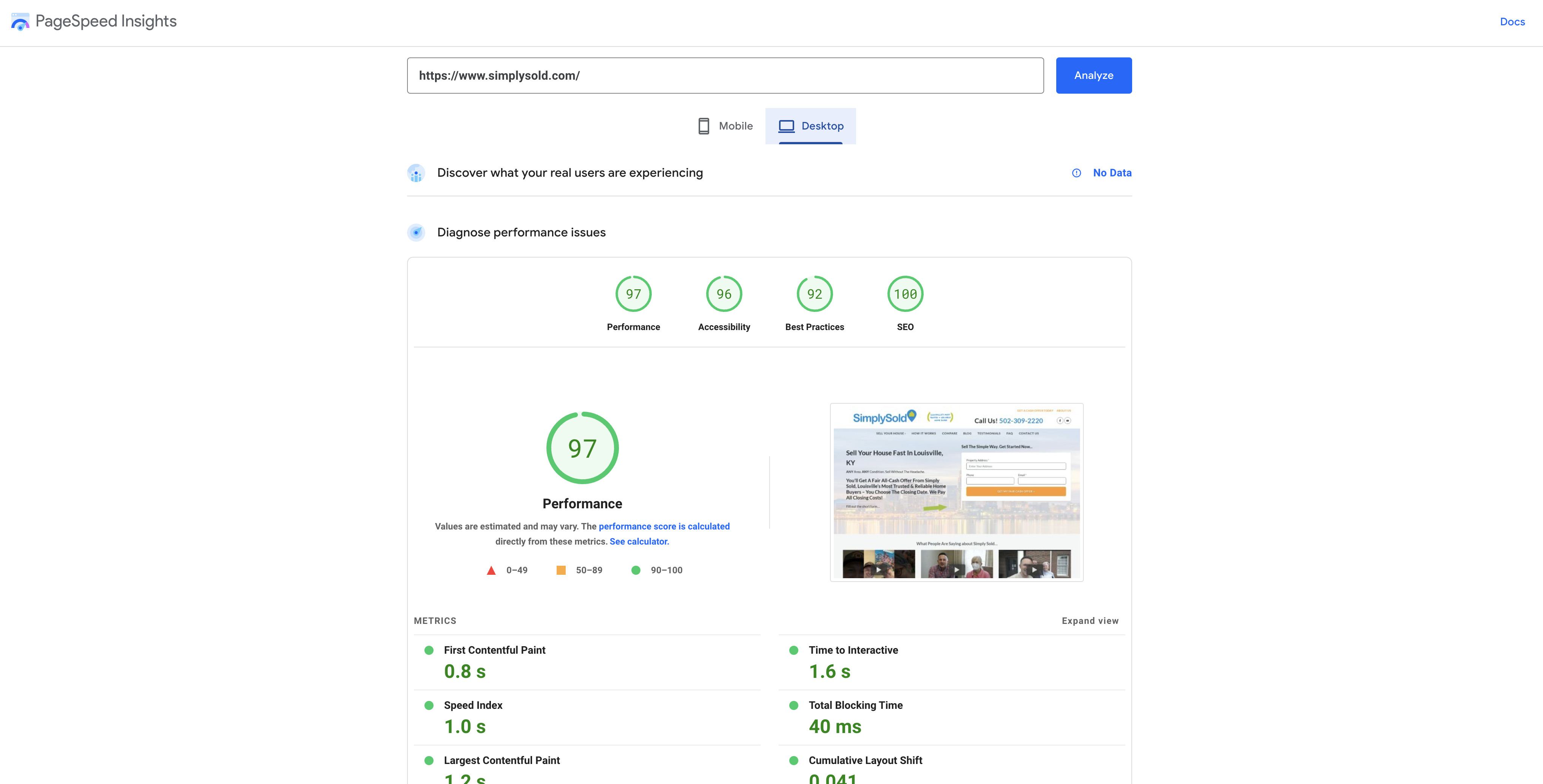
This helps with SEO rankings, and, more importantly, helps with the conversion rate. When your website loads quickly, people stay longer and are more willing to work with you than if they have a clunky and difficult experience.
It’s not the most important element in the world, but it does make a difference…
And how much would it cost you if a motivated seller, could-be-a-deal, left your website because it moved too slowly? $10,000? $50,000?
Yeah… it’s not worth it.
Bonus Section: Common Real Estate PPC Landing Page Mistakes to Avoid for Sellers
While crafting compelling landing pages to capture motivated sellers, here are some common mistakes to steer clear of:
- Generic Landing Pages: Don’t use a one-size-fits-all approach. Tailor your landing page specifically to the needs of motivated sellers (e.g., facing foreclosure, inheriting a property) rather than a broad real estate audience.
- Weak Value Proposition: A vague or unclear value proposition won’t resonate with time-sensitive sellers. Clearly state how you solve their problems and the benefits of working with you (e.g., “Sell your house fast for cash and avoid costly repairs”).
- Confusing Navigation: A cluttered landing page with complex navigation will frustrate sellers. Keep it simple and focus on a single call to action (e.g., “Get a Cash Offer Now”).
- Lack of Trust Signals: Sellers are entrusting you with a significant financial decision. Omit trust signals like security badges, professional licenses, or testimonials, and you risk losing credibility.
- Excessively Lengthy Forms: Don’t overwhelm sellers with lengthy forms. Request only essential information needed to get started (e.g., property address, contact details).
- Unrealistic Promises: Avoid making exaggerated claims about closing timelines or cash offer amounts. Focus on transparency and realistic expectations to build trust with sellers.
- Not Tracking & Testing: Don’t set your landing page and forget it. Regularly track key metrics (e.g., conversion rates, bounce rates) and A/B test different elements (e.g., headlines, CTAs) to optimize your landing page performance for maximum lead generation.
By avoiding these common pitfalls and focusing on the best practices outlined above, you can create high-converting real estate investor PPC landing pages that effectively capture motivated sellers and propel your investment business forward.pen_sparktunesharemore_vert
How Do You Get Results?
PPC takes work but is essential for real estate professionals seeking more qualified leads. Real estate businesses can ensure high conversion rates by optimizing their landing page for conversion. This is especially important when targeting hyper-competitive markets such as Dallas, Miami, or Denver, where it’s even more critical for a business to have all conversion principles in place.
Doing so can increase lead generation by up to 2-3x or more compared to businesses without conversion optimization. With the right approach and strategy, you can use PPC to increase lead generation and build brand loyalty among your target markets.
If you’re already a member, here are some resources to help you learn more about PPC:
Other free PPC resources:

