
Right now, more than ever, you must have custom real estate website design. In fact, 99% of millennials (21 – 37 years old) search online when looking for a home.
I know, I know. Whoop-dee-do, no surprise.
But here’s a few stats that are surprising. 89% of older baby boomers (54 – 72 years old) also use the internet during a house search and 77% of the silent generation (76 – 93 years old) do the same.
In fact, 44% of homebuyers across all ages purchase a home that they find on the internet.
This means that despite the age of your prospect, people are looking online at some point during their house hunt — more than likely.
And since they’re looking online, you need to be online.
If you’re not, you’re losing business.
End of story… “Here, you can have my clients, savvy internet real estate competition,” type of bye, bye.
And as you already know, those clients that work with the competition will do so again in the future — you don’t just lose them right now, you lose them forever.
Of course, that’s not always the case, but it often is.
Unfortunately, just being online isn’t enough, either. You need a website that drives traffic and converts visitors. In most cases, having your face on a corporate real estate website isn’t adequate, and neither is a cruddy website that your tech-buddy designed.
I don’t have anything against your tech buddy or your real estate corporation, but I do want to help.
For that reason, here at Carrot, we asked ourselves, “What are the three most important elements for any custom real estate website design to have?”
This is what we came up with.
Custom Real Estate Website Design Must #1: Easy Navigation
When someone lands on your website, they want to do something.
But what, exactly, do they want to do?
Fortunately, in the real estate niche, that’s a relatively easy question to answer.
People either want to learn about who you are (i.e. Can they trust you? Do you have a reliable track record? Do you seem legit?) or what you do (i.e. They want to pursue your services).
Put more simply, visitors want to…
1. Learn whether they can trust you.
Or…
2. Work with you.
Pretty simple, huh?
Yeah. At least on the surface.
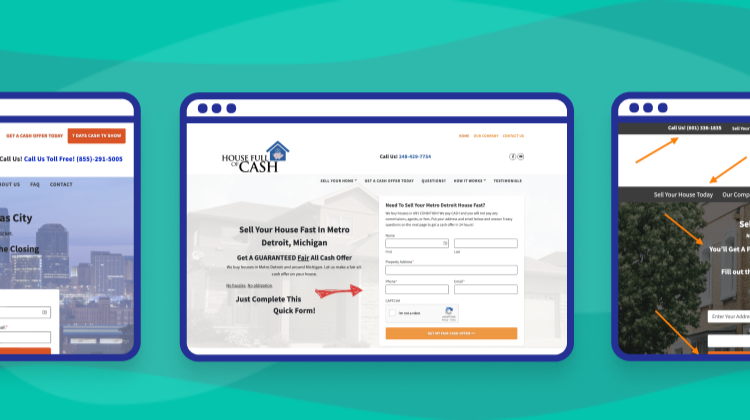
But here’s the thing: even guiding those two simple intentions requires some savvy website navigation. After all, the last thing you want is for visitors to land on a website that looks like this.
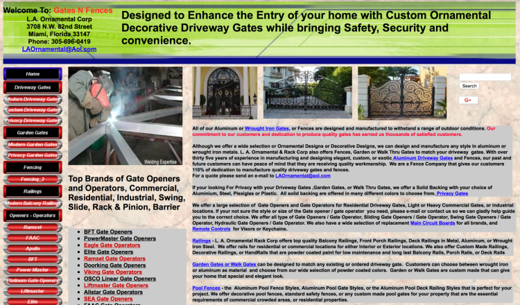
If you arrived on this website, you’d leave within the first few seconds — your visitors will do the same thing.
In fact, 38% of people will leave a website with an unattractive layout.
What, really, though, is the problem with the above website?
Because if we look beyond the hideous colors and hard-to-read text, there’s something even worse: poor navigation.
Since people don’t know where to go, they leave.
And you don’t have to take my word for it. One study found that 50% of referral-based website traffic immediately uses a website’s navigation menu to orient themselves.
This is why, at Carrot, we include dead-simple navigation menus on our customer’s websites. For Investors…
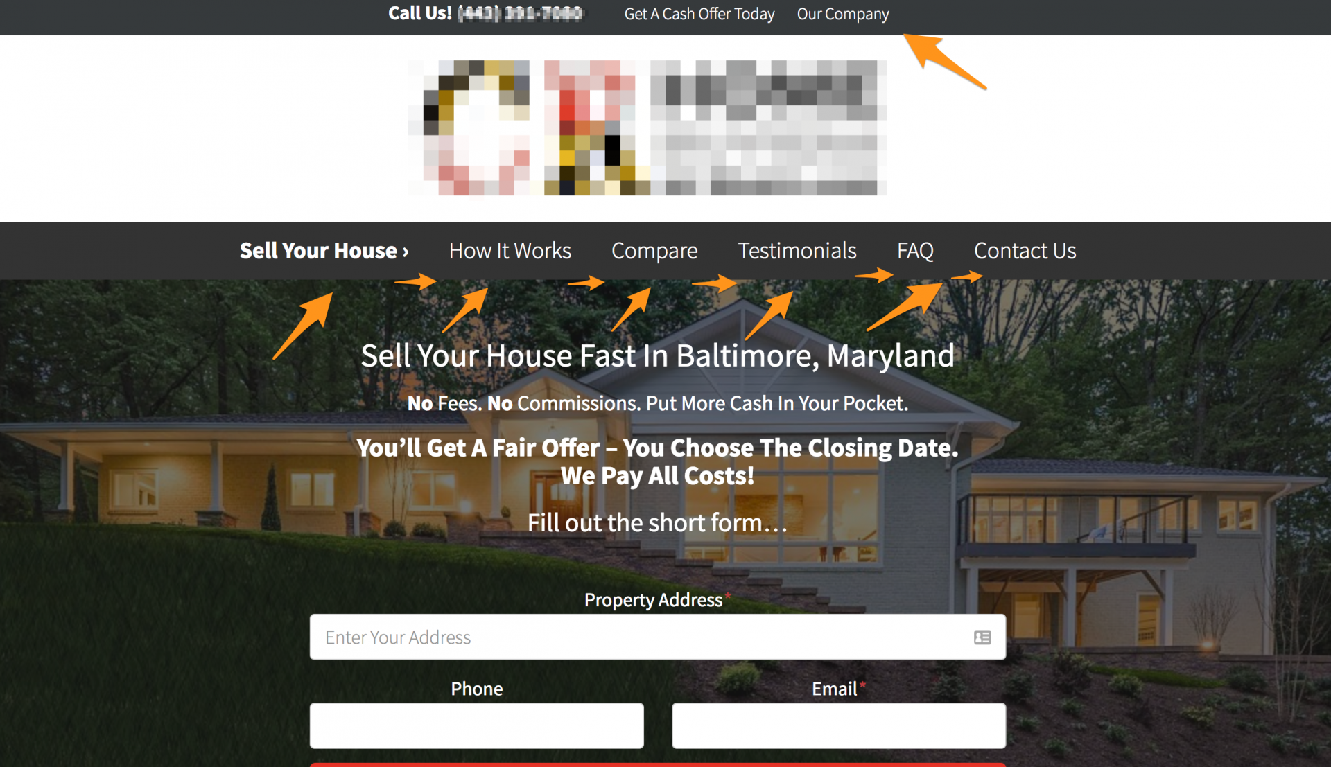
And agents…
The moment that prospects land on those websites is the same moment that prospects know exactly what to do and where to go.
Immediately, then, those websites build trust.
A website without simple navigation, on the other hand, hurts trust and increases your bounce rate — which, in turn, hurts your business and the financial independence that you so ambitiously crave.
The point is, a cluttered and hard-to-navigate website hurts everyone and helps no one.
What, though, makes the difference between an easy-to-navigate website and a navigational disaster?
Here are 4 things to keep in mind.
- Does your navigation bar have seven or less options? — You don’t want too many options on your website. You need to have the necessary ones (About Us, Contact Us, Testimonials, etc), but nothing more. Ironically, the more options that people have to choose from, the less likely that they’ll make a choice at all for fear of making the wrong choice. Remove that fear with fewer options.
- Is the button copy for each navigation button honest and clear? — In other words, title your blog, “Blog” and your about page, “About Us.” Don’t try to remake the wheel. You’ll only make things unclear for visitors to your website and hurt your reputation in the long run. Use terms that people are familiar with and immediately recognize.
- Is the design clean and the text easy to read? — This one is getting a bit more into the opinionated territory. For that reason, I recommend showing your website to a few trusted friends and asking them for their honest opinions. What do they think of the copy, the colors, and the overall flow? Do they like it or hate it? Ask them to be honest.
- Is the website easy to navigate on mobile devices? — Today, more than half of our member leads come from mobile devices. If your website isn’t just as easy to navigate on mobile devices as it is on a desktop device, you need a new website. Consider how terrible this website looks on mobile.
In contrast, all of Carrot’s websites are mobile-friendly automatically… no extra work and no extra thinking. Boom. Donezo. Check to see if your website is mobile-friendly.

If you want us to help build you an awesome website, investors can go here and agents can go here to check out our plans. We’d love to work with you :-)
Plus, we’ll make sure you have all of the above elements dialed in.
Otherwise, take the above information and hand it to your designer. Or make sure that the real estate website builder you choose integrates this advice.
If your website isn’t easy to navigate, then it’s got no chance of competing with other online real estate websites. If it is easy to navigate, though, then people will immediately trust you — something that’s crazy valuable in the real estate world.
Custom Real Estate Website Design Must #2: Clear and Relevant CTAs
Your CTA (Call-To-Action) is arguably the most important part of your custom real estate website design.
Your website might have a persuasive sales copy and a clean design, but if people don’t know where to click once they’re ready to take action, none of that matters.
After all, the whole point of your website is to generate leads for your business. Without a CTA, that’s impossible.
What, though, should your CTA be? Should you ask people to call you or sign up for your email list or enter their personal information?
Since you’re a real estate agent or investor, generally speaking, the best CTA is a phone number. Think about it. If you were looking for a real estate agent or investor, would you want to email them and wait for a response or call them and talk to them right now?
More than likely, the latter.
In fact, contact information on a website is vital to all industries. 51% of people think that “thorough contact information” is the single most important element missing from business websites. And 44% of internet users will outright leave a company website if it doesn’t have contact information or a phone number.
In the real estate industry, that truth is even more detrimental.
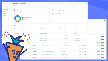
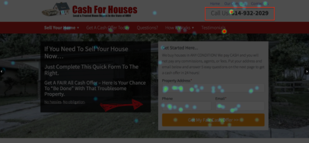
Through a heat map study at Carrot that we ran on one of our customer’s websites, we found that the “Call Us” CTA in the upper right corner was getting massive attention.
Of course, so too did straightforward CTAs like this…
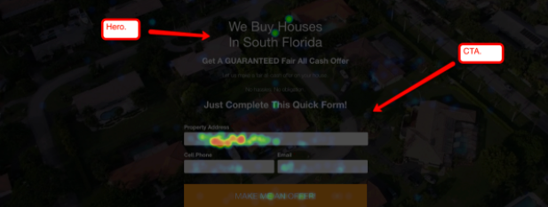
And this…
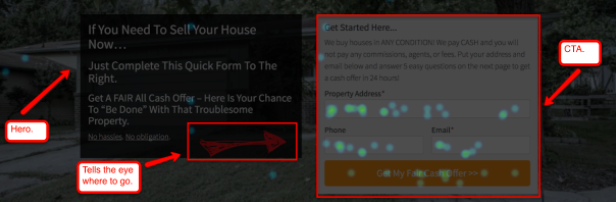
Which illustrates exactly why your CTA needs to have two characteristics.
- It needs to be clear (visually and linguistically)
- It needs to be relevant (to the page it’s on and the business you run)
Here’s what that looks like on our real estate agent websites.
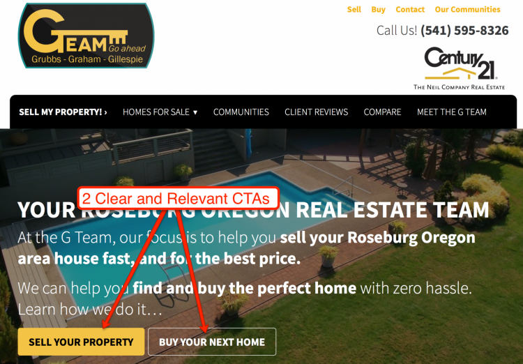
What makes this CTA clear and relevant, though?
First of all, it stands out from the rest of the page. The CTA’s positioning, color, and shape make it easy to notice the moment that you land on the website.
Second, the button copy is clear and represents exactly what people expect to find when they visit a real estate agent website. You can either sell your property or buy your next home.
Additionally, Orbit Media Studios offers this “Pro Tip” regarding mobile website navigation:
“ProTip! For mobile visitors, make sure that the phone number turns into a button that dials the number when tapped. It’s a simple matter of adding tel: to the href code for the phone number for the mobile version of your site. The code should look something like this:
<a href=”tel:773-348-4581″>(773)348.4581</a>”
At Carrot, we design the best real estate websites for lead generation in the industry with clear and relevant CTAs. If you want to do it yourself, though, then use this as your CTA checklist.
- Is the button copy clear? Do people know exactly what’s going to happen when they click it?
- Is the CTA relevant to the website or page it’s on? What are you asking people to do and is that what they expect?
- Does your CTA stand out visually? Is the color unique from the rest of the elements on the page and is your eye naturally drawn to it?
Custom Real Estate Website Design Must #3: A Compelling “About” Page
Out of the three elements that we chose to mention in this blog post, this is going to be the most surprising.
Easy navigation and clear, relevant CTAs — sure. That makes sense.
But an “About” page?
Really?
Is that one of the three most important custom real estate website design elements if you boil it down to its foundation?
Yes. Yes, it is.
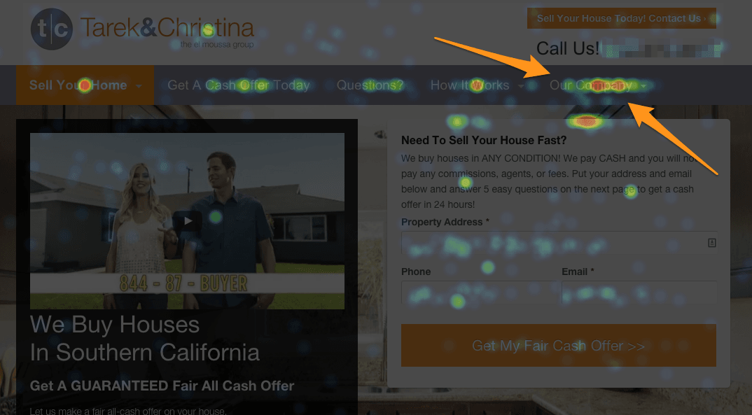
Carrot’s own research shows that the About Page is often one of the top three most visited pages on our customer’s real estate websites.
Here’s a visual representation of that attention.
But you don’t have to take our word for it. Another source found that 86% of visitors want to see information about a company’s products and services on the homepage.
And with real estate, you are the product.
Similarly, 52% of website visitors want to see “About Us” information when on a company’s homepage. Clearly, people care about who they’re doing business with.
But how do you create an “About Us” page that builds trust and creates a relationship?
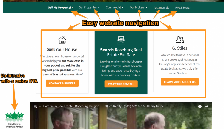
Well, let’s walk through one of my favorite real estate “About Us” pages.
A team of real estate agents based out of Roseburg, Oregon — The G Team — starts their “Meet The G Team” Page with their core values.
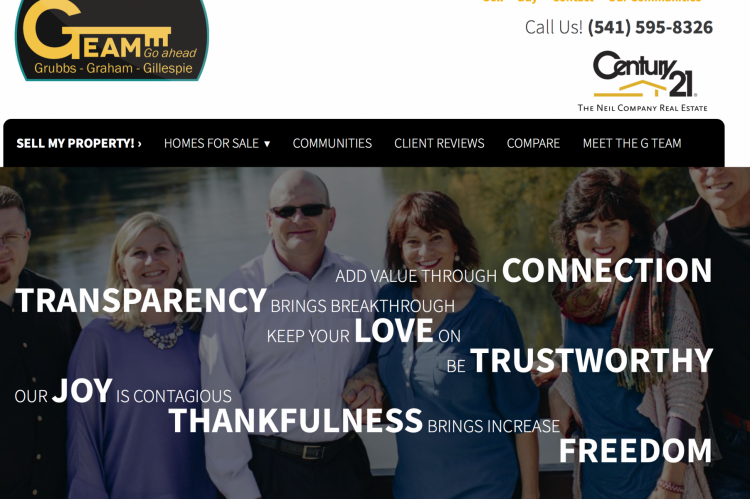
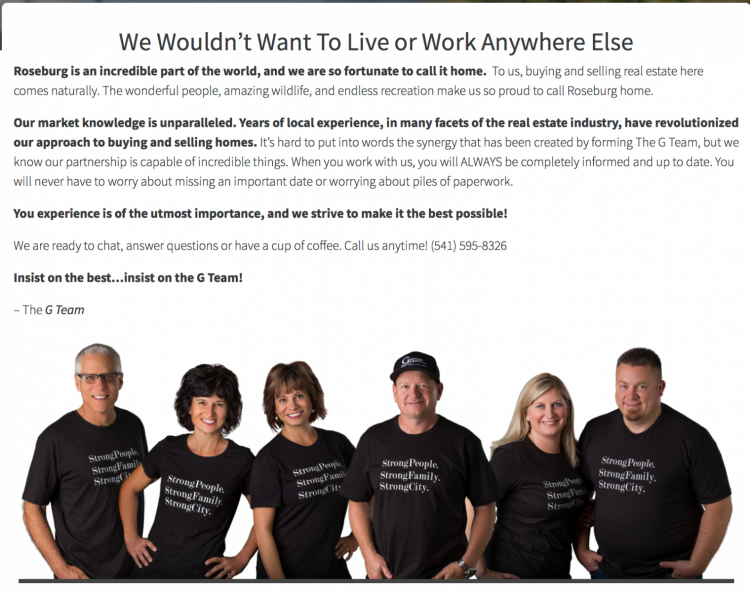
Then, they build authority in their local market by describing their passion for the area and their expertise.
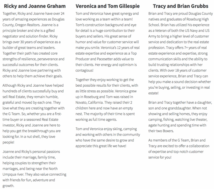
Next, they have bios for people on the team.
A friendly picture of the team…
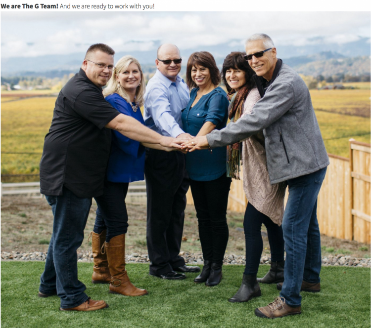
And they end with a video and CTA.
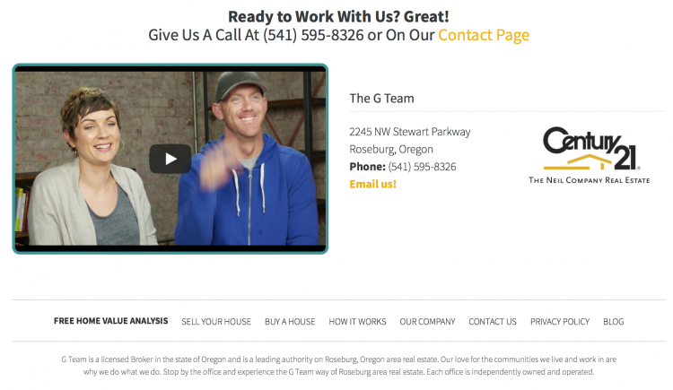
The best part about this page is that they treat it like a sales page. Because believe it or not, your “About Us” page is a sales page.
Think about it this way. Why would someone visit your “About Us” page in the first place? Probably because they want to figure out if they can trust you, if you have a reliable track record if you offer the service that they’re looking for.
In other words, they visit your “About Us” page because they’re trying to determine if they want to work with you or not.
Your “About Us” page needs to help them make that decision.
In fact, here are the elements of a great “About Us” page for your real estate agent website design.
- Create and include your core values.
- Add your mission statement.
- Tell your story — Be brief, but include the juicy details that help people understand why you do what you do.
- Include an authentic and professional picture of yourself — Don’t take a picture when you have a fake smile on. Take a picture when you’re laughing or smiling genuinely. Believe it or not, people can tell the difference. And studies show that visitors will think you are more intelligent, attractive, and friendly if you’re actually smiling. Do the same for the rest of your team if you have one.
- Write the page’s content in the first person, like you’re actually… well, you — Don’t try to write in the third person like a robot describing someone else. Nobody wants to work with a robot. They want to work with a human. You’re a human, so be a human.
- Include a CTA — Anyone who visits the “About” page wants to learn about you because they’re thinking about working with you. Convince them, then pitch them.
Conclusion
You need a custom real estate website design but, most importantly, you need a website that drives traffic and converts visitors.
In fact, if you have a website that doesn’t do those two things, then it’s practically the same as not having a website at all.
For that reason, at the very least, your website needs easy navigation, clear and relevant CTAs, and a compelling “About Us” page. Without those, your website will sit in cyberspace, doing nothing for your business and nothing for your dream of financial and personal independence.
At Carrot, though, we’ve generated over one million leads for our customer’s real estate websites in just three years. We’d love to help you, as well. Agents can find out more about working with us here and investors, here.
If not, that’s okay too. :-)
Either way, follow the above advice and you’ll be well on your way to having the website — and business — of your dreams.
What do you think is the most important element on any real estate website?