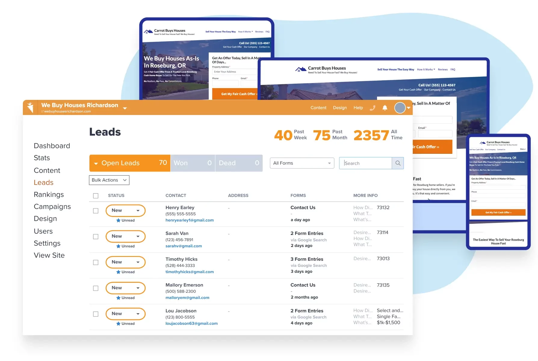
Carrot’s real estate marketing platform has evolved beyond a simple website builder into a comprehensive Lead Generation Hub that helps investors and agents create unique, high-performing websites that convert visitors into leads at a rate 44% higher than industry benchmarks.
Key Takeaways
- Carrot websites dominate search results, capturing over 50% of top-3 Google rankings across 225 U.S. markets, giving members a competitive advantage in visibility.
- Leads generated through Carrot websites are 7x more likely to convert into deals compared to non-Carrot leads and yield an average profit of nearly $14,000 per deal.
- Despite using the same software platform, Carrot members can create vastly different website designs that reflect their unique brand identity using the Visual Editor and customization options.
With Carrot, real estate professionals can build websites that cut through online clutter, capture qualified leads, and become valuable assets rather than liabilities in growing their business.
Table of Contents
- Carrot Website Examples
- Kauai Cash Home Buyers
- MN Nice Home Buyers
- KM Homes
- 412Houses
- KCMOHomeBuyer
- Jessica Wilkinson
- DHS Realty Group
- Unique Property Solutions
- TK Properties
- Grand Real Estate Investments
Carrot was an accident — albeit a wonderful one.

See How Carrot Works How many deals are you losing to your competitor’s website?
See How Carrot WorksTapping into his experience as a real estate investor and online marketer, Trevor Mauch, CEO of Carrot, built his first motivated seller website in 2003.
Almost immediately, the site began generating organic motivated seller leads – it was then Trevor knew he’d found the gap that all entrepreneurs are looking for… where your expertise overlaps the market’s needs.
So he built another site. And another. He finally had the grand idea to create a software company called Carrot. He wanted our websites to be so irresistible that motivated sellers couldn’t help but convert… and the investors using them couldn’t help but grow!
Now we’ve transformed Carrot from being like any other website builder into a Lead Generation Hub, built on a real estate marketing platform with multiple tools and resources to help investors, agents, and hybrids grow their businesses with real impact and freedom. Take a look at some of our member’s performance stats below.
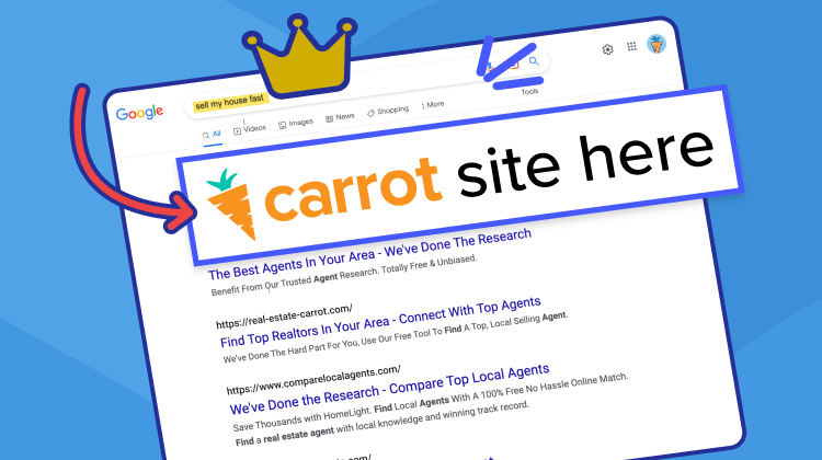
By attracting the right traffic through SEO, Carrot websites capture over 50% of top 3 Google search results across 225 U.S. markets, meaning Carrot members have a competitive advantage in being seen first by high-quality clients.
Carrot sites are stunning and effectively converting traffic into leads at a 44% higher rate than industry benchmarks, making Carrot the industry leader in producing high-quality leads.
Speaking of high-quality leads, Carrot leads are 7x more likely to convert into deals than non-Carrot leads and on average, yield almost $14,000 in profit per deal!
To celebrate Carrot’s accomplishments over the past decade and hopefully convince you to try Carrot (wink wink), we will share 10 of our favorite Carrot member websites.
As you read through, notice the versatility of these sites and the significant differences in style and tone… all easily created by the same software backed by the same crazy people with the same crazy dream: to help entrepreneurs reclaim time for the things that matter most in life.
Gain the most freedom, impact, and growth in your real estate business with highly motivated buyer and seller leads!
Carrot website examples convert leads into deals 7x higher than non-Carrot leads and 2.5x more profitable.
That’s the power of Carrot’s real estate marketing platform…with websites so powerful that we had to call it something else: the Lead Generation Hub.
Take a free, interactive demo today to find out how a Carrot website has helped investors and agents attract, convert, and close more deals than ever before for over 10 years.
Carrot Website Examples
As mentioned, we’ve compiled this list of 10 sites representing how Carrot members are actively adjusting their websites. But before that, let’s take a minute to show you how one builds a real estate website.
To paint a picture, once you become a member at Carrot and are ready to create your unique site, we’ll first have you select Site Type to determine what types of leads you are looking for (ex., Motivated Sellers, Cash Buyers). Next, we’ll have you choose a website template to help you get started on constructing your own design.
Even if you aren’t a web designer, our websites are easily customizable using Carrot’s Visual Editor. This user-friendly design tool eases the process of making your site stand out without the need for any fancy coding. You’ll be able to drag and drop text boxes, images, videos, and more in real-time without ever needing to leave the page (saving you time and stress).
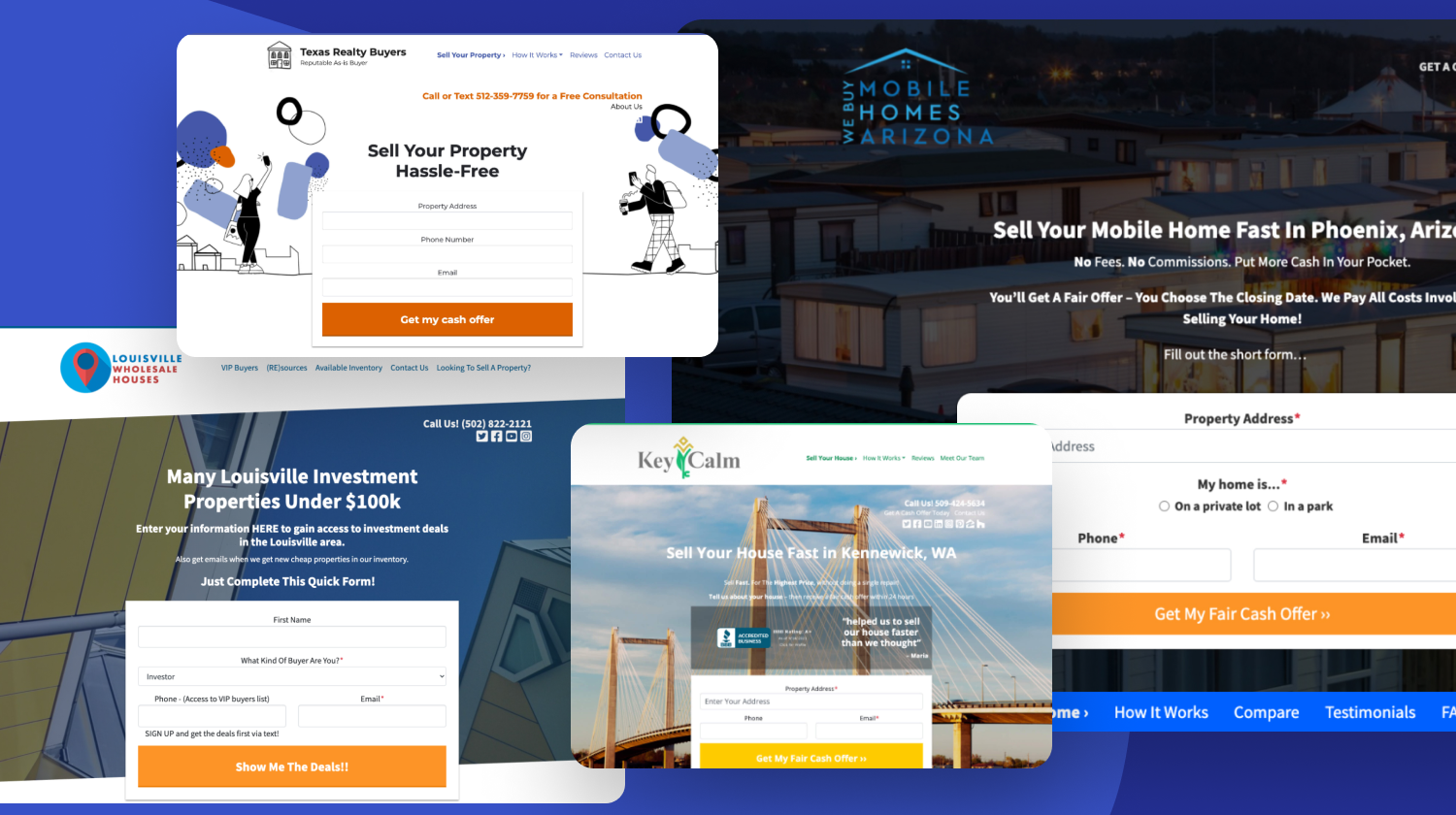
If you’ve seen Carrot sites in the past and are asking yourself, “don’t all Carrot sites look the same?” then these examples prove that you can stand out from the crowd with a little effort. 😉
We want to inspire you with this quick round-up of Carrot websites that our members love. Be sure to scroll through each site to see the endless possibilities!
Additional website design services with amazing results!
Some Carrot website examples below have been optimized using our Concierge Set Up services.
If you don’t have the time to create your website, check out our done-for-you, high-performance Concierge Set Up!
On average, our CSU sites…
- Attract more than 3X the traffic of an average Carrot site.
- Get more than 5X the leads with 3+ additional leads every month compared to the previous.
- Have a 35% higher conversion rate from lead to deal.
Kauai Cash Home Buyers

A fantastic site design that blends local images, colors, and branding. Kauai Cash Home Buyers packs credibility into three testimonials blocks, including six testimonial videos. Their “Watch Our TV Commercial Below” and accompanying video adds “local” as an important call-out for their market.
MN Nice Home Buyers

MN Nice is a change of pace from other sites—simple, easy to follow, and practical design. The addition of a “You May Have Heard Us On…” section offers a unique way to call out credibility.
KM Homes

KM Homes is an example of a “hybrid” website. The realtor.com and Zillow badges communicate the option to list a house. Further down the page, they also offer an alternative to selling quickly. The website is easy to navigate and uses large images to enhance the clean structure.
412Houses

412houses.com presents a professional design, relevant content, and features that contribute to its credibility as a platform for real estate activities in the Pittsburgh area.
The website showcases a well-designed, visually appealing and user-friendly layout, which can contribute to a positive browsing experience.
Their “customer reviews” section highlights their past clients suggests a track record of successful transactions and satisfied customers.
KCMOHomeBuyer

Overall, the website’s design, content, and features contribute to its credibility as a platform for buying homes in the Kansas City area.
- Professional Design: The website features a well-organized and visually appealing design, which can contribute to a positive user experience.
- Clear Purpose: The website explicitly focuses on buying homes in Kansas City, indicating a specific and transparent business model.
- Contact Information: The site provides clear contact details, including a phone number and an address. This transparency can enhance trust and credibility.
- Accreditations: The website showcases accreditation logos, such as the Better Business Bureau (BBB) and Senior Transition Specialist, which can further enhance its credibility.
Jessica Wilkinson

The real estate website design for San Diego-based Jessica Wilkinson, a Big Block Realty brokerage, is simple yet effective. Whether you want to investigate properties in and around San Diego, get info on housing buying and selling values, or check out some of her informative real estate blog posts and newsletters.
DHS Realty Group

All aspects of your business are key. That includes your real estate website design. DHS Realty Group utilizes the block editor in a variety of colors to guide guests down the page. The choice of words and color scheme welcomes visitors to their site. The photos are eye-catching, and the icons match the topics.
Unique Property Solutions

Unique Property Solutions goes big with videos and authentic local images. Take one look at it, and it’s evident they are a highly engaged “local” business that cares about how visitors learn more about their company and is determined to turn those visitors into leads.

We tried to create the website on our own and had some initial success however our success paled in comparison to what our Concierge team of Taylor, Lisa, Nate and many others behind the scenes helped us achieve! The team was professional, responsive and super easy to work with and we enjoyed creating a great website with their expertise.
– Shannon Kolbe – Unique Property Solutions
TK Properties

TK Properties’ design is clean and practical by showing off local houses with their motivated seller website. The custom logo and branding show off well. The testimonials and the design’s responsive capabilities across the homepage. Overall, a perfect example of website design.
Grand Real Estate Investments

Besides using credibility badges below the hero, Grand Real Estate Investments drives credibility by adding a “Mission” section on their homepage and additional testimonials. They also add local flair with custom location-based images.
It’s like utilizing that website as your core for everything is the key. That’s definitely the key. But it’s so simple to use. It’s not like a regular WordPress site. I love the simplicity. I know how to do everything. – Robert Grand, Grand Real Estate Investments
Conclusion
With Carrot, you can build a unique website that stands out amongst all the clutter online, draws buyers and sellers in, snags their contact information, and becomes an asset (rather than a liability) for helping you grow your business.
Use these Carrot website examples as inspiration.
We know that because thousands of Carrot members have done it.
Will you be next?


