What if I told you that, by adding one element to your real estate website, you could increase your conversion rate by 10%?
You wouldn’t have to increase traffic and you wouldn’t have to do more marketing. You’d just have to add one dead-simple thing to your homepage.
And boom. 10%.
Would you do it?
If you’re like most real estate agents (72%), you’re already dissatisfied with the number of leads that your website generates. So I’m going to safely assume that the majority of you would welcome a 10% increase in your website’s conversion rate.
Sure. 10% isn’t huge. But it’s something. And in an industry where one deal can equal tens of thousands of dollars, 10% often separates the wheat from the chaff.
Where, though, am I getting 10% from?
Well, it’s an estimate. This little trick probably won’t double your revenue or change your business completely, but it’s a simple way to increase your conversion rate in very little time.
And who knows? For you, it might make all the difference.
Interested?
Here’s what it is.
The Best Real Estate Websites For Lead Generation Have This In Common: The “Call Us!” CTA
I’m not going to splice words, here.
This is the trick.
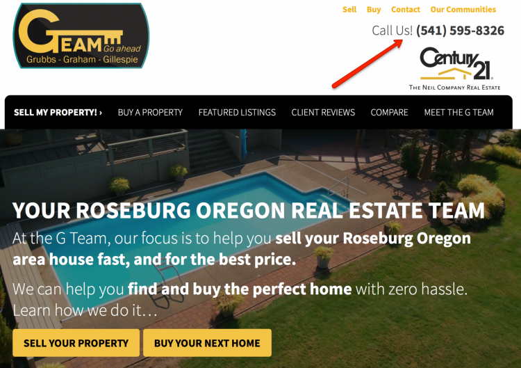
That’s right. That “Call Us!” CTA in the upper right corner of the page drives leads and converts visitors.
If you don’t have it on your website, then there’s a good chance that you’re missing out on about 10% of your potential lead generation.
But you don’t have to take my word for it.
As they say, “the proof is in the pudding.” So let’s talk about the pudding.
Proof that the “Call Us!” CTA Works on the Best Real Estate Websites for Lead Generation
44% of website visitors will leave a company’s website if there’s no contact information or phone number. Dead. Buried. Gone.
And you and I both know that the moment they leave your website is the same moment they go to the competition’s website. When that happens, your part in their story is over. In fact, 73% of buyers say that they would use their real estate agent again in the future — they’d even recommend the agent to a friend.
Once someone’s gone, they’re gone — and so too are their recommendations.
Naturally, you can’t afford to lose website visitors (and their friends) to the competition for such a silly reason. If having this “Call Us!” CTA really makes a difference, then you damn-well better include it on your website — especially when you consider that it’s only going to take about five minutes for you to add.
Talk about an ROI.
But in case you don’t trust the stats I’ve already presented, maybe you’ll take better to our own (Carrot’s) data from nearly 4,000 websites across tons of different real estate niches (wholesalers, rental owners, house flippers, and agents).
First of all, we found that 91% of people who become leads on these real estate websites convert on the same exact day of their first visit to the website.
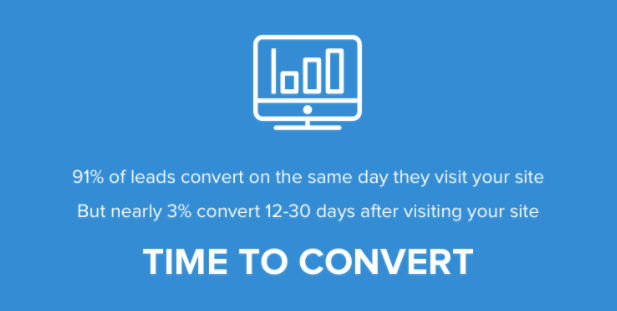
This means that high-value people who visit your website want a solution right now. 91% of the time, ideal prospects aren’t on your website to browse around and come back tomorrow.
They’re on your website because they want a solution… and they want it right now.
In fact, prospects are so ready to take action that the vast majority of our customer’s leads come from the home page.
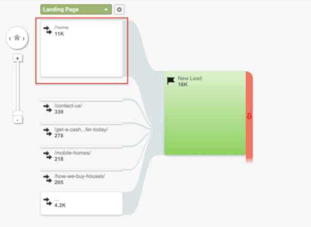
Which means that they visit the website and become a lead before even clicking anywhere else. They take action.
But what does that have to do with the “Call Us!” CTA?
Well, put yourself in the prospect’s shoes. If you visit someone’s website looking for a solution to your problem or wanting to get in touch with a realtor, the last thing you want to do is dig around their website looking for contact information.
And the very last thing you want is to come across an email or a form like this.
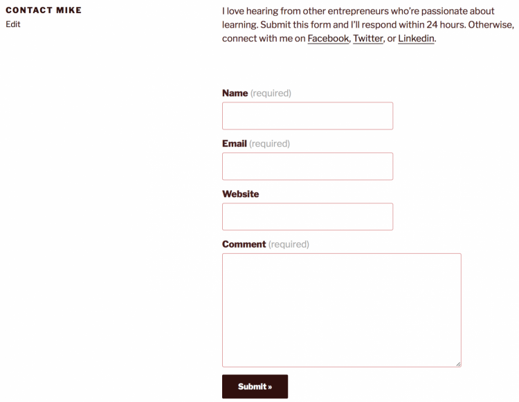
No. You want to call someone right now and schedule a time to talk further.
For that reason, the best real estate websites have the “Call Us!” CTA — which wins your attention.
And the same is true for your website visitors.
Additionally, we found that the average time-on-page for the “Contact Us” page across these real estate websites was a whopping one minute and twenty-nine seconds.
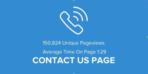
Which is pretty damn significant for a page that usually has nothing more than a phone number, email, and/or contact form.
Or consider, from this heatmap of one of our customer’s websites, how much attention the “Call Us!” CTA receives.
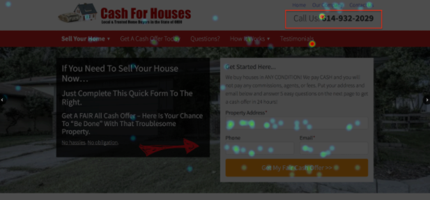
Plus, since 52% of home buyers use an iPhone during their home search, a lot of prospects literally have their calling device right in front of them when viewing your website.
Here’s what the founder and CEO of Zappos has to say about the importance of the “Call Us!” CTA.
“On many websites, the contact information is buried at least five links deep, because the company doesn’t really want to hear from you. And when you find it, it’s a form or an e-mail address.
We take the exact opposite approach.
We put our phone number (it’s 800-927-7671, in case you’d like to call) at the top of every single page of our website because we actually want to talk to our customers. And we staff our call center 24/7.”
And while you might not be the owner of a company that sells shoes online, the point is the same — business people that make it easy for prospects to contact them are far more likely to turn visitors into leads and leads into deals than those that make it difficult. Statistically, 50% of buyers work with the company that responds first.
This means you want to make it as easy as possible for prospects to contact you; the “Call Us!” CTA does exactly that.
How, though, should the rest of your website support this CTA? It’s to that question that we turn next.
How the Best Real Estate Websites for Lead Generation Set Up The Supporting Elements
In the end, your website should be phenomenal at only two things.
- Building credibility.
- Making it easy for the visitor to take action.
When someone first arrives at your website, they will want to know if they can trust you or not. They’ve never met you in person and so your website is the only thing they have to reference.
If it doesn’t convince them that you’re trustworthy, they’ll leave. If it does, they’ll contact you.
End of story.
In the digital real estate world, it’s really that simple.
For that reason, the majority of your website should be dedicated to building credibility with your visitors. You want them to know that they can trust you and you want them to know that as quickly as possible.
How, though, do you get someone to trust you when your website is the only thing between their decision and your business?
Well, there’s a nearly endless amount of elements that go into building trust with your website — “Website credibility judgments are 75% based on overall aesthetics” — but here are four of the more important ones.
- Does your website load fast? If people have to wait too long, they’ll leave and go somewhere else.
- What is the first thing that people notice when they land on your website? Does that element build trust for your business? If it doesn’t, then consider making this element something that does.
- How clean is your real estate website design? If your website is cluttered with random information and difficult-to-decipher CTAs, then people won’t trust you and they definitely won’t stick around.
- Is your website easy to navigate? Don’t overcomplicate things. Keep your navigation bar intuitive and your CTAs clear. You want people to know what’s going to happen when they click something on your website and you want them to easily navigate where they want to go. Avoid vague and unhelpful navigational terms on your website.
At Carrot, we’re relentless about doing all four of these things for our customers so that they don’t have to worry about it.
If you don’t want to worry about it, either, then you can check out our real estate agent websites or our real estate investor websites.
If you want to do it yourself, though — or you’re just curious — then check out how we guide website visitors from trusting the real estate expert to taking action.
Here’s how we do it on our real estate investor websites.
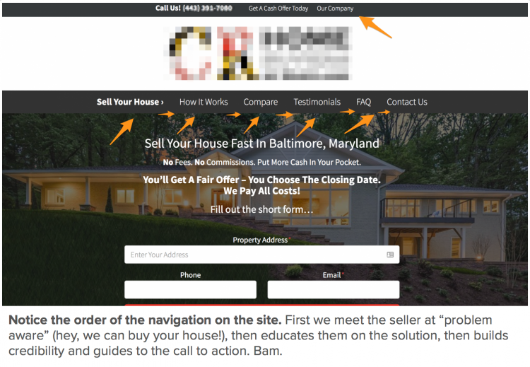
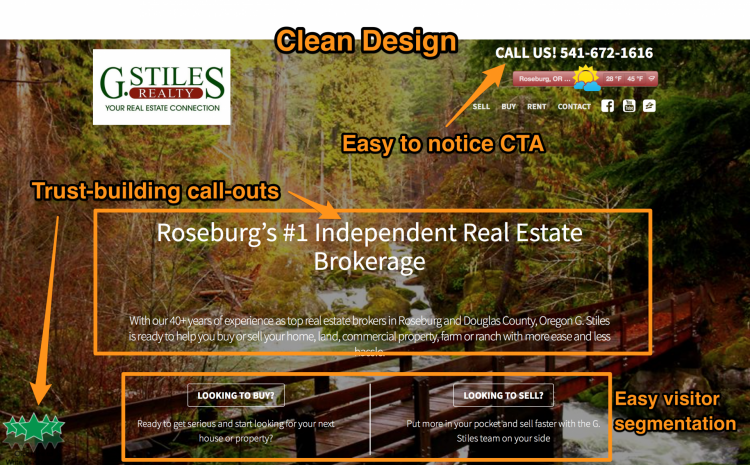
And here’s how we do it on our real estate agent websites.
Since the best thing that your website visitors can do is contact you, the rest of the website should work to get them to a point where they’re ready to call you or email you.
Which means one thing: building credibility.
The only hesitancy that committed prospects have about contacting you is that they don’t know who you are, they don’t know if they can trust you, and they don’t know if you can help them.
Other than the “Call Us!” CTA, every element on your website should work to convince them they can trust you and you can help them.
Then, and only then, will they dial your phone number.
Conclusion
The “Call Us!” CTA probably won’t be the most interesting part of your website’s design. It won’t be the prettiest or the most compelling. But that doesn’t mean it’s unimportant.
In fact, that little “Call Us!” addition to your website can make an estimated 10% difference in your conversion rate. Now, you know why it’s important and how to support it on your website.
Because in an industry where every sale is worth tens of thousands of dollars, 10% can make a big difference.
And in the case of the “Call Us!” CTA, about five minutes equals +10%.
What do you think is the most important element on a real estate website for generating leads and converting visitors?


