We’re fanatical testers here at Carrot.
So much in fact that during any given week we’re setting up multiple tests on our Carrot customers’ websites based on our “data dives” that our team does into the data we’re tracking to help improve the effectiveness of our system each and every week.
We’ve have had our heads down the last couple months getting some big projects pushed through, and frankly, have a backlog of test data that we haven’t made blog posts on yet.
And, thanks to all of you who answered our Customer Survey a few weeks back and who said, “I want to see more test data on the blog!”… we’re going to start rolling out some results of our conversion tests here on the blog on a more consistent basis.
One Of The Most Important Parts Of A High Converting Real Estate Investor Website Is…
… the Call to Action area.
The Call to Action area is the part on your website that guides the reader of your website (a motivated house seller, cash buyer, note seller, agent, etc) to take a certain action that you want them to take.
This could be joining your Discount Property List… getting an offer on their house… or even just a free market report.
But there are 3 core elements to a great Call to Action form…
1. The “ask” headline:
This is the spot that grabs their attention and hopefully spells out in a few short words the benefit they’re going to get OR simply asks them a question to get them to mentally say, “Yes, that’s me. What do I do next?”.
2. The opt-in form:
This is the actual form that people put their information into. We’ve tested variations of forms, numbers of form fields, size of form fields, type of information we collect on form fields… and have found a pretty darn good structure that has increased the conversion rate on our members’ websites dramatically.
3. The action button (or “submit” button):
This is often overlooked by people. Lots of people just assume that a person on your website is either going to click that button or not if they’re a motivated seller.
But, that’s just not the case. We’ve tested variation after variation of different sizes, colors, positions, and words on the “submit” buttons and in many cases found dramatic differences in conversion rate.
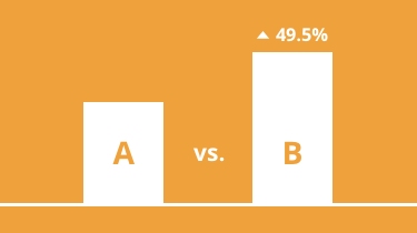
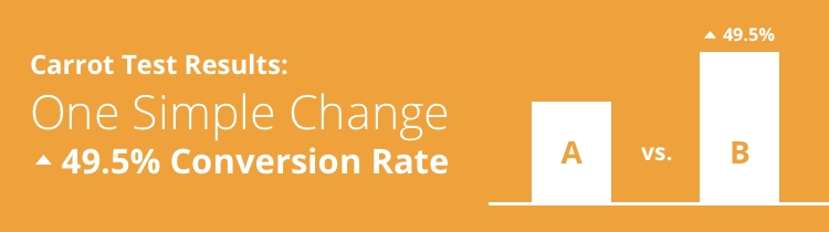
The Submit Button Change That Boosted Conversions 49.5%
This isn’t the first time we’ve run this exact test… and won’t be the last.
But this latest round of tests on the submit button on the main opt-in form on a motivated seller website had some really interesting results.
The Hypothesis in this test:
Will changing the words on the submit button from a “descriptor” (“Click to Continue” or “Submit”) to a “mental commitment” increase conversions?
Every single time we’ve run this test on a real estate investor website we’ve seen an improvement in the conversion rate when we got rid of the “Submit” or “Click to Continue” buttons in place of something that said something like… “See Available Properties” or “Get My Fair Offer Today!”
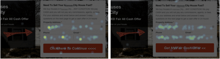
Below are a few shots of the actual tests and heat maps showing the results.
Test #1: Motivated Seller Website – Making Button Copy More Relevant
This test is actually still an active test but is currently at a 95% statistical chance to produce a winner (which is pretty darn good. We shoot for at least 97% to call it 100% conclusive.)
But as you can see in the heat map image above, all we changed was the words inside that red button. All of the “hot spots” on the pictures are the places visitors to that website during the test were clicking on and interacting on.
The Control is the button that said “Click here to Continue <<<<“… which is what we call a descriptor. It just tells you want to do.
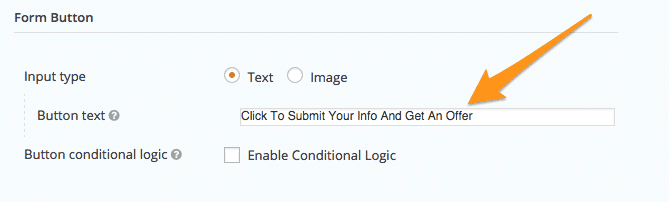
The Variation 1 button says “Get My Fair Cash Offer <<“… which is what we call a mental commitment. It meets the web visitor in the same mental mode that they’re in when they’re on that site… and mentally guides them toward the benefit they want (a fair cash offer on their house, today).
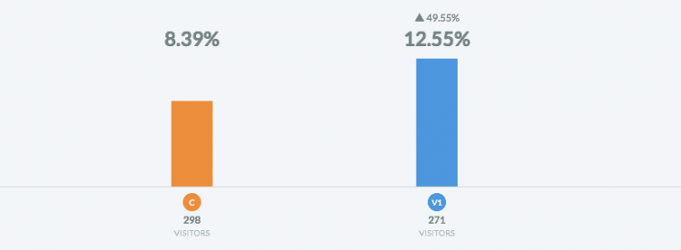
The Results: Out of 569 total sellers who landed on this InvestorCarrot motivated seller website, 59 converted as a lead (a 10.37% average).
The Variation with the mental commitment phrase… “Get My Fair Cash Offer <<” showed an improvement in 49.5% at a 12.55% conversion rate on SEO and PPC traffic… which is pretty darn solid for the home page of a website.
What Does That Mean? Out of every 100 visitors who land on your website, you’d get 12.5 leads rather than 8.3. Doesn’t sound like a huge deal.
But when those numbers add up it gets exciting. At 1,000 visitors to your website (assuming these numbers hold true) that would be 40 extra motivated seller leads.
If you close 1 out of every 20 leads into a deal (which is a low percentage for many of our customers) and you net on average $7.5k (which is much lower than many of our customers net per deal)… that’s $15,000 in extra revenue without having to generate any more traffic to your website. Free money assuming your close ratio per lead stays true.
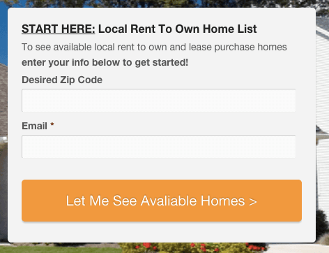
Test #2: Rent to Own Website – Making Button Copy More Relevant
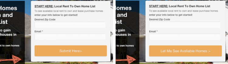
This test was a very similar change to test #1. On this InvestorCarrot members rent to own website we simply changed the button copy from a basic descriptor, “Submit Here >” (which the customer changed the button to that text away from our default text of “Let Me See Available Homes >”… so we wanted to test it again just to prove why it was there in the first place ;-).
A rent to own real estate investing website is going to get a much higher conversion rate than a motivated seller website is just because of the nature of the type of lead.
But the concept still held up in this instance with a completely different type of website and type of lead.
Why? It’s baked into us as humans to want to take the easiest path… the one with the least amount of resistance. If I landed on this website because I did a Google search to find local rent to own homes… and this button reinforces exactly what I want… to see “available homes” right now, I can’t help but follow that path and make my brain happy.
This conversion psychology is built into all of our InvestorCarrot websites and we’re continually testing and improving every single month.
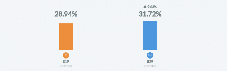
The Results: The variation that had the button copy that was more relevant to what the website visitor was thinking performed higher by 9.63%.
What Does This Mean? Out of every 100 visitors to your website you’d get 3 more “free” leads. Over 1,000 visitors to your website you’d get an extra 30 leads. If you were able to put just 1 out of every 30 qualified leads into a deal that made you $10k… that’s an extra $10,000 in profits per 1,000 visitors without adding any more traffic to your website. Free money.
We’ve run this exact same test on a number of other websites (both InvestorCarrot sites and non-Carrot sites) and results have been similar.
So make sure to update the call to action text on your submit buttons to add more value to your website visitor.
How To Change The Submit Button Text On Carrot Websites In Under 10 Seconds
If you’re an InvestorCarrot member reading this and have set up your website within the last 5 months, this change is already the default setting on all of your websites. Yay! As we find things that perform better, we automatically build them into the system… and in some cases make those changes across the board for our members.
But here’s how you can change your submit button text quickly if yours says “Continue” or “Submit”.
1. Go to the “Forms” tab and click the “Settings” button on the form you want to change.
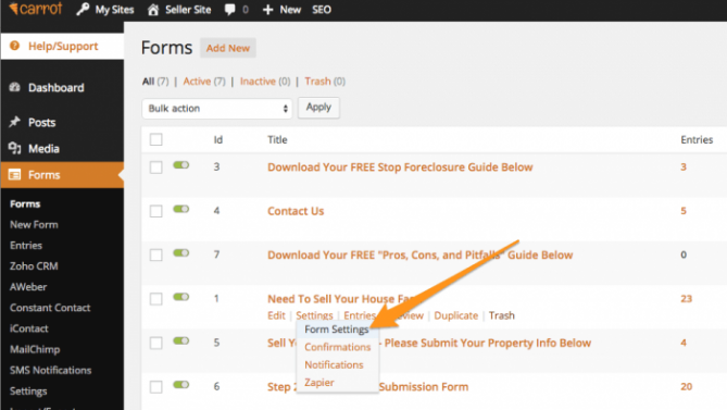
2. Go to the “Form Button” section and update the “Button Text” box. Done!
Done!
3 Other Call To Action Button Conversion Boosting Ideas
This article is only walking through this one hypothesis… that changing from basic “descriptor” submit button copy to submit button copy that adds more value to the visitor and talks about the benefit they want to get, increases conversion rates and leads.
But, we’ve tested (and are currently testing) many many other elements of the opt-in box.
But here’s some things you may test if you want to get all geeky like us and work on improving the conversion rate of your websites (if you don’t want to fiddle with it and would rather have us do it, we include our conversion testing assistance for any InvestorCarrot customer who is generating at least 100 visitors to their website a month. Why? Simply because we’re dedicated to continually improving the effectiveness of our Inbound Online Marketing System and websites for real estate investors. We don’t just try to make pretty websites. Our members are pulling in over 13,000 leads a month because of the combination between our innovative websites and SEO benefits, our conversion optimization focus, our training, and our hands-on high-level strategy help. )
- Change the “possessive” noun from 2nd person to 1st person: “Get Your Fair Cash Offer!” to “Get My Fair Cash Offer!” . We’ve shown this to improve conversions in many cases and has been shown to do the same in test after test in other industries.
- Button Size And Position: I see too many real estate investors websites have their call to action button too small… or it blends in to the rest of the page. We’ve found choosing a button color that stands out on the page (contrasts ideally) and is as large as the form fields have improved conversion rates by a measurable amount. We’re running a button size test right now on the website of one of the largest investors in California… and it’s showing a 200%+ improvement so far (it’s early). And it’s no accident that the call to action button on InvestorCarrot websites is wide, large, and the same width as the form fields (we’ve tested it many many times).
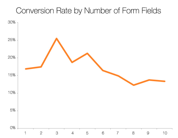
- Form Fields: Form fields can make one of the biggest differences in your call to action area. We’ve tested it and settled on about 3-4 form fields on your front end form (the form your visitors see first) is ideal for conversions. Then, feed them to an effective “step 2” to further qualify them (it works like gangbusters on InvestorCarrot websites). But don’t take our word for it, here, here, here, and here also tested the same thing and found the same results. It’s human psychology in action.
So if you are making any of those mistakes or just want to test them on your own website, put that in your action plan this week and get to work!
We Think About Conversion So You Don’t Have To

60,000 Leads Per Month (2020) And Climbing – Gotta Love That
Here at Carrot we get emails and live chat messages every week from members who say that their Carrot website performs better than their old website.
Not just in the search rankings (which Carrot sites hold more page 1 rankings for search phrases that matter than any other website platform for investors) but also on the conversion rate.
Now, let us get real here for a second.
Do we have a magic potion that makes our websites convert more visitors into leads? Nope.
You can learn to do your own conversion testing just like we have over the past 7 years… testing millions of visitors to our pages and well over 1,000 individual tests over the years.
Over time you get good at figuring out what works and what doesn’t.
And when a customer emails us saying “I didn’t tweak hardly anything and my Carrot website converts 4x more visitors into leads than my other website”… that makes us giddy like a rabbit in a… well… carrot patch ;-)
So if you just want to focus on doing more of what makes your heart sing (the stuff you love to do in your business) and less of the techie and marketing stuff you don’t like or just flat out don’t have the time for… that’s why some of the top investors around the country work with us.
We’re not the cheapest monthly rate on the block… but like we showed in this post… we’re dedicated to making your real estate investing websites more effective to generate more real estate investing leads for motivated sellers, cash buyers, private lenders, rent to own tenant buyers, note sellers, and more.
And if you close only 1 extra deal because of our commitment to results over all else over the lifetime of your account with us… that alone will pay for 10-15 years of InvestorCarrot service in that extra “found” revenue.
Take a demo of Carrot today or reach out to us if you have questions in the comments section below.
And heck, if you liked this post, hit the Facebook “Share” button and Linkedin button on this page. I’d appreciate it a ton. It keeps us motivated to keep putting out great content like this you can’t get anywhere else in the real estate investment industry.