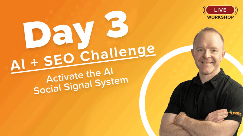
Day 3 – AI Search Challenge:
The “New” Off-Page: Building Your Trust
Starts at 10am PST
Keep the Conversation going- Join the Challenge Facebook Group Here and Dive in with us All Week!
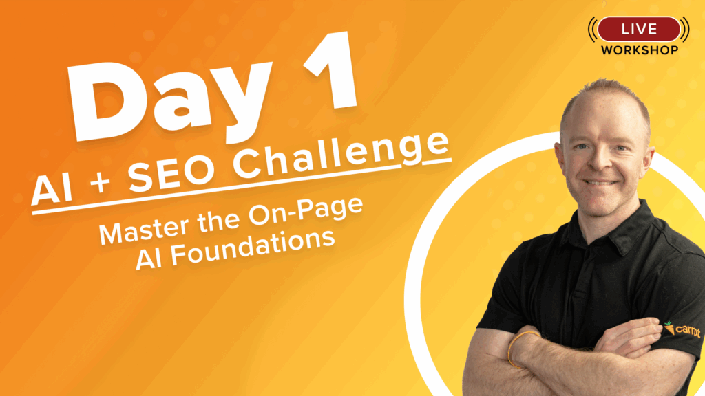
Day 1 – AI SEO
The AI Foundation

Day 2 – AI SEO
Optimizing On-Page
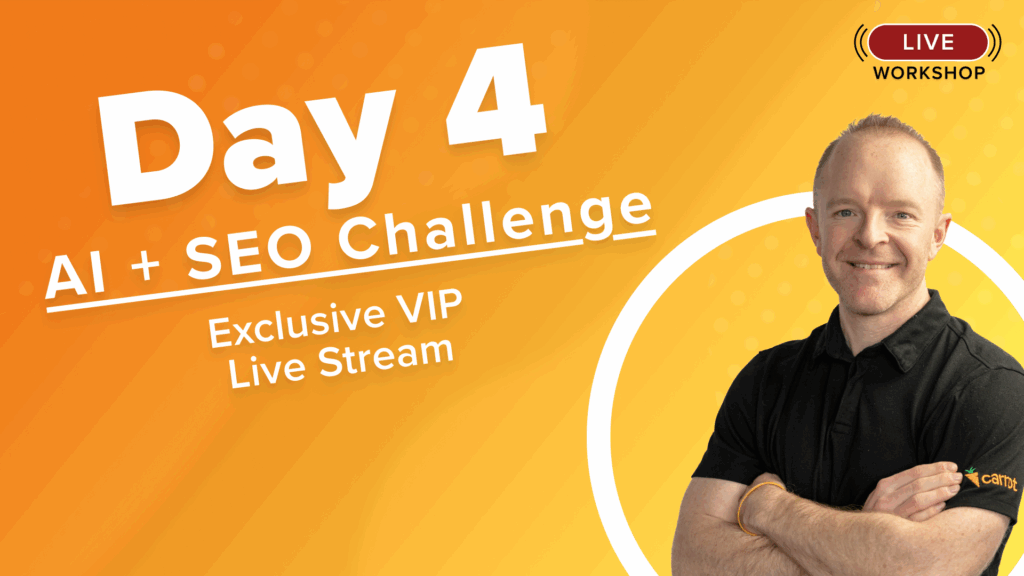
Day 4
Exclusive VIP Access Only

Resources
Get All Resources Here
Accelerate with VIP
$99
*New users who activate Carrot. Renews at $99/mo. after one month.
Valued at $2,739
✨ Includes personalized website workshop + all replays
✅ 3 Day Challenge (Value: $199)
Includes 3 days of strategy, tactics, and implementation
✅ Daily Slide Decks & Checklists (Value: $149)
Follow clear daily action plans and step-by-step checklists.
✅ AI Search Visibility Engine GPT (Value: $297)
Discover hidden ranking opportunities with AI
✅ AI SEO Website Schema Generator Tool (Value: $197)
Automatically create structured schema to boost visibility.
✅ AI SEO On Page Content Optimizer (Value: $247)
Fine-tune your site for better engagement and SEO scores.
✅ AI SEO Video Marketing Engine (Value: $197)
Turn your videos into powerful SEO assets.
✅ Hyper Local Link Finder Tool (Value: $347)
Find and build high-trust local backlinks to improve authority
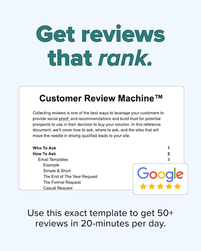
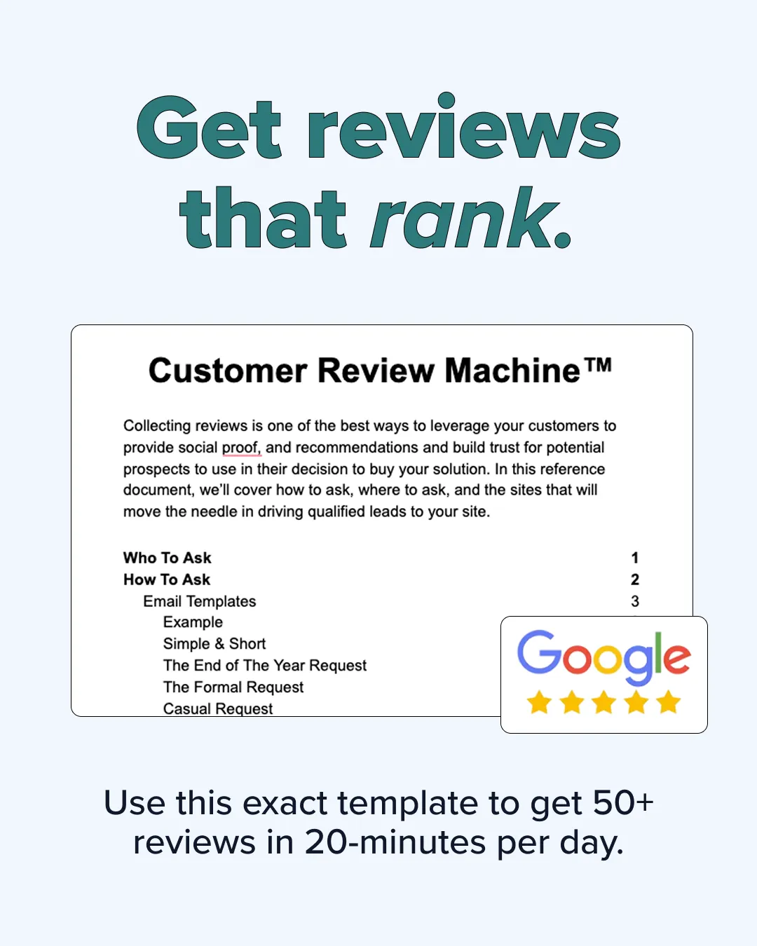
✅ Customer Review Machine (Value: $147)
Collect and manage reviews to strengthen local credibility.
VIP EXCLUSIVES
🌟 1 Month of Carrot on the Starter Plan (*new users only) (Value: $99)
• 1 High converting website
• Integrations
• Carrot CRM
• 3 automated location pages
• On-page SEO recommendation
• Unique content scoring
• Rank tracking for 3 keywords
• 3 campaign tracking links
• Call tracking
🌟 Day 4: Exclusive VIP Personalized Website Workshop (Value: $497)
Live working session to dive deeper into your website
🌟 Full Recordings Library (Value: $247)
Access the full challenge content anytime you want.
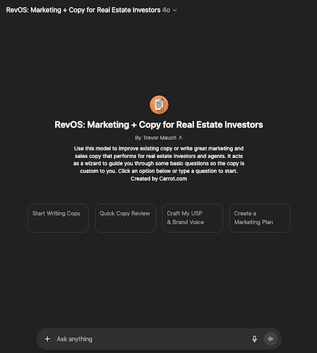
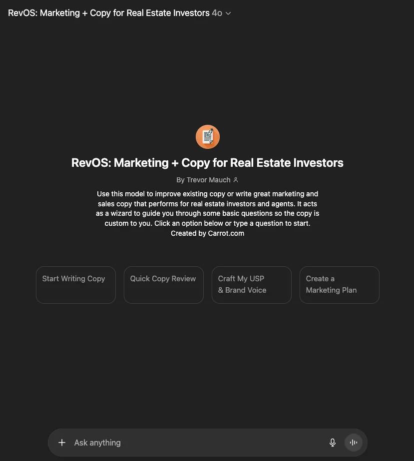
🌟 RevOS: Custom Marketing Copy GPT (Value: $116)
Generate conversion-ready marketing copy for your website
Have questions about this deal? Reach out here