
The hero section… that all-important sliver of real estate at the very top of your website.
It’s a visitor’s first impression of your site and your company, but it plays a different – more important – role as well: it’s your first opportunity to convert those visitors into leads. As more and more web traffic is taking place on mobile devices, that sliver of website real estate in the hero section is shrinking, and you have to approach it with those (often) competing needs in mind.
How much content is too much? Is it more important to highlight the form that’s actually generating leads? How does this change based on whether a visitor is on desktop or mobile?
At Carrot, our Innovation Lab is constantly pondering questions like these – AND launching tests to answer them.
In this post, we’ll outline a series of tests we ran on hero sections that increased conversion rates by anywhere from 25 to 55%, plus we’ll point you in the right direction when it comes to how you should approach the prime real estate (the hero section) on your own site.
Example: Hero Section Test Results
What Did We Test?
Our CTA Hero tests spawned from a very simple realization… the vast majority of conversions across our network of member sites occur exactly where we would expect them to: in the forms found in the hero section.
So we dug in to find out how our members are approaching those hero sections. It turns out that the answer to that was quite varied. Some members are stuffing as much content as possible. Some are reducing the amount of content. Others include videos, pictures, etc.
So we designed a very simple test… one that pitted what we considered a “traditional” hero section against one that had significantly reduced amounts of content both surrounding the form and in the form itself.
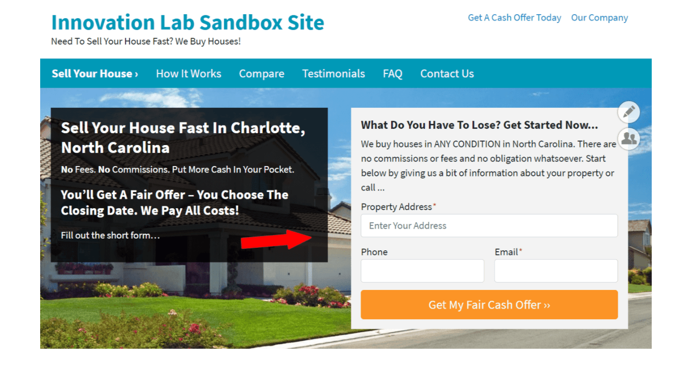
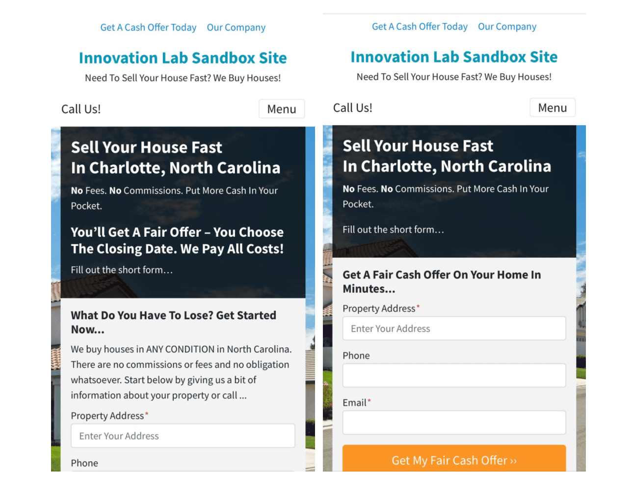
(Traditional Hero Section with several lines of contextual content + a form description)

(Slimmed version of the hero with some contextual content + the form description removed)
A few things immediately stand out with the “slimmed down” version.
- The form itself appears more prominent when you remove the form description. It guides the eye more specifically to the input fields and the final CTA button rather than the text above it.
- By matching the content reduction on the contextual blocks (in this case, the information to the left), it decreases the overall footprint of the hero section and begins to “raise” the content immediately below it.
Point #2 is especially important when considering mobile traffic. At Carrot, we generally see that mobile visitors account for 57% of all traffic and 61% of all conversions across our network. Our own design principles have been morphed to take a mobile-first approach accordingly, and that is where our primary hypothesis for this test originated from: that by reducing the content in the hero section, it would make the form itself more prominent and appear “above the fold” on mobile, thereby increasing user engagement and ultimately conversions.
And The Results….
We launched this test across a myriad of site types, categories, layouts and environments – and the results were quite amazing.
On every individual site where there was enough traffic and conversions over the lifespan of the test to register a statistically significant outcome, the slimmed down version of the hero won (and by large margins!).
- Test Site #1 – Land Seller Site
- Conversion uplift of 45.87% – 398 conversions in the slimmed down version versus 259 in the traditional version
- Conversion uplift of 45.87% – 398 conversions in the slimmed down version versus 259 in the traditional version
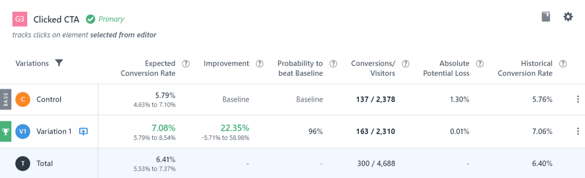
- Test Site #2 – Motivated Seller Site
- Conversion uplift of 22.35% – 163 conversions versus 137
- Conversion uplift of 22.35% – 163 conversions versus 137
- Test Site #3 – Motivated Seller Site
- Conversion uplift of 46.86% – 102 conversions versus 71
Furthermore, our measurements of user engagement (which include scroll depth, time on page, bounce rate, etc) were significantly improved (by anywhere from 15-25%) on sites with the slimmed down version of the hero.
A few other findings/caveats in our testing design…
- We wanted to ensure that these changes in the hero section did not improve conversion for mobile versions while harming desktop versions/visitors, so we split up tests accordingly to isolate these visitors. There were zero cases in which conversion rates increased on mobile and decreased on desktop.
- Similarly, we wanted to ensure that these changes in the hero section did not negatively impact conversion on forms that may appear lower on the page. There were zero cases in which lower-ordered forms experienced a drop in conversions that outweighed improvement to the hero section form, and in many cases, those lower forms improved as well (indicative of our increase in user engagement metrics).
In total, this test was a resounding success – the slimmed down version of the hero section performed significantly better on all site types, categories, and versions.
So what does this mean for your site?
It means, generally speaking, that when it comes to your hero section, you should take a “less is more” approach! Instead of packing that incredibly important part of your website with a wall of text, graphics, videos, etc, minimize it.
Some best practices we recommend from our testing results:
- Focus on highlighting the form you ultimately want visitors to engage with by removing form descriptions and content surrounding it (as shown in the pictures above).
- Load your site on your mobile device and see where that form appears. Does it entirely fit within that initial “above the fold” view? If not, can you reduce the amount of text that appears above it so that even 50% of the entire form appears in that view? Our testing indicates that the more a form can appear in that initial view, the better.
- Avoid placing graphics, images, videos or long-form content in the hero section. There are so many better places to include that information and content lower on the page!
As we’ve said, that hero section is your website’s prime real estate. It’s your opportunity to make an impression, sure, but it’s also your first opportunity to convert a visitor into a lead. We hope that by bringing you these results from our Innovation Lab, it helps you take a closer look at this section on your site and how it could be helping (or harming) your conversion rates.