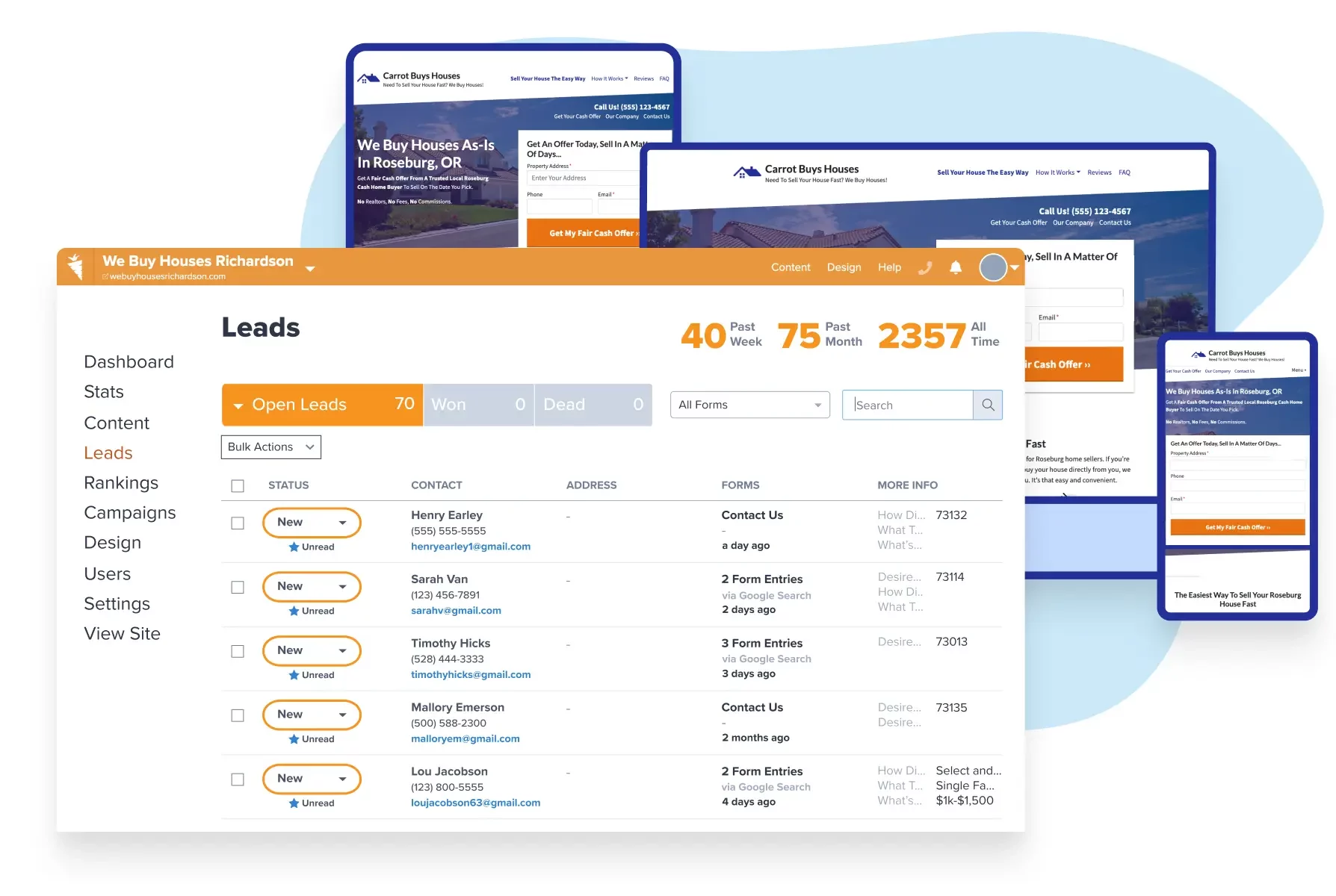
There’s a fine balance between ensuring your website performs well and stands out. We’ve spent the past 10 years refining website templates for real estate investors, making them excel at ranking well in search engines, building your credibility, performing lightning-fast, and turning visitors into highly motivated leads.
Carrot has expanded website customization options with new block pattern designs that allow real estate professionals to easily create unique, professional websites that reflect their personality while maintaining high performance.
Key Takeaways
- Block patterns are pre-designed webpage sections organized into categories like Call to Action, Content, Credibility, and Data that can be easily implemented without design expertise.
- The patterns come pre-loaded with your brand colors for seamless integration and allow for customization to create visually appealing pages that stand out.
- Using different block patterns helps break up text-heavy pages, making information more digestible for visitors and creating a more engaging user experience.
With ongoing design improvements planned for the future, Carrot members can now better differentiate their websites from competitors while maintaining the high-converting, SEO-optimized foundation that drives lead generation success.
Table of Contents

Join Carrot: How many deals are you losing to an underperforming website?
Join NowBut that doesn’t mean we don’t care about how your website looks. Your website is your online business card and should reflect your personality.
That’s why we’re excited to announce that Carrot members now have even more website customization options! Did you know that Carrot has a team of in-house website designers dedicated to improving your site and Carrot experience? Well, they recently added 50 new block pattern designs so you can easily customize your website and make it look as unique as you are.
What’s a “block pattern?”
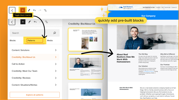
Think of each webpage as several sections stacked on top of each other. You have the “hero” section at the top of the page (usually with an image and the page title), then maybe a section of text or an image gallery, probably a “call to action” section that lets visitors easily contact you, a section that shows off your customer reviews, and so on. We pre-built many of these key sections as “block patterns.” It simply means a section pre-designed to serve a specific purpose.
We know it’s important to you that your site “doesn’t look like every other website.” Using block patterns is a great way to do that! Carrot offers a variety of block pattern styles for the most important sections of a site. All you have to do is pick your favorite style and add your information. You can use any block pattern on any page. The beauty of pre-built patterns is that you can customize the look of your website without being a web designer. With just a few clicks, you can quickly transform key pages from the out-of-the-box template into something that stands out and fits your style.
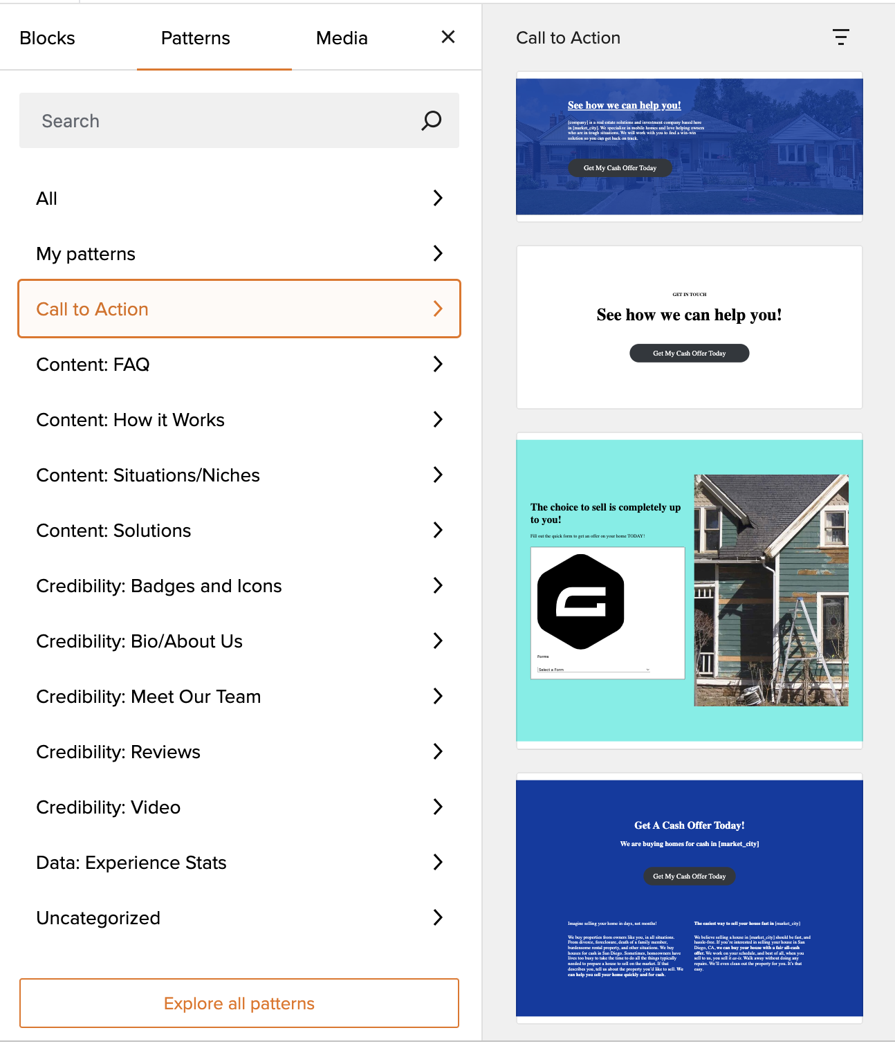
Block Pattern Categories
Finding a design to meet your needs can be difficult if you’re searching through a seemingly endless library of options. What if you use one and then find something you like better? Pattern Categories solve that problem.
You can easily browse pre-built sections that meet your needs by deciding what you’re trying to accomplish with that webpage section.
Block pattern categories included:
- Call to Action
- Content: FAQs
- Content: How It Works
- Content: Situations/Niches
- Content: Solutions
- Credibility: Bio/About Us
- Credibility: Meet Our Team
- Credibility: Reviews
- Credibility: Videos
- Data: Experience Stats

The patterns you see are pre-loaded with your brand colors, so they’ll seamlessly blend into your website’s look and feel. Feeling creative? You can edit these patterns and add content, then save them to “My Patterns” for easy use on other pages.
Find your design
Using different block patterns is a great way to break up a page and make it easier for visitors to process information. For example, you can replace a block of text with icons and short blurbs that draw attention and make a big impact. Select from over 500 pre-loaded icons across a dozen categories and customize your icon color so your site truly reflects your business.

Whether you like sharing maximum information or prefer a sleek design, the block patterns give you options. Some patterns are text-heavy, others are very streamlined, and others stylishly mix images and text.
The “Content: How it Works” and “Content: FAQ” patterns, in particular, offer a wide array of styles. If you have those sections on your website, now is a great time to revisit them and refresh your site design.
Not sure exactly which block pattern you like best? Add the section to your page and scroll through the different pattern designs to see how they each look in real life.
More to come
That’s just the latest update. The Carrot design team is working on even more block patterns and other design options to let you customize and differentiate your site further. You can expect to see more features roll out over the next few months, so stay tuned!
Take a free Interactive Carrot website demo and see how we can help you stop losing deals to an underperforming website!


