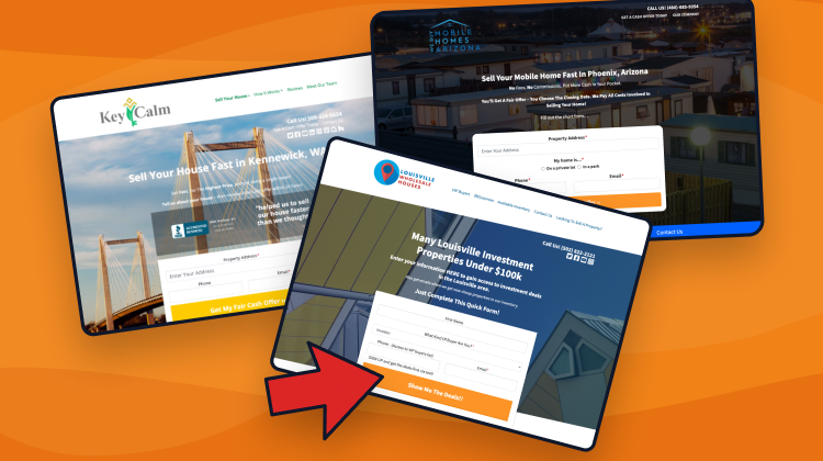
Are you tired of using generic website templates that don’t deliver the results you want?
At Carrot, we understand the importance of a high-converting real estate website for investors, and that’s why we’re BIG nerds regarding testing. Over the past decade, we’ve put our website templates through hundreds of rigorous tests to ensure they deliver the best possible results.
We know what works and doesn’t, and we’re constantly refining our templates to help you achieve your real estate investment goals. So, if you’re ready to take your website to the next level, come and discover the power of our high-converting real estate templates – you won’t be disappointed!

Featured Training: Learn To Rank Your Real Estate Website…The Right Way
Learn MoreWe’ve tested things like…
- Page Format
- CTA Text
- Headline
- Button Color
- Menu Navigation
…and lots more.
Sometimes the results are inconclusive. Sometimes they are significant — when that happens, we apply what we learned to our website templates.
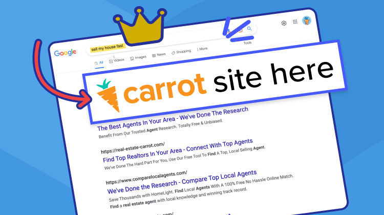
In part, our obsession with conversion optimization has made us the #1 website builder for real estate investors.
Are you tired of low conversion rates and struggling to generate leads for your business? If so, you’re in luck!
In this post, I’ll share what a good conversion rate looks like and provide three powerful techniques to optimize your website for maximum success. Don’t miss out on this opportunity to take your real estate business to the next level.
What do we mean by conversion & how much does it matter?
When we talk about conversion on a real estate investor website, we’re referring to a website visitor taking a desired action, such as filling out a form.
The percentage of website visitors who complete this desired action is known as the conversion rate, which is an important metric for measuring the success of a website in achieving its goals.

Understanding your conversion rate is crucial to know how well your real estate investor website performs. It can help you optimize your website to attract more leads, increase engagement, and ultimately, drive greater success for your real estate investment business.
The 3 Biggest Factors of a High-converting Real Estate Website
Watch this video… “Website Conversion 101”
1. Personalization
Structure and appearance
The websites that convert take advantage of their web design to pull people in and get them to explore their site. Attractive web design for high-converting websites means:
- Fast page load: People want information fast, especially since over half of internet traffic is on the go with mobile, so fast page speed is essential to convert. Learn more about page speed optimization.
- Responsive design: With so many people accessing the Internet via mobile, your site needs a responsive design that encourages Internet users to take the step to convert.
- Intuitive navigation: Websites that convert make it easy for people to find the information they want.
- Engaging layout: High-converting websites use layouts that make it easy for people to find information on the page. These websites use white space as rest-stops for the eyes. They also use web-safe fonts and eye-catching images, graphics, and videos. Ask yourself for every component of your website, “is this helping me generate leads?”
Logo & brand colors for a cohesive look.
Logos and brand colors are essential for website conversion rates as they help to create brand recognition and establish trust with visitors.
Logos serve as a visual representation of a brand and can help to communicate a company’s message and values instantly. The impact a good website logo can have on conversions can vary greatly depending on various factors, such as your target audience and the website’s overall design. However, it’s generally agreed that having a strong and well-designed logo can positively impact conversions in several ways.
A good logo can help to establish brand recognition and credibility, increase brand awareness, and create an emotional connection with visitors. These factors can contribute to higher levels of trust, ultimately leading to increased conversions.
Brand colors also play a key role in establishing a company’s identity and creating an emotional connection with consumers. When used consistently across all touchpoints, logos and brand colors can help to build a strong brand image, increase brand awareness and create a sense of reliability and credibility, all of which can contribute to higher conversion rates. Utilizing a logo maker, you can get the effect quite simply.
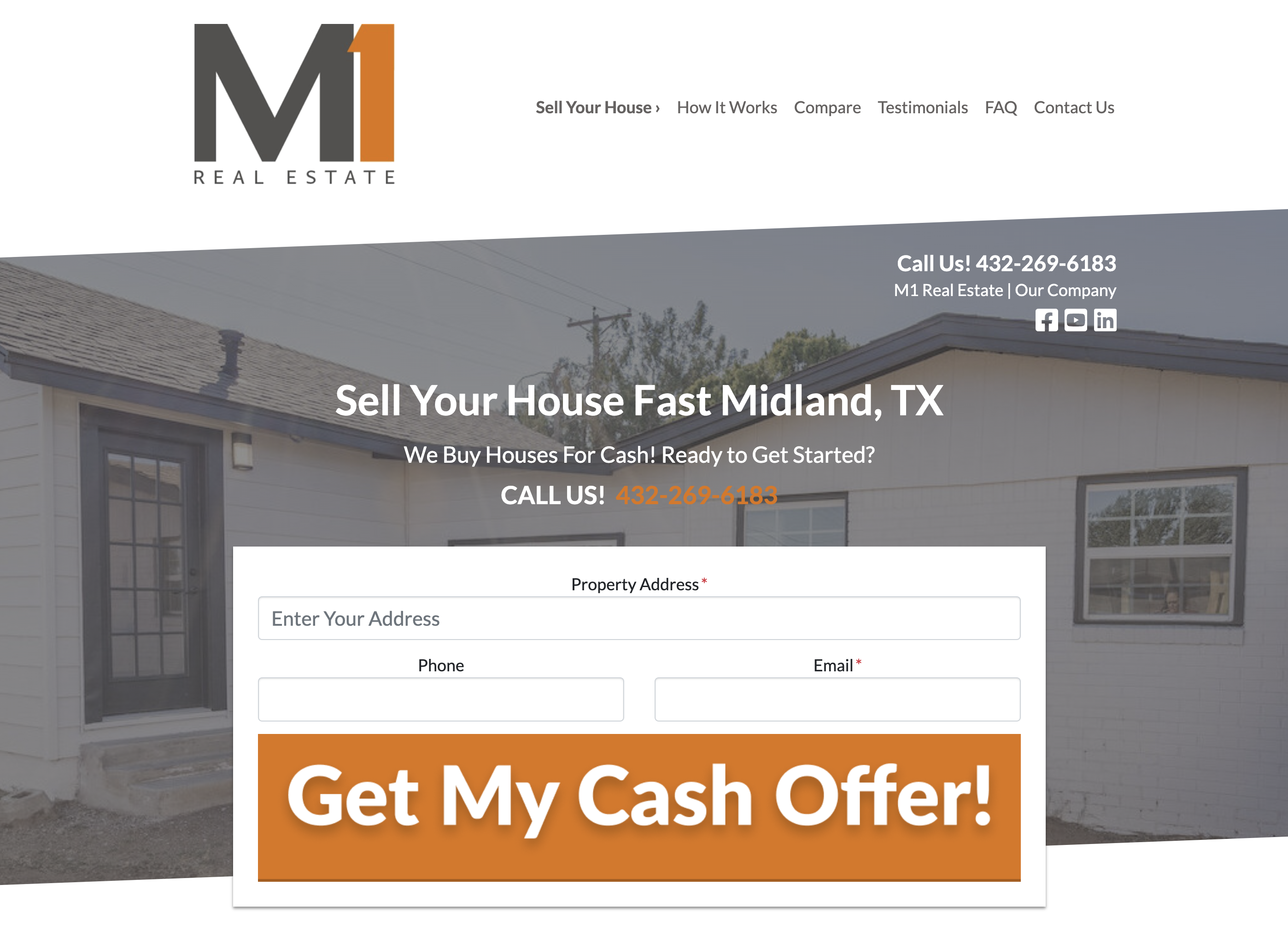
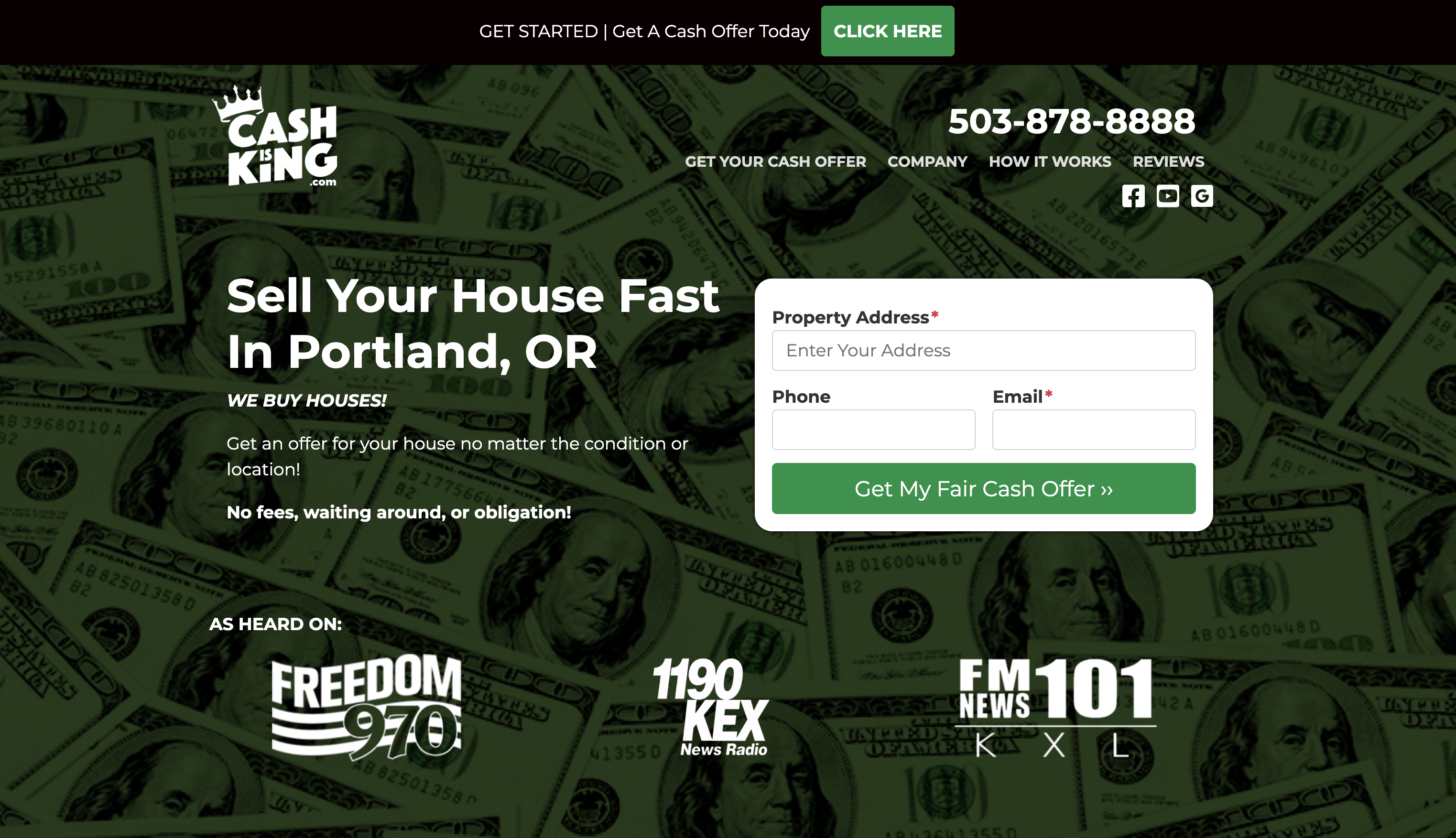
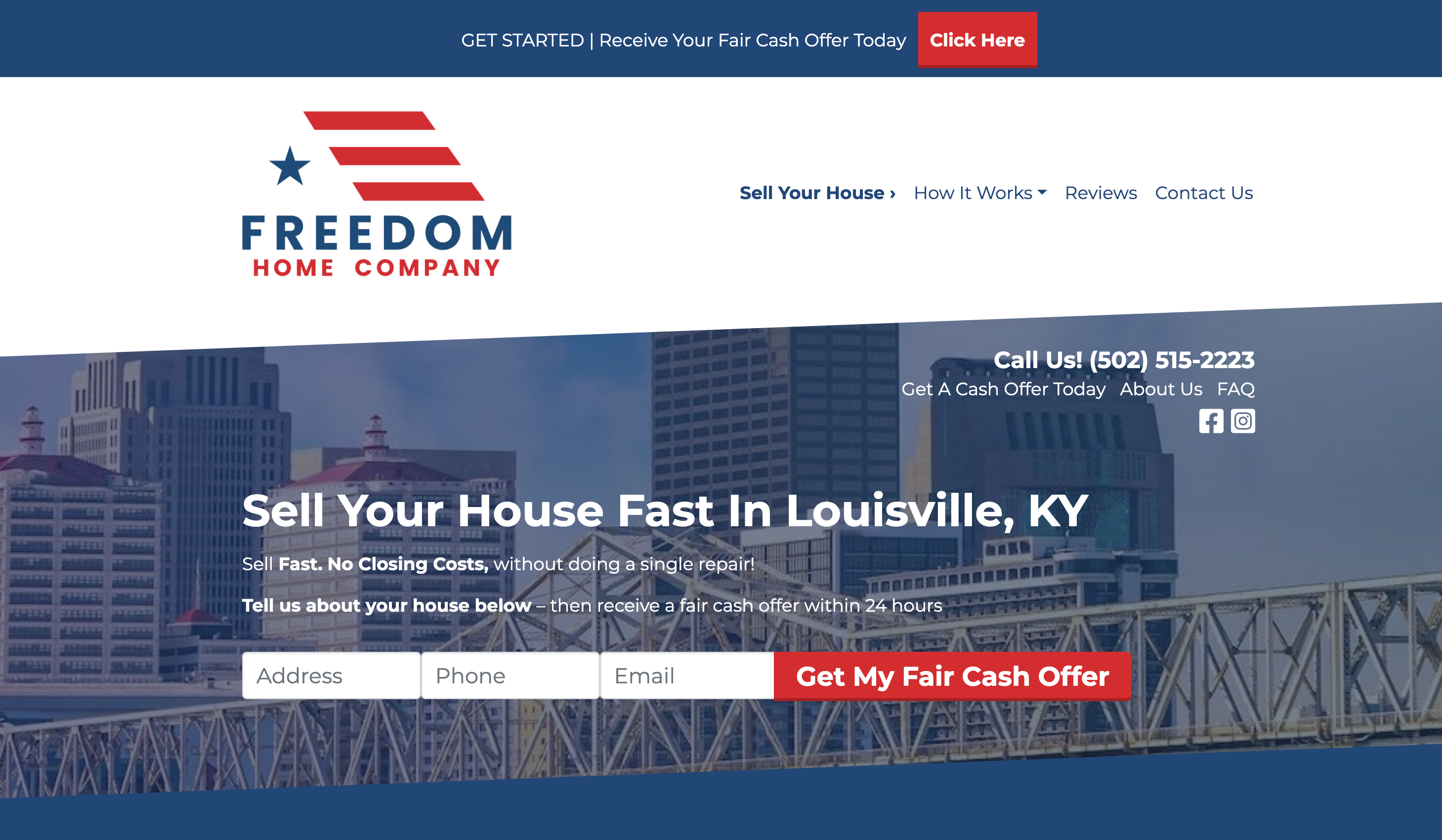
Here are a few examples of quality logos and brand colors.
Put some love into your “About” page
Over the years, we have continuously run heatmaps on our Carrot sites to learn more about how people engage with them.
We looked at where people clicked the most.
And, to our surprise, the “About” header in the menu was regularly the second-most clicked button on the homepage.

Go figure.
Real estate is a highly personal business.
So it’s not remarkably surprising that people… well, want to learn about YOU — probably even before they call you or opt-in on your website form.
This is why it’s essential to give your “About” page the attention it deserves.
How?
Well, it’s pretty straightforward.
Here are 3 quick tips with examples.
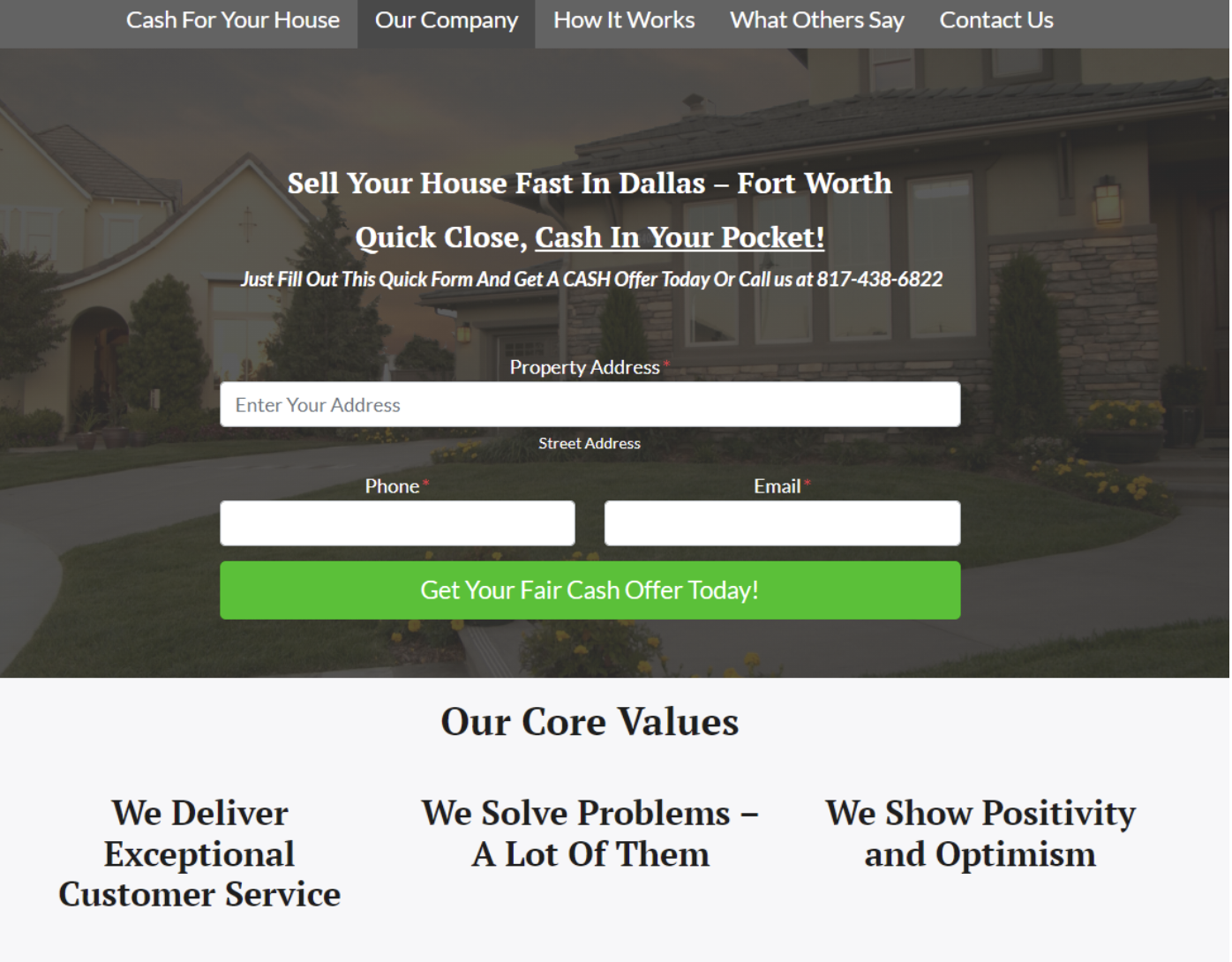
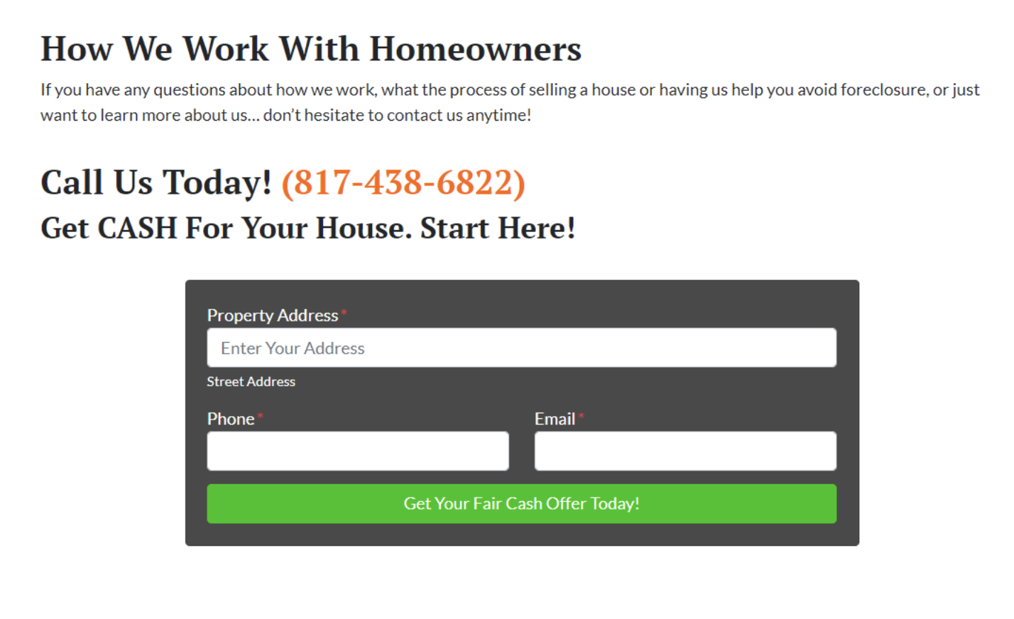
1. Share Your Core Values — What makes you tick? What are the non-negotiable qualities that you believe give a person character? Create some core values and put them on your “About” page. This will help people relate to you and get a feel for who you are.
2. Tell Your Story — You don’t have to write a book, but it’s good to talk about yourself and let people know who you are and how you got where you are today. Bonus points if you include a picture of yourself!
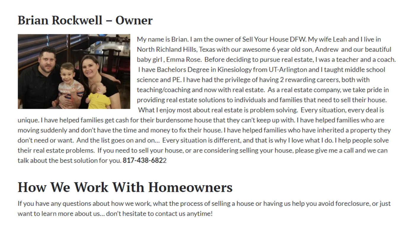
3. Encourage Outreach — People click on the “About” page because they’re thinking about working with you… but they want to learn a little about you first. So at the end of your “About” page, don’t forget to encourage people to contact you if they have any questions.
2. Localization
Real estate investor website localization refers to adapting a website to your target audience’s language, culture, and customs. Custom content appeals to your target audience. By localizing your website, you can improve the user experience and increase conversion rates by:
- Building trust: Localizing your website can help you build trust with your target audience, showing your business is trying to understand and cater to their needs. This can lead to higher levels of customer loyalty and increased conversion rates.
- Improving relevance: Localized content relevant to your target market can improve the user experience and increase conversions by demonstrating that your business understands and values their cultural differences. A motivated seller in San Francisco has different needs than a motivated seller in Boston.
- Boosting SEO: Localized websites can also improve search engine optimization by targeting specific keywords and phrases relevant to your target audience. This can increase visibility, attract more qualified traffic, and increase conversion rates.
Website localization can significantly increase conversion rates by improving accessibility, building trust, relevance, and boosting local SEO.
Here are some examples of website localization.


See more examples of Carrot sites in the post.
3. Credibility
In marketing, social proof refers to the importance of providing evidence of your trustworthiness and effectiveness.
And it’s super powerful.
Check out some of these stats…
- 87% of buying decisions begin with research conducted online before the purchase is made.
- The average consumer reads 10 online reviews before making a purchase decision.
- 88% of consumers trust user reviews as much as personal recommendations.
Remember: most people visiting your website have no idea who you are.
Maybe they saw one of your Facebook Ads, found you through Google, or received a piece of direct mail.
Either way, one of the first things they want to know is this: are you legit?
So… how do you add social proof to your website?
You can use testimonials…
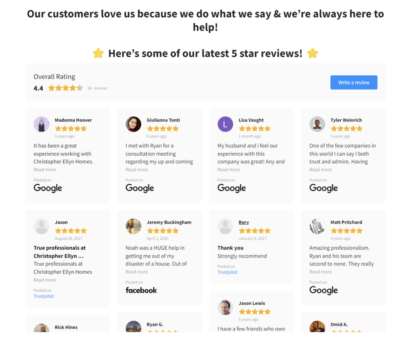
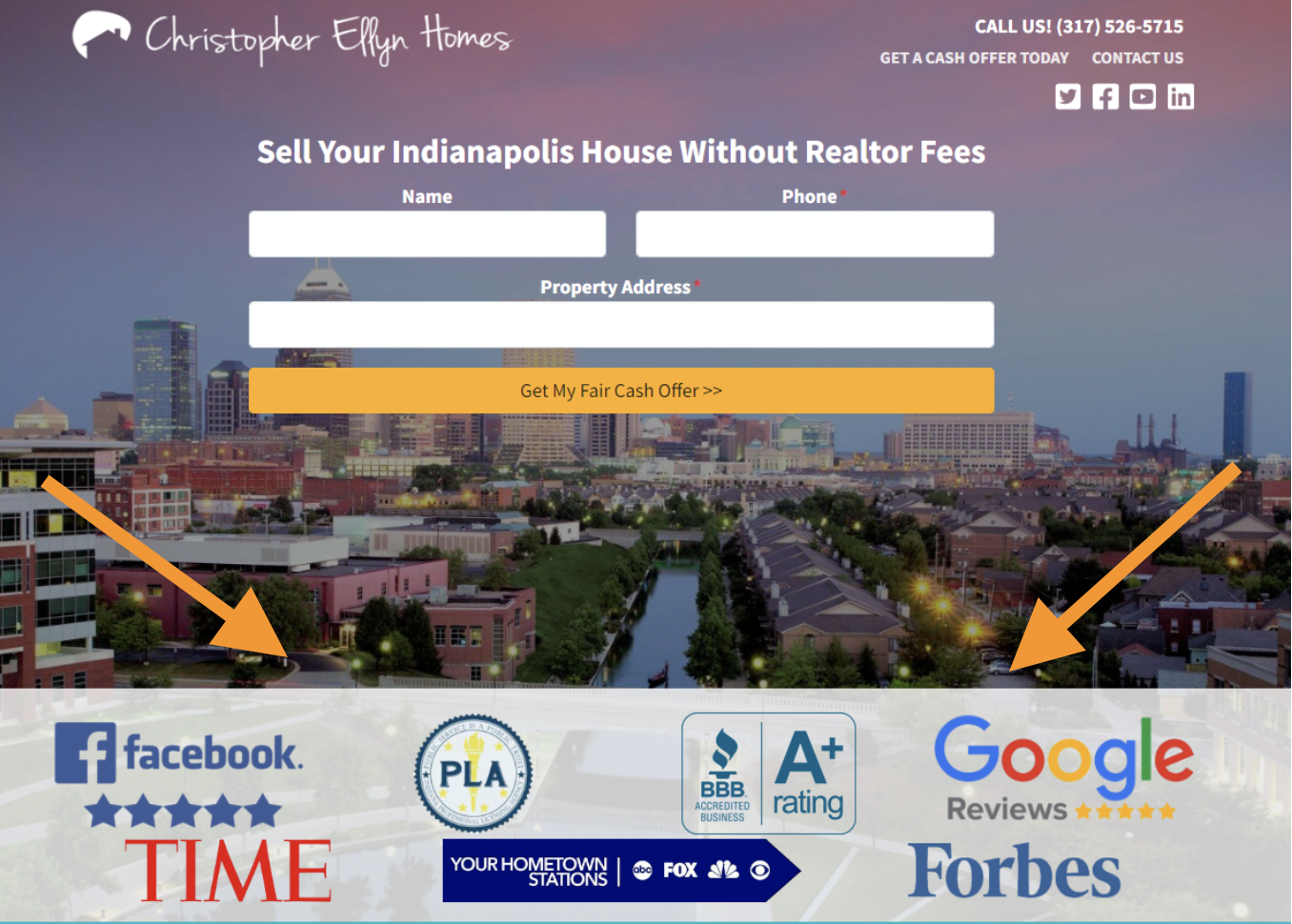
Credibility bars…
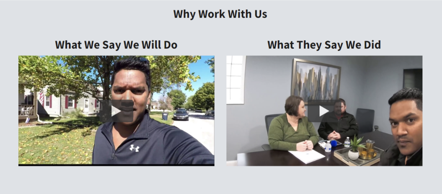
Or video case studies…
This is a critical part of your website for increasing conversion rate… don’t ignore it.
How are you building authority & credibility on your website? In the comments below, let us know what you’ve found the most effective.
Final Thoughts
By implementing the tips and strategies outlined in this ultimate guide to website conversion, you can create a website that showcases your properties and provides a seamless user experience for your visitors.
At Carrot, we obsess about website conversion rates, so you don’t have to.
There’s a lot to it.
The good news is we’re here to help. You don’t have to get overwhelmed, spending all day testing colors, forms, and copywriting. Not only have we done a lot of the work for you in our software, but we’ll guide you along the way, step-by-step, so you can be on your way to doing what you do best — closing deals.
Want to generate more motivated seller leads and get your website up and running fast? – take the 30DC
If you have any questions…
And as always, if you feel Carrot may be a fit for your real estate websites and want better results online, we’d love to have you in the Carrot community and be sure to learn more about website design and conversion.
Check out our plans and hit us up with questions anytime!

