We get this question from our members quite a lot: “My website is converting phenomenally, but how can I make it look different from other Carrot websites?”
Sure. We have several different high-converting website templates. Still, though, many of you want to be able to differentiate your website even further from other Carrot members.
So, in an effort to give you more customization freedom on your Carrot website without sacrificing ease of use and the highest conversion rates in the industry, we’ve officially launched our new Hero customizer…
Your New Hero Customizer
Let’s take a quick look at the new feature. You now have three options when customizing your website’s hero section…
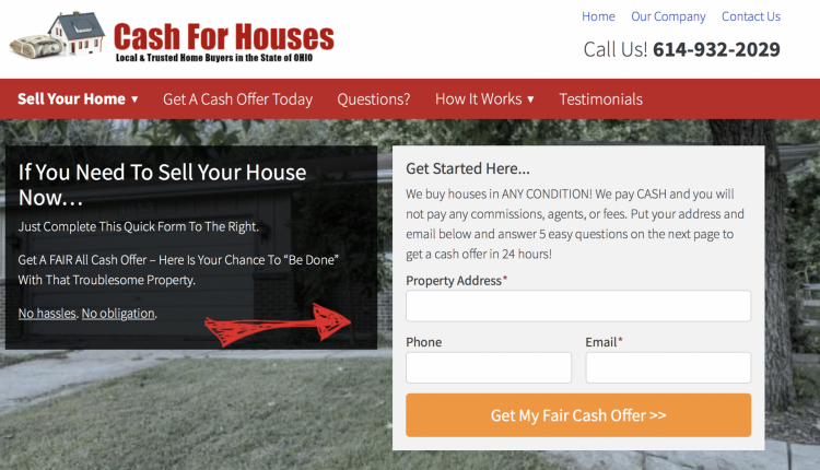
Columns (the traditional Carrot style)…

Stacked…

And Inline…

Not bad, huh?
So why did we decide to give you these optional customizations on your website? Why not just give you a single option that converts better than the rest? Three reasons.
- Choosing one of these options will help you differentiate your website from other Carrot members – something many of our clients have asked for.
- These changes allow us, here at Carrot, to continue testing your websites and iterating based on what we find. With different people using different fields, we can continue to test and increase your website’s conversion rate through iteration.
- We also want you to be able to test different form fields on your website. We’ve run lots of tests on these forms (more on that in a minute) and one overarching thing has revealed itself: different forms perform better in different markets.
Depending on the demographics, sophistication, population, and other market factors, one of these three forms will likely win the day. To help further, though, let’s chat about some of the data we collected before launching this feature.
Our Hero Customizer Experiment
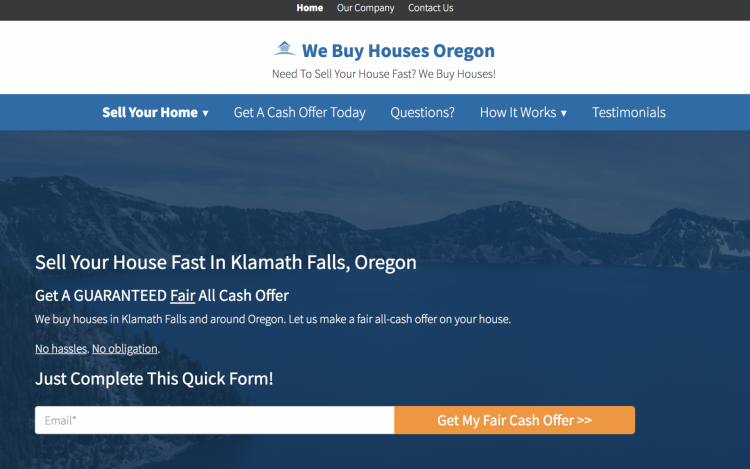
Our test analyzed seven different Carrot websites. On each control version, the hero form was either stacked…

Or columned…

The variation for each website, on the other hand, was an inline form…

As you might have already guessed, we wanted to see what kind of impact an inline, single-field form would have on conversions. The results?
Ultimately, what we found was inconclusive. Some of the websites experienced as much as a 49% lift in conversion rate. Others saw a slight lift, between 10% and 20%. And one of the websites actually experienced a 25% decrease in conversions.
Here’s the cold, hard data.

Similarly, we’ve tested our traditional columned form and found it increase conversions significantly up against other real estate website creators (it’s our traditional form-type for a reason). And yet again, we’ve found the stacked form version to outperform the traditional version on some real estate investor websites.
So, what does all of this testing mean?
It means two things:
- Regardless of which form you choose, you’re in good hands. Here at Carrot, we don’t publish a form-type unless it’ll drive a conversion rate that’s higher than the industry standard.
- Ideally, you’ll do some testing of your own. Like I mentioned earlier, different forms work better in different markets. Play around, A/B test each different hero field, and see which one has the highest conversion rate for your market.
Maybe the best part about this new feature, though, is how easy the dev team has made it to adjust your hero field. I swear, we have the best nerds in the industry.
Literally, just a few clicks to make the change…
And if you want more details on how to adjust your hero field with just a few clicks, you can go here.
Happy customizing! And let us know what you think of this new feature in the comments!


![[New Feature] Use This Hero Customizer To Differentiate your Website and Increase Conversions](https://i.ytimg.com/vi/k6H0SLVQ0QI/maxresdefault.jpg)


