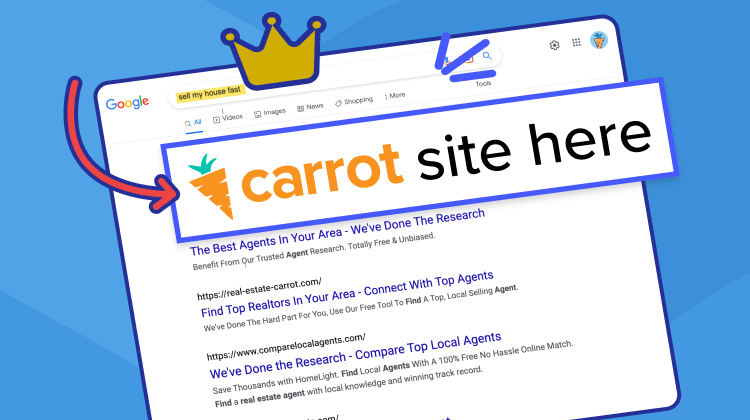
If you happened to check out carrot.com lately, you’ll notice a lot has changed!
Here at Carrot, we’ve been working intently for the past year refreshing things behind the scenes. We’ve been going through our site, organizing, rebuilding pages using our new Visual Editor, and on top of all of that, updating the Carrot look and feel to better reflect the Core Values that we live and breathe by!
Bright colors and fun illustrations embody the Carrot spirit and our mission to add humanity to business and help you regain time for the things that matter most in life.
But don’t worry; we are still the same great product and nothing will change how you use Carrot in your day-to-day workflow. You’re going to continue to receive the same great service you’ve always gotten from us and a promise that we will always do our best for you!
Being design-led is a smart investment
But why a design refresh? The reality is that design-led companies do better in business. Many people have calculated the ROI on design and there is a lot of data to back it up. According to the McKinsey Quarterly, who created their own design index to measure the success of design-led companies, companies that invested in their design had 32% higher revenue growth and 56% higher shareholder returns than their counterparts.
According to the Design Management Institute who also measures the ROI of “design-centric” companies, there was a 211% return over the S&P 500. According to a report by IBM, design-thinking resulted in a 301% ROI.
What does it mean to be design-led? There are a lot of definitions out there, but for Carrot, it means we prioritize the people we serve. We value constant iteration and improvement in our product, always focusing on the customer needs first. We wanted to make sure that our look and feel reflects our Core Values and our design-led company philosophy.
The Carrot Core Values are: Be a Beacon of Positivity & Possibility, Have Fun & Be Different, Take Initiative & Show You Care, Craft Amazing Experiences, Adapt, Evolve, & Always Improve and Add Humanity To Business. These phrases bring to mind design that has energy, dynamic colors and lots of fun and creativity!
What does this mean for you? We want to continue to grow as a company and bring our product to as many real estate professionals as we can because we believe in our message about regaining time back for the people we serve. This design refresh means that we are committed to always growing, innovating, and bringing the best product we can to our members.
Oh! And since our story has evolved over the past few years, we thought it was about time for a new video to help tell it!
The updates to the Carrot Visual Language
There are a lot of things we did to the Carrot look and feel in order to embody our Core Values visually.
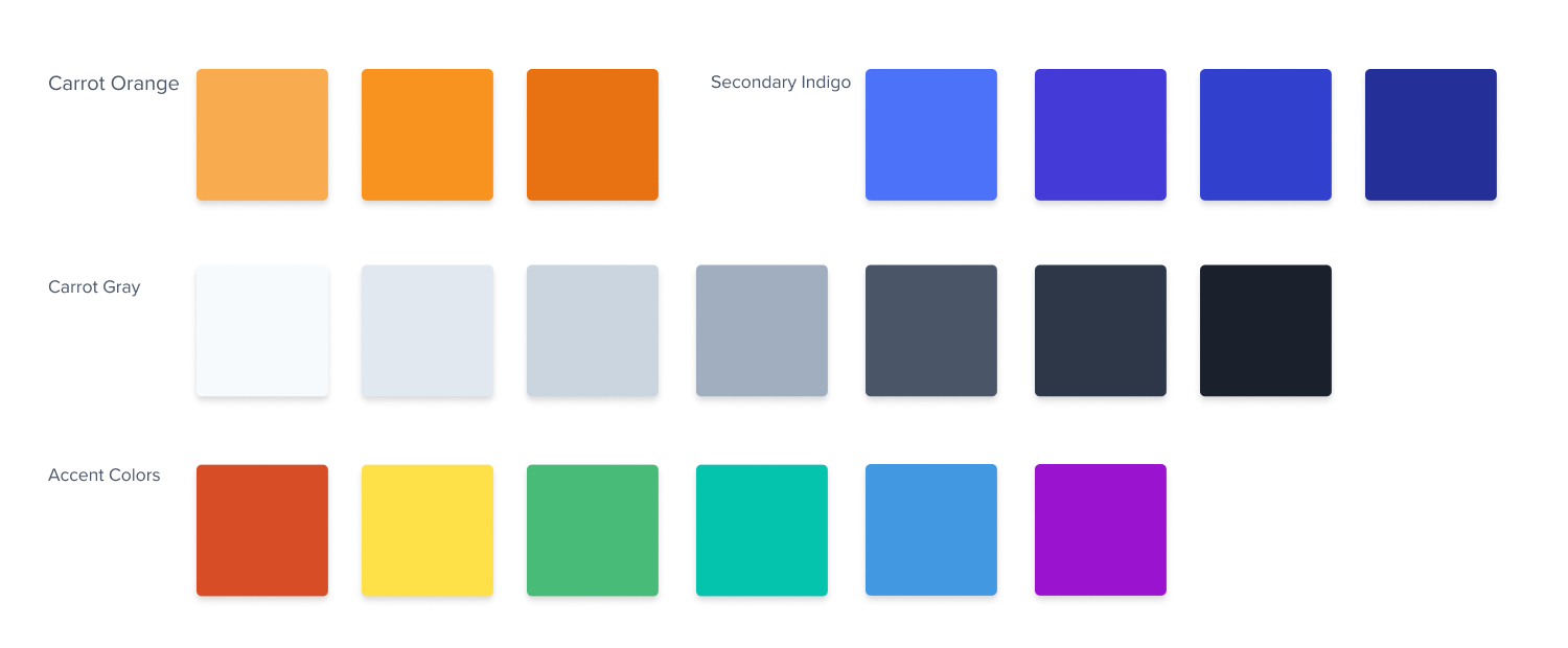
We started with the color palette; we added more complementary tones and more fun and energizing options.
Our previous color palette was a bit limited and used a lot of dark gray and black tones. Dark gray and black is great in a lot of contexts, but it didn’t complement our signature orange as well as we wanted anymore.
The new palette is more robust with more bright options that all work together utilizing complementary colors. We also added tints and shades to round it out and give the design a look with more depth and a brighter tone.
We refreshed the logo.
The carrot logo is still the mark that you know and love; we just removed the gradient and updated the carrot top color with our new Carrot teal! This new teal directly complements our signature orange on the color wheel.

Personal touches matter in our business, and we wanted to show that in our designs too.
We replaced generic stock photos of software and dark overlays that had started to look drab with bespoke illustrations, colors, and textures utilizing our new color palette to convey the energy and positivity that we already exude.
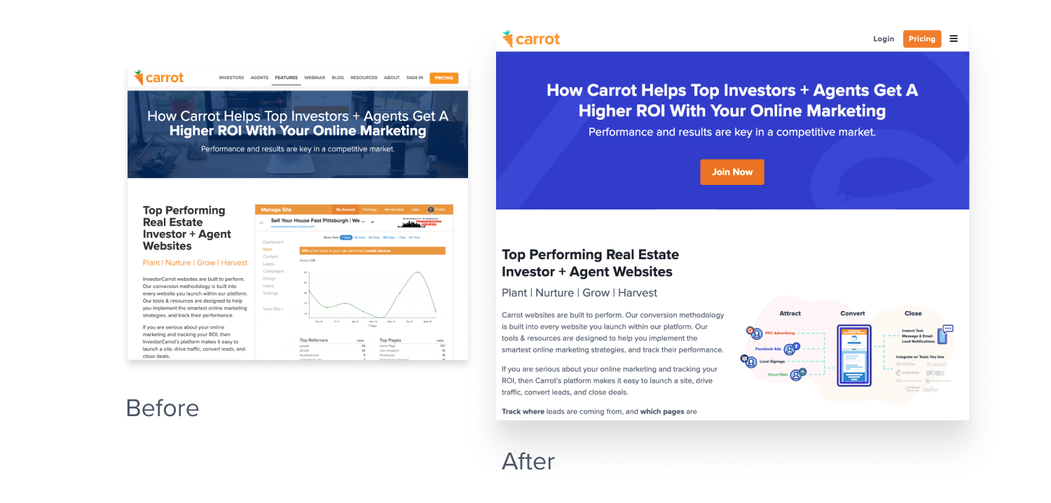
We gave our illustrations and icons a facelift to better represent the concepts behind our software.
We value clarity and creativity and wanted it to shine, so we made some custom Carrot Buds to show our team spirit and the trend just grew from there. Our new digital Carrot Bud is our Carrot team mascot! He leads the way through our software with a little flair, adding some fun moments throughout the site.
From a practical perspective, utilizing illustrations to demonstrate our product offerings has a more contemporary vibe, doesn’t require we update imagery every time there is a new device released, and can help us more easily emphasize the parts of the software that we are trying to highlight.

A little bit of effort goes a long way
How is this relevant to you? Many small companies don’t think their brand matters or that they can focus on other areas of the business and be successful. This is true, but putting even a little bit of effort into your brand has a lot of benefits.
- A thoughtful brand builds credibility. We’ve all been to those websites that are poorly designed, and we don’t trust them. By not putting effort into what your brand looks like, it paints the picture that you don’t care about other aspects of your business either.
- A clear message makes everyone’s job easier. If your vision and core values are clearly laid out, then your whole team can get behind it and your unified message means marketing and advertising is in alignment with the rest of the company.
- A unified vision builds brand advocates. Think of the brands that you love. Have they put energy and effort into their messaging, look and feel? We all have brands that we support and those companies have put a lot of thought and time into how they are presented to the world in order to keep people loyal. Your company should be no different.
- A well-designed brand drives a higher price point. The service you provide is obviously important, but if you can nail your brand from a messaging and design perspective, more people will value what you offer and will pay a higher price for it.
How to get started with refreshing your own brand
A design refresh can certainly seem overwhelming, but it doesn’t have to be. Even putting a little effort into a few things can bring great results.
- Think about your business’s mission and vision. Write it down, share it, edit it and hone it in. This is the foundation of your brand. Until you think about this, you won’t be able to nail the visuals. There are a lot of great resources out there about writing this statement.
Hubspot has some great examples. - Once you have your mission and vision completed, take a look at your logo and color palette. Do they align with your company statements? Do they represent how you want your company to be viewed? A really great logo is usually simple, easy to read, and works in multiple sizes. You can have versions that can be used to post to social media or print on letterhead. Many successful logos are just typography and don’t even have any imagery associated with them.
- Once you have your updated mission and vision, logo, and color palette, you can take it a step further and think about the types of photography you might want to use to represent your brand. Don’t be afraid to source stock photography on your website and have some fun!
All of this can certainly be overwhelming, so don’t be afraid to hire a professional to help you. We have a Design Refresh Service or a full Concierge Setup to help you get your site updated and in alignment with your company brand!
Plus much more!! Check out the other services Carrot has to offer to help our members generate more leads in our new marketplace.
Have you checked out our new website? We’d love to hear what you think!

