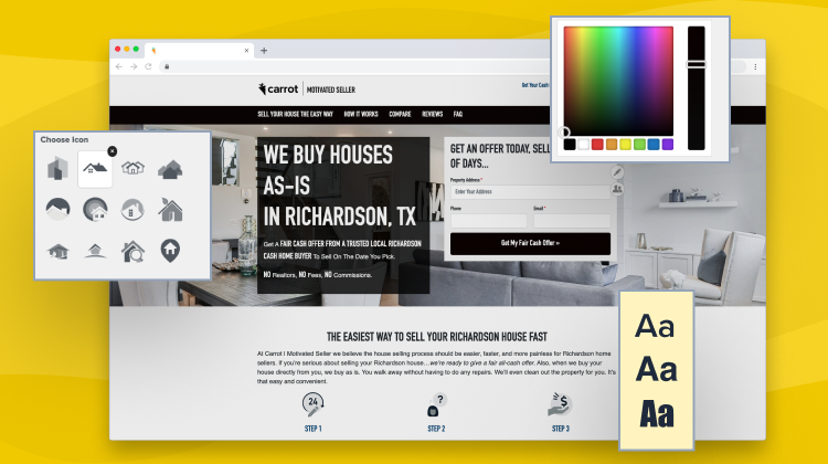
If you’ve ever thought…
“Geez, this looks like every other Carrot website design in my market – how can I make myself look different from the others while still maintaining the awesome conversion rate that Carrot websites provide?”
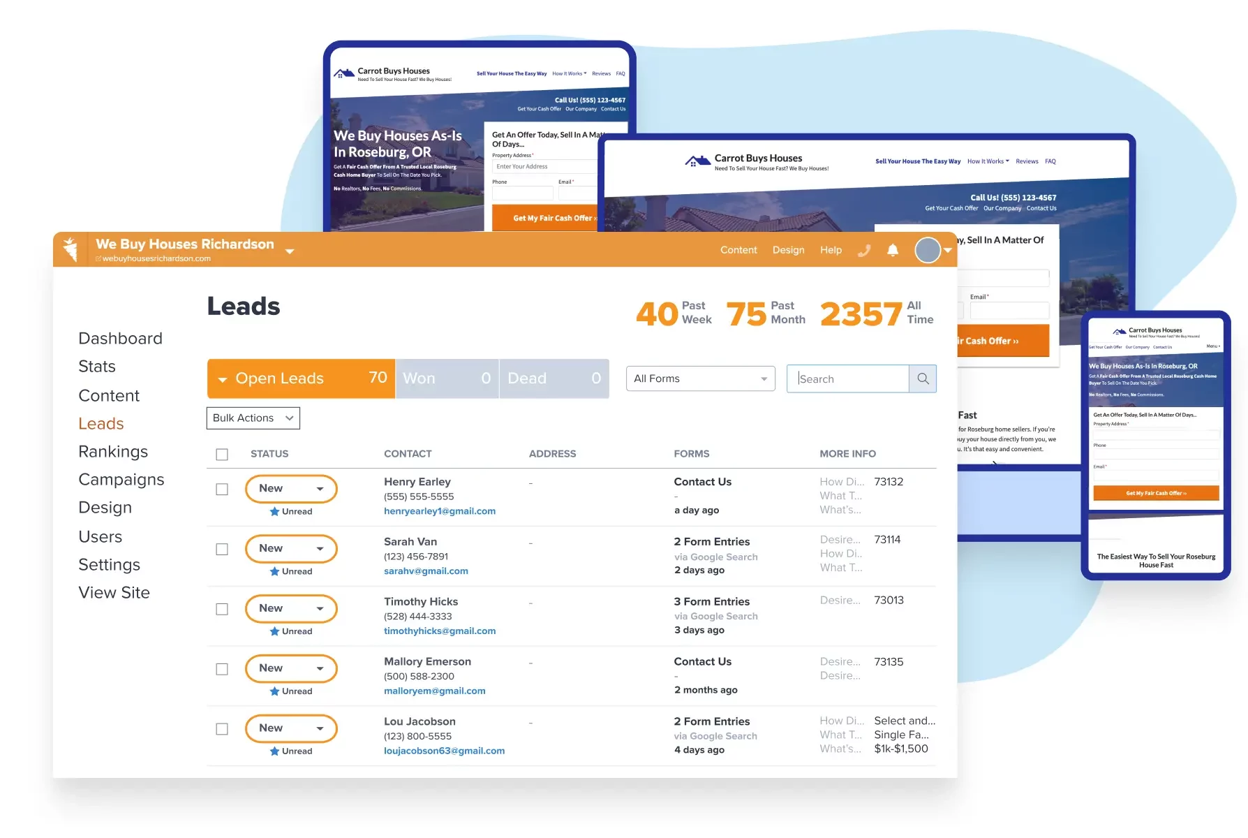
Demo Carrot: How many deals are you losing to your competitor’s website?
Take a Free DemoThen, you’ve come to the right place! We have 1000’s of members, many of whom are in competitive markets and generate hundreds of leads monthly. They close multiple, multiple deals each month, as well.
To the lead-converting glee of Carrot members, we prioritize conversion optimization over aesthetics. To some, that might seem like a bad idea.
After all, don’t the two always go hand in hand?
Not necessarily.
Carter Steph is proof. Carter switched from an $8k “pretty” custom website to Carrot and saw his closing rate go from 7% to 20% within a few months. Read his story here.

We have been in business for years and have always had a web presence. We switched to Carrot this month and have already seen a huge improvement in our click-through rate, but more importantly we have more leads being generated by form fills then we have ever received. And we’ve only had our new website up for 7 days!!
– Carter Steph, 1-800-2 Sell Homes
Even conversion testing giant, Crazy Egg, claims that “ugly” websites often convert better than their prettied-up counterparts. That’s not to say that we’ll provide you with an ugly website that converts well; it’s simply to illustrate that conversion optimization should trump website aesthetics when choosing a website design platform.
Fortunately, at Carrot, you don’t have to choose between the two – on our real estate investor websites and our real estate agent websites, we’ve found the perfect balance between conversion optimization and beauty.
Here’s a basic, nothing-fancy website with an “at-time” 25% conversion rate:

But if tomorrow someone forced us to choose between giving our customers high conversion rates or designing beautiful websites, we’d immediately choose performance.
Often, people choose a website based only on how it looks rather than how it converts, and we think that’s a massive mistake. You’re in business to make money, not just to look pretty, and, for our members, that’s what we help them do – build a sustainable and predictable business.
We’re not Wix, WordPress.com, or SquareSpace—and our members, as well as we, are proud of that differentiation.

We ran a test a few years ago and we had double the conversion on Carrot verses LeadPropeller and our custom site.
– Jason Bible, Houston House Buyers

“I blew $40k unfocused and doing all kinds of marketing in my first year… then I focused on Carrot and Evergreen marketing and after a year of focused work did my first $100k month.”
– Adam Mitchell – Dallas, TX “Home Buying Guys”
There are 100’s if not 1000’s of different ways to make your website stand out from others.
We wanted to give you the top changes you can make (whether you’re an agent or investor) in about 10 minutes that will differentiate your business from the others in your market without sacrificing a high conversion rate. Check out our tutorial video or keep reading to learn more:
Note: This article is for real estate investors and agents. The differentiation recommendations below can be made to an Agent or Investor’s website.
Website Design Changes
1. Choose a Website Theme 2 Minutes
We have eight different website themes (or designs) for our members.
All of these convert to our standards (we’ve tested each and every one thoroughly), and the one you choose should be a matter of preference.
Here are your options. It takes less than 2 minutes to choose a new website theme.
8 Different Design Templates to Choose From
Mahogany – Our Latest Premium Design! (For Grow members)
Stand out without losing the performance. Our latest Premium Design Mahogany features clean, modern lines, big, bold, easy-to-read text, and space to emphasize all of your content. Instantly separate yourself from others in your area with a few clicks.
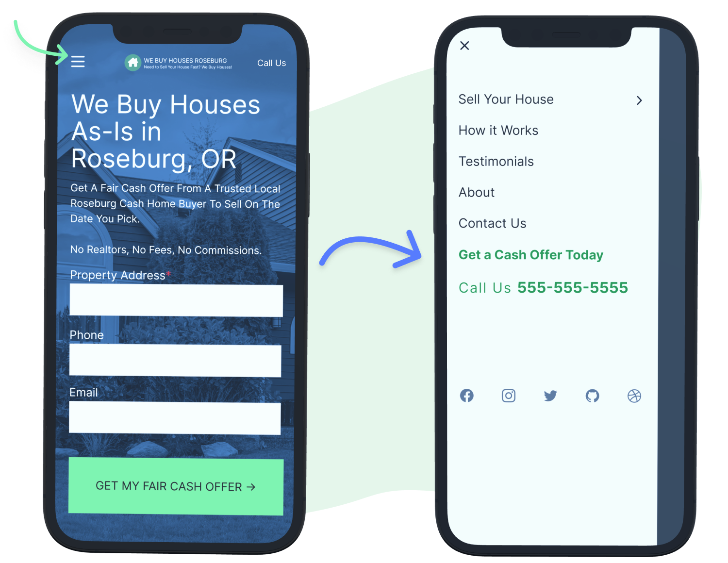
Aspen Design (For Grow members) account for 5.14% of Carrot member websites
We’re officially introducing a new, full-featured design for those of you who crave a distinguished, modern (and, yes, still high-converting) website.
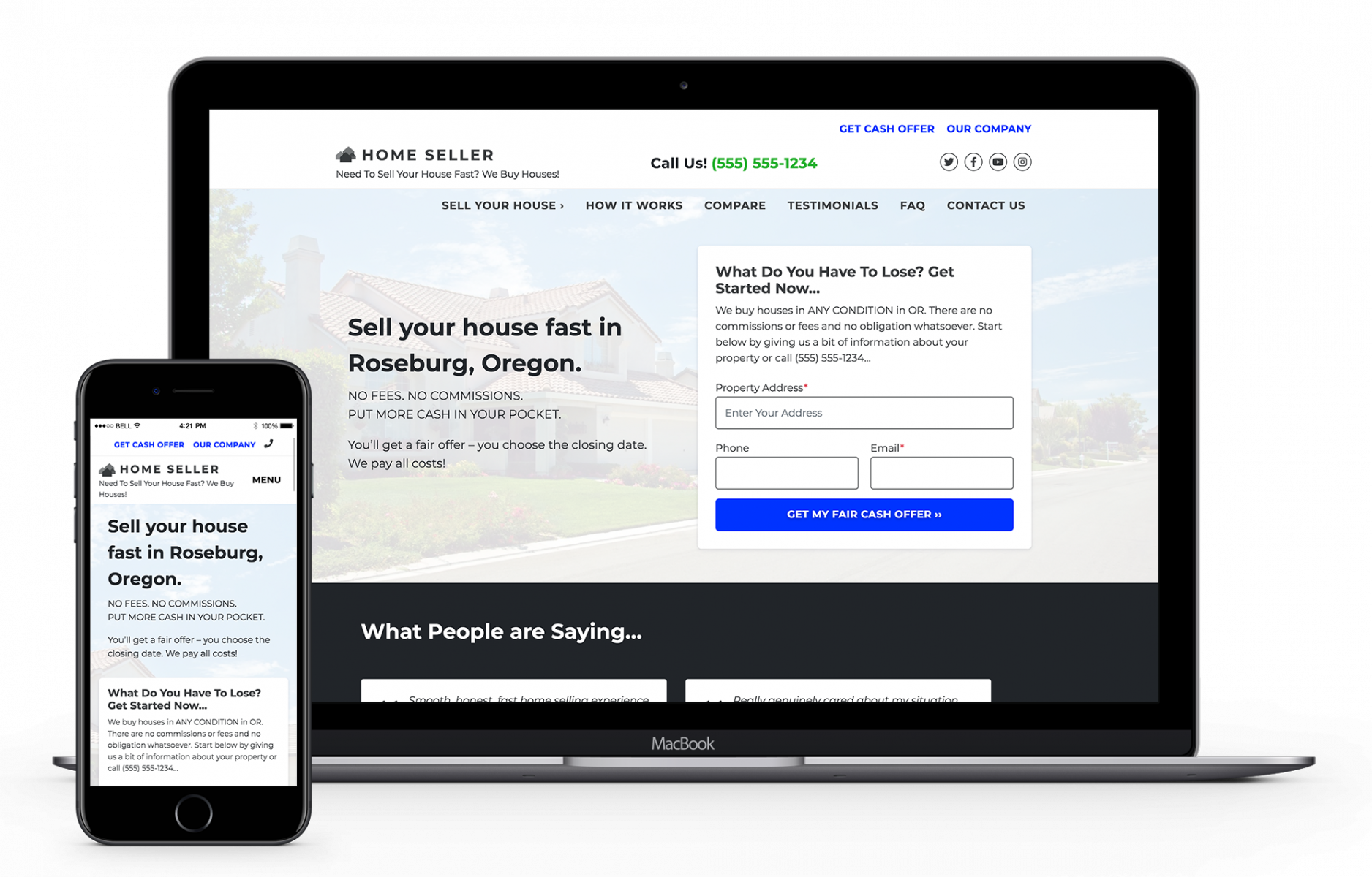
Hemlock (For Grow members) accounts for 11.31% of Carrot member websites
A more modern “angle” on our highest-performing designs. Test this one to see if it inches your performance up and gives you that differentiation you’re looking for.
To learn more about changing your website theme, go here.
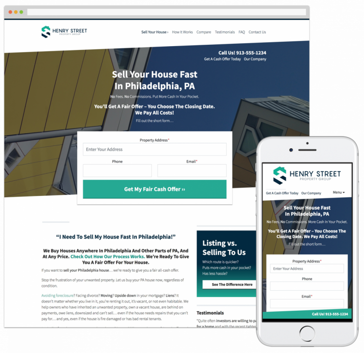
Oak – Accounts for 3.49% of Carrot member websites
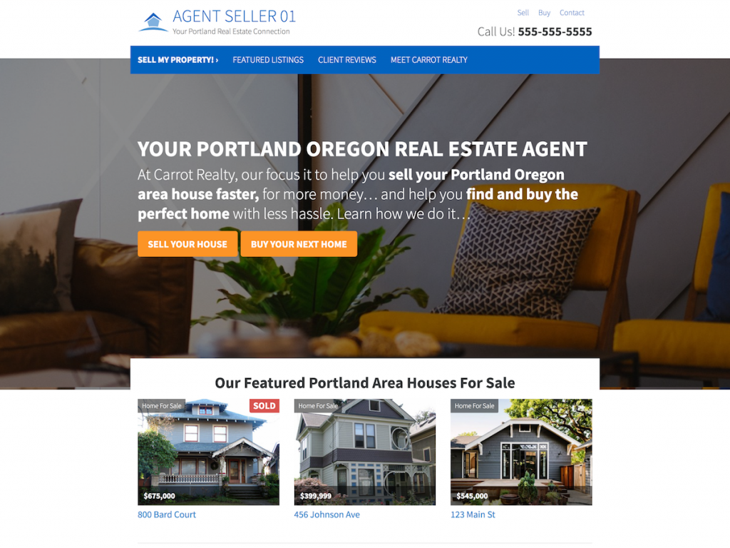
It is a design with a striking image and a clear CTA area, and it is amazing on mobile. It’s the default design for Agent websites.
Juniper – Accounts for 12.81% of Carrot member websites
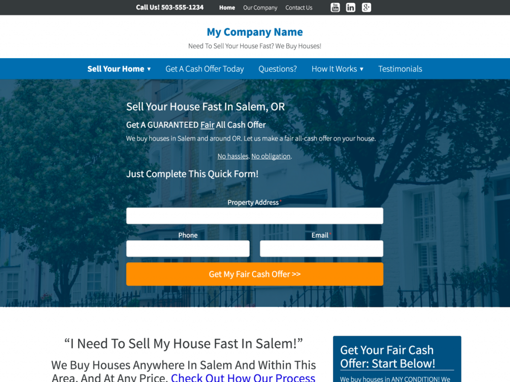
Our 2nd most popular design features a centered CTA area and outstanding mobile performance.
Cedar – Accounts for 7.55% of Carrot member websites
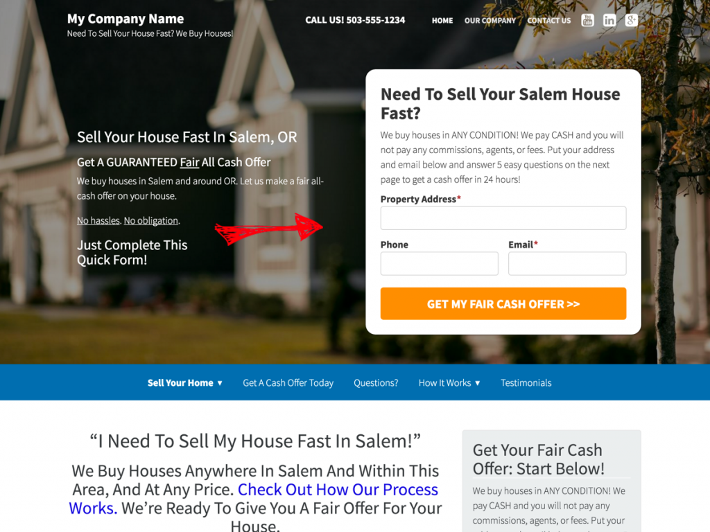
Large and striking hero image with our right-aligned CTA area, with the navigation below the hero. Ideal for people with a white, transparent background logo.
Douglas – Accounts for 54.26% of Carrot member websites
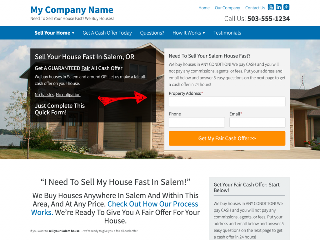
This is the default style for all investor websites, but it takes a few seconds to switch to one of the other ones on this page.
Madrone – Accounts for 5.34% of Carrot member websites
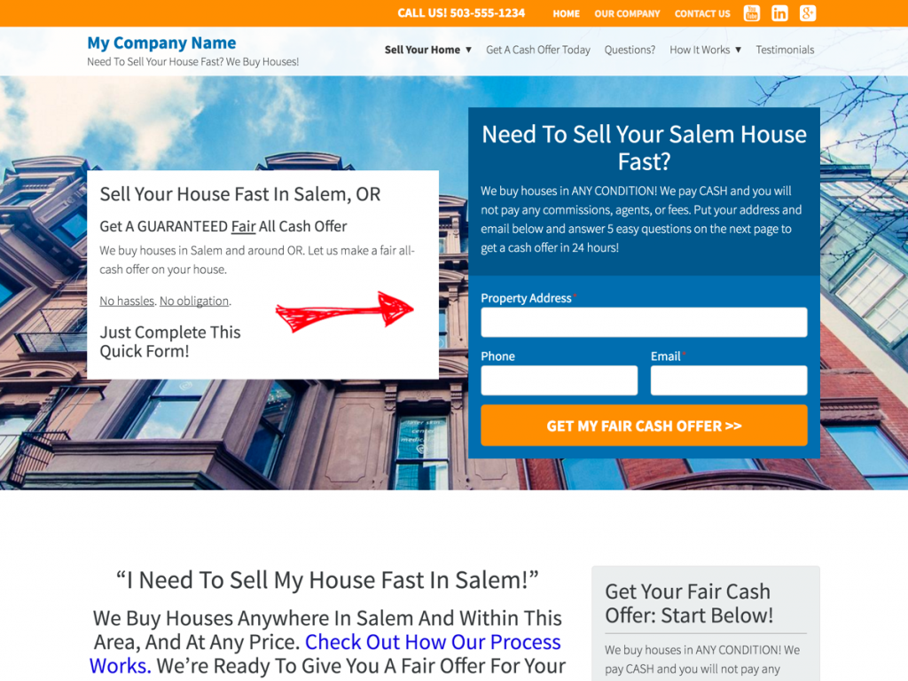
A different take on our Douglas design, just with a reimagined header design to freshen things up on mobile and desktop.
Branding Changes
2. Upload a Logo 4 Minutes
Creating a clean and reputable logo can help differentiate your website from other Carrot members and add loads of credibility. As it stands, only 36% of Carrot customers have uploaded a logo to their website.
This means that uploading a logo to your Carrot website design will help you stand out even more.
The more unique and reputable your logo is, the more it will differentiate your website and build credibility.
Here are a few examples of Carrot members who use a logo to build credibility and differentiate their website.
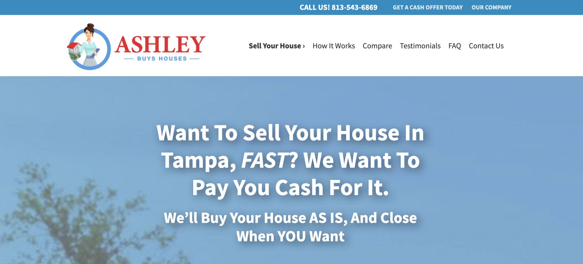
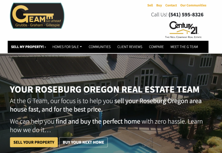

Here’s a gif showing how easy adding a logo to your website is.

To learn more about adding a logo to your website, go here.
3. Adjust Website Colors < 2 Minutes
Colors have a deceptively significant impact on differentiating websites that – at their foundation – look similar. Just consider how different these Carrot websites look with the same theme but different colors.

The Carrot members that differentiate their website the most don’t only change the color, but they match the color of their logo to the color of their website. In other words, they create their brand colors and then add them to their Carrot website design.
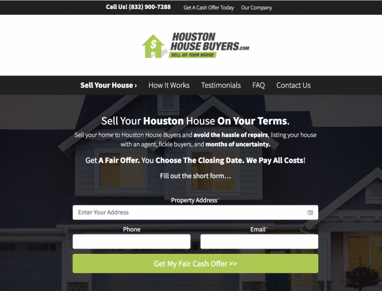
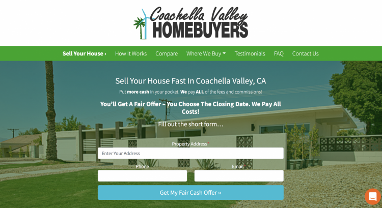
And here’s a gif showing how simple it is to change the base colors of your website.

To learn more about changing the colors of your Carrot website, go here.
4. Use A Branding Icon 3 Minutes
If you don’t have the time or finances to create a custom logo for your website, no worries—you can simply use our pre-made branding icons to differentiate your website.
Plus, only 8.5% of Carrot’s websites use branding icons, so you’ll stand out from the competition quite well.
Here’s an example of what it can look like.
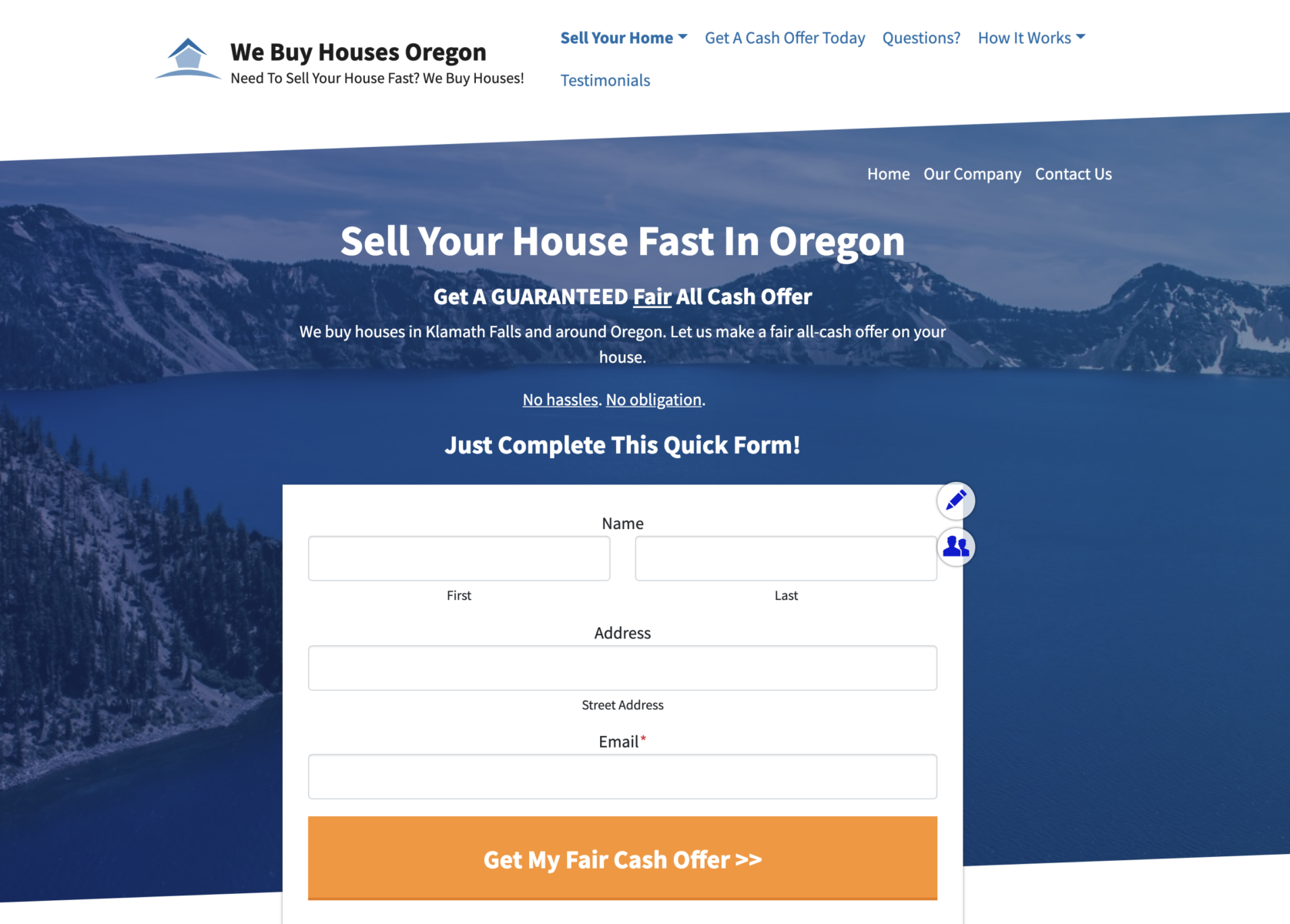
Here’s a GIF showing how you can add a branding icon to your Carrot website design in just a few minutes.

5. Change Button Color < 2 Minutes
Similar to the overall branding colors of your Carrot website, the button color can help differentiate your business and even increase the chance of conversions.
We found, for instance, that changing the color of the button on one of our member’s websites from black to orange increased conversions by 29.55%.
The trick isn’t to change your button color to orange but to a color that stands out relative to the other colors on your homepage. Choose a color for your button that is either sparse or nowhere else on your homepage.
Something like this from House Heroes…

Or Krista Buys Houses…

And here’s a gif showing you how you can change the button color of your CTA.

To learn more about how to change the color of your CTA button, go here.
Imagery Changes
6. Update Hero Section 5 Minutes
The hero section image is the quickest and most significant visual update you can make. As a Carrot member, you can also quickly and easily customize the hero image on your website.
We recommend avoiding stock photos if you want to stand out from other Carrot members. Try using a photo directly from your market – something your market will recognize and think, Okay, I’m in the right place.
Consider the look and feel of these personalized hero photos on Carrot member websites.
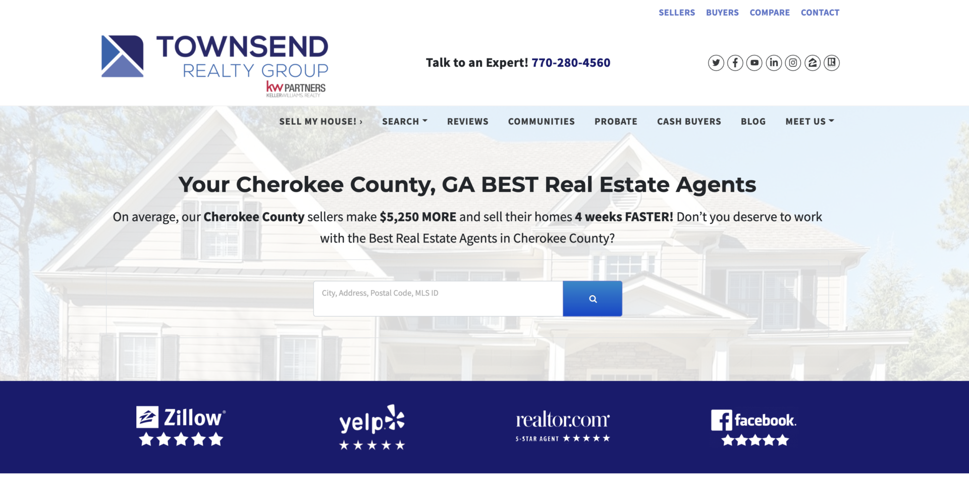
Townsend Realty Group
Learn how Townsend Realty Group is achieving predictable business growth with Carrot at a 25% conversion rate.
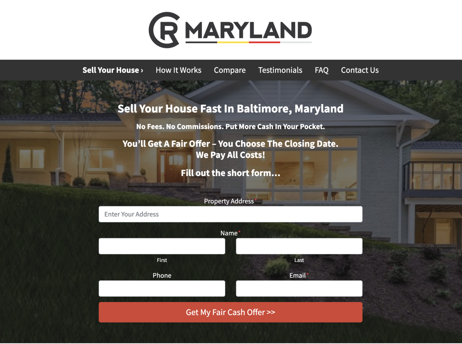
Example in Baltimore – Juniper Design Template

Example in Louisville – Aspen Design Template
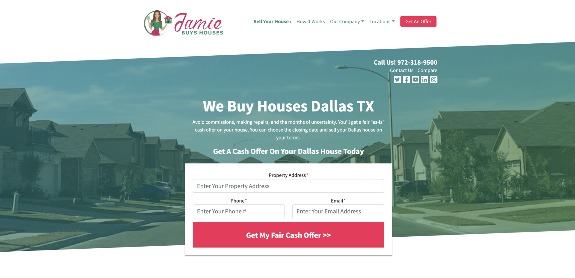
Example in Dallas, Texas – Hemlock Design Template
And here’s a gif that shows how easy it is to add your local image to your Carrot website design.

To learn more about changing your hero image, go here.
7. Add Local Images 10 Minutes
Like the hero section on your website, avoid stock photos and generic images throughout the rest of your website unless you are adding local or USA maps. To build trust and credibility with your target market, try using real photos of houses in your market. Place them throughout the website to make it clear to visitors that they’re in the right spot and that you’re the person to help them. To enhance the visual appeal of these images, consider using a photo editor like Picsart to optimize and polish the photos before uploading them to your website.
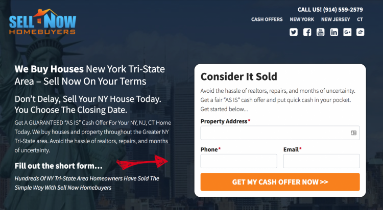
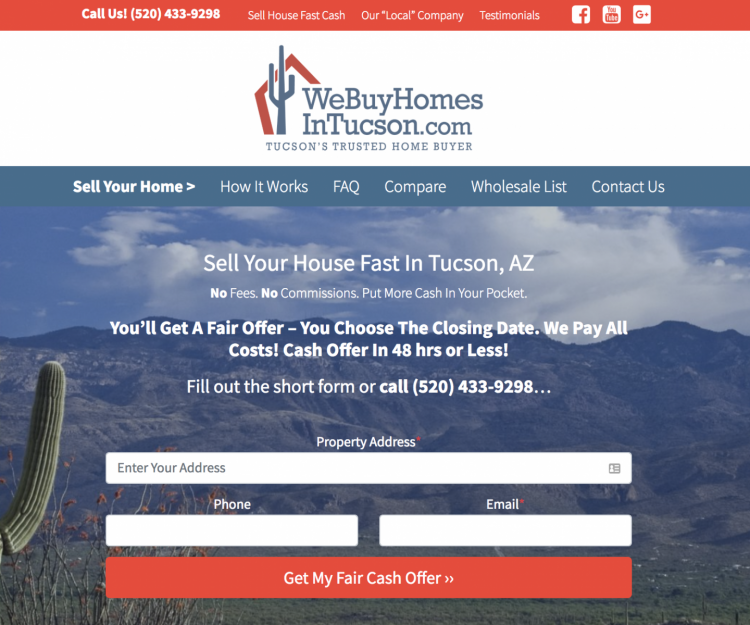
Consider how these Carrot members sprinkle personalized photos throughout their
websites.

The Beckham Group
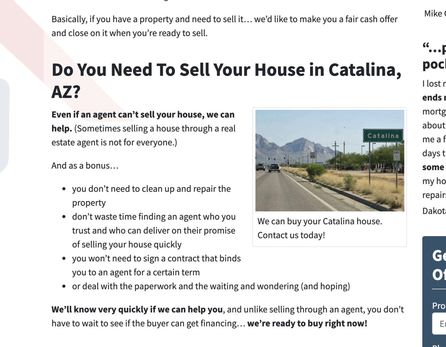
We Buy Homes In Tucson
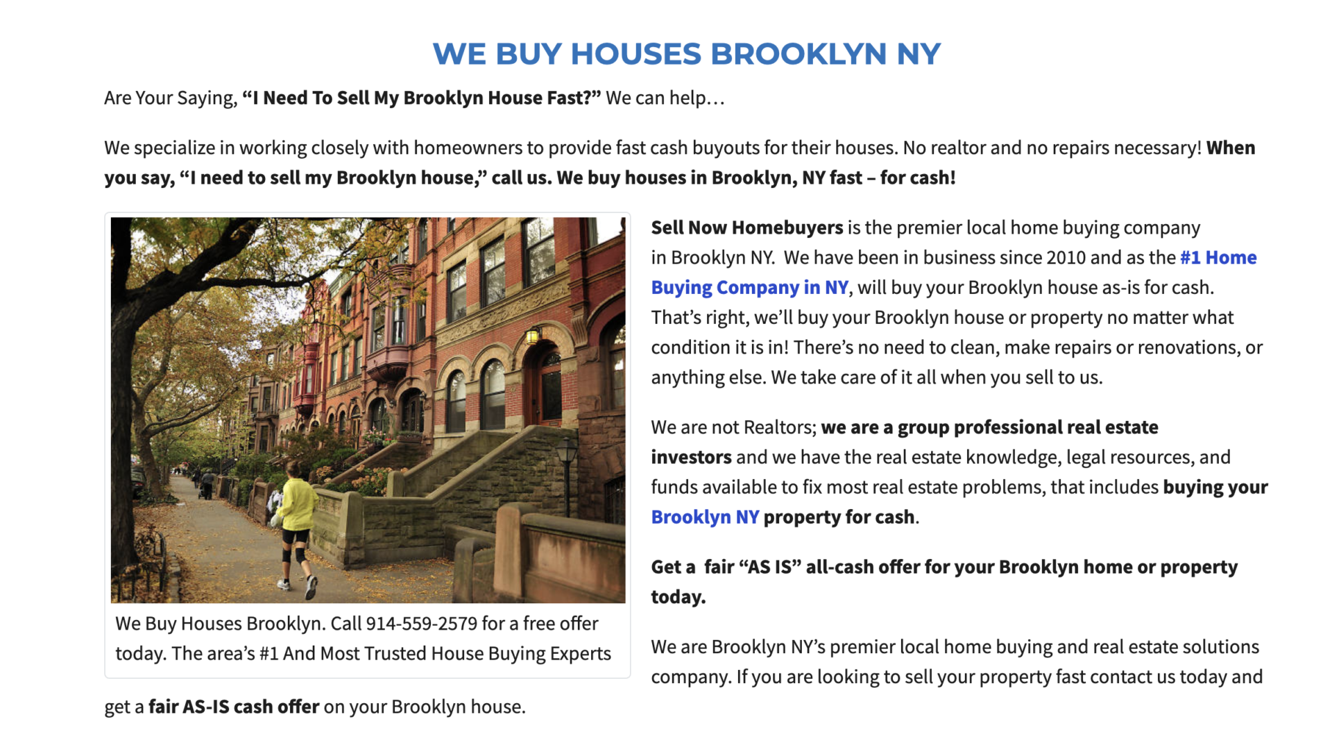
Sell Now Homebuyers
To learn more about adding images to your website pages, go here.
8. Adjust Your Hero Form Layout 3 Minutes
As a Carrot member, you can customize your form section with two clicks of a button (literally). You can easily change to three styles, regardless of your selected website style.
Column / Stacked / Inline


Simply choose the one that best fits your brand image. Each will convert well (we’ve tested them), so the choice is yours.
Go here to learn more about changing your form layout with a few clicks.
Credibility Improvements
9. Add a Credibility Bar 10 Minutes
Adding credibility to your website, whether you’re a Carrot member or not, is critical for your conversion rate. This is especially true in the real estate industry, where consumers try to work with someone they can trust who won’t deceive them.
Our credibility bar option is the perfect way to add a differentiating and trust-building flair to your website. You can use the credibility bar in several different ways on your Carrot website.
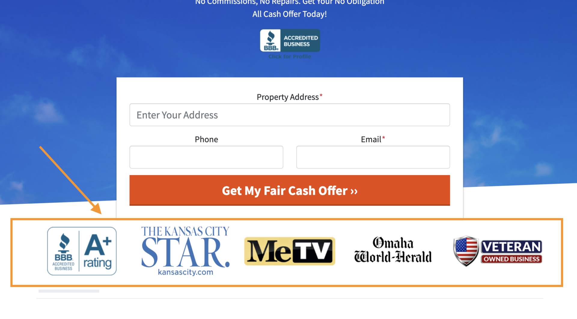
7DaysCash
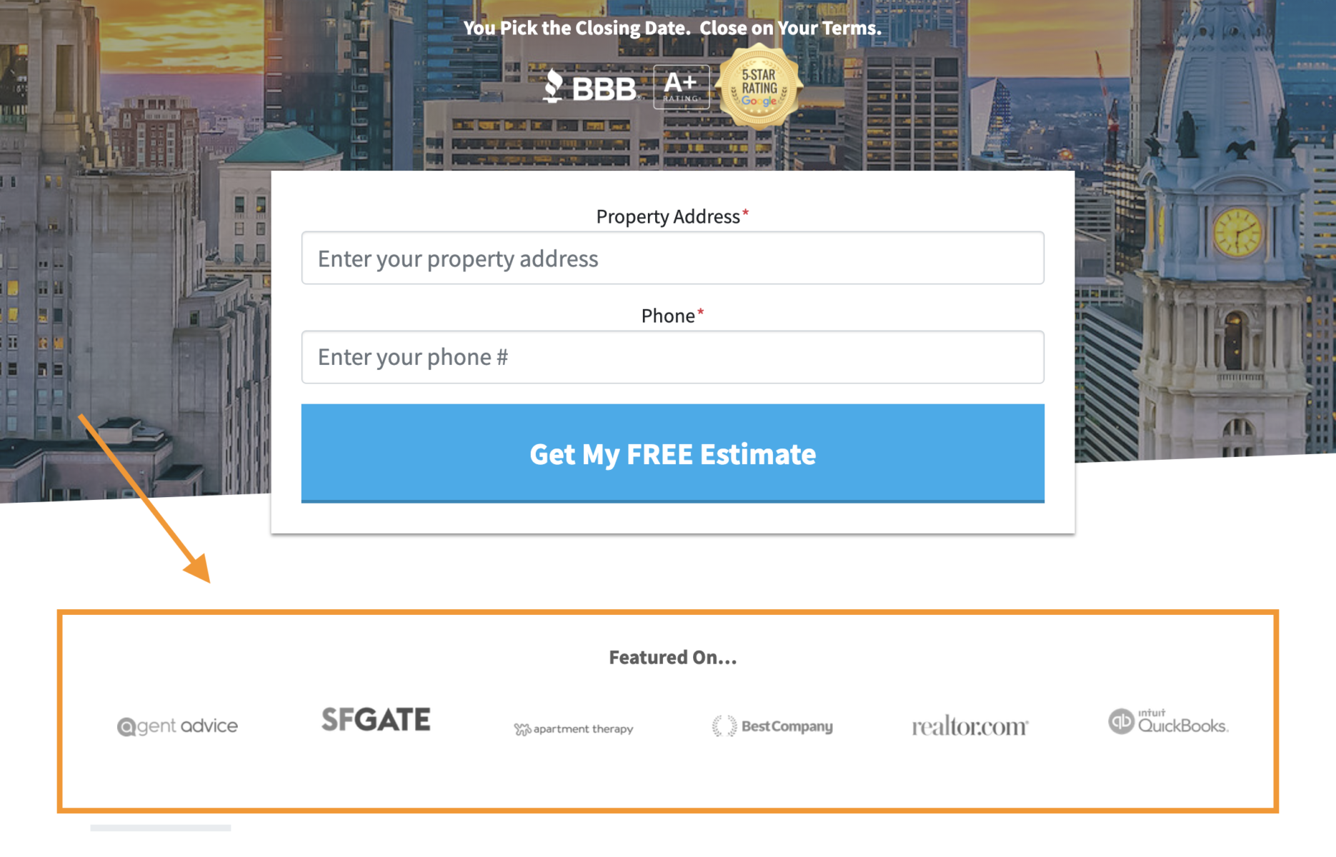
Halo Home Buyers
Go here to learn more about adding a custom credibility bar to your website.
10. Add Testimonials 10 Minutes
The Credibility bar isn’t the only place to add a past customer testimonial to your website – and it’s not the only place you should.
You can also add testimonials to these spots on your website to build even more trust with visitors.
Here are a few different looks, including using video testimonials.
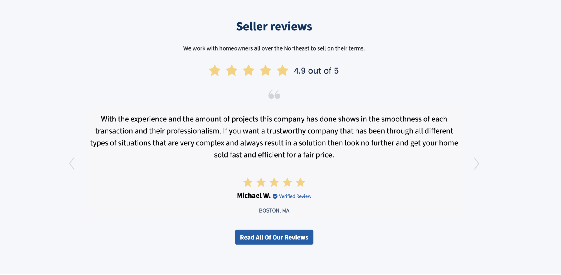
Ocean City Development

GuaranteedCashOffer

Sell Now Homebuyers – Video testimonial
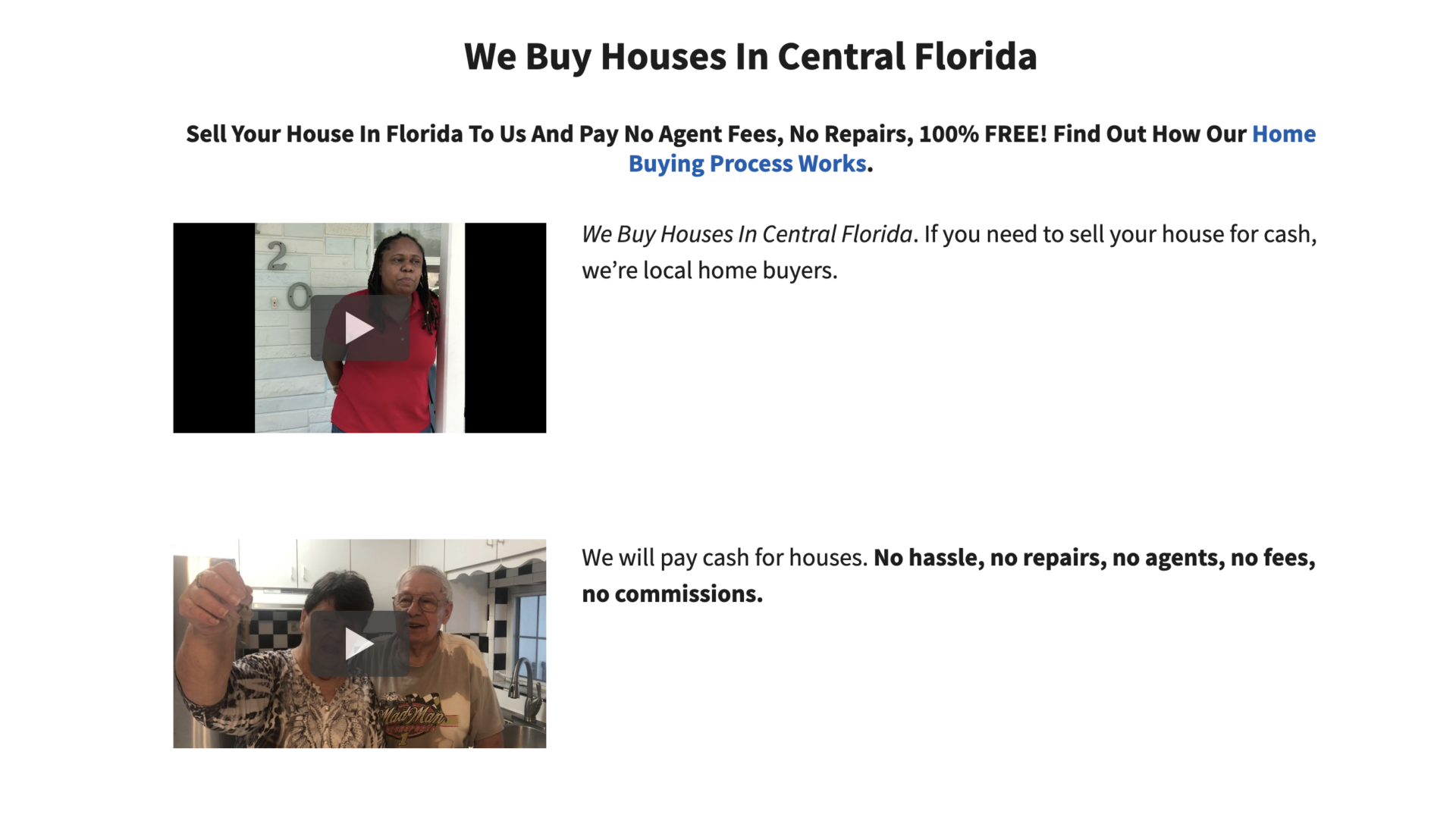
Frank Jr Buys Houses – Video testimonials
If possible, your testimonials should have some, if not all, of these elements:
- Full name of the person.
- Professional title of the person.
- Image or video of the person.
To learn more about adding testimonials to your Carrot website, go here.
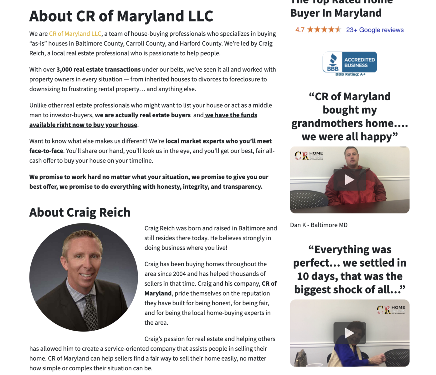
11. Personalize the “About” Page 10 Minutes
When people visit a real estate website, our research shows that the “About” page is the third-most visited tab. You can further differentiate your website from the competition by writing up something personal, adding biographies and pics for team members, and casting company vision.
For inspiration, consider how these Carrot members have customized their About Page.
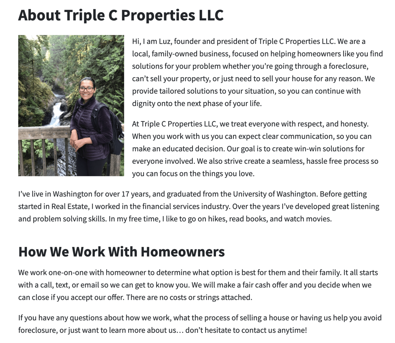
Triple C Properties
12. Add Badges 10 Minutes
Website badges that show what makes your company unique and different from the competition can be a great way to stand out online. For example, a website badge that says “Veteran Owned” or “100+ 5-Star Ratings.”
Here are a few examples.


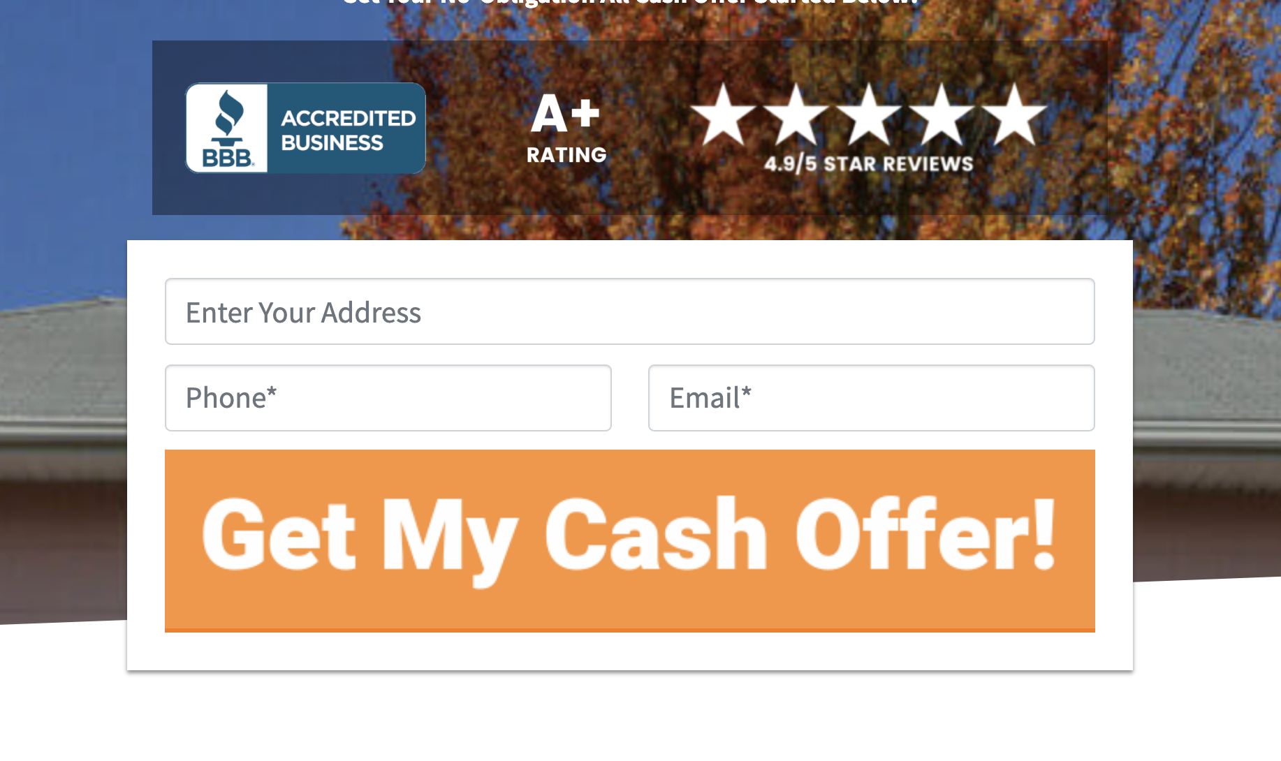
Consider your unique selling proposition for your business and create a badge that expresses that on your website.
With this, you’ll sell or buy stronger and faster than the competition and quickly differentiate yourself from other clutter online.
Easy Editing
13. Visual Block Editor
Like anything in life, there are trade-offs. The “big” low-cost website builders (think Wix, Squarespace, and WordPress themes) chose to go all-in on ease of use and sacrifice performance for their clients. You would save a bit of time, but it could cost you tens of thousands of dollars (or more) from underperformance.
Performance and results and easy editing
At Carrot, we have been all-in on performance since the beginning. We created the easy drag-and-drop Visual editing experience on our websites so that users can enjoy both benefits without sacrificing either.

What the Visual Editor helps you do
A few benefits you’ll enjoy with this powerful Visual Editor include…
- No more switching back and forth from editor to page – now see all your edits in real-time, including your hero section, forms, and more!
- Use Drag and Drop tools to easily create and edit pages with movable and reusable block patterns!
- Make your website stand out visually without having to use any fancy code.
- Enjoy the new “Full-Screen Mode” to have the most beautiful, clean, and simple editing experience possible… without the distractions (try this mode, you’ll love it!)
- SEO Grader updates: 1) Your SEO grade for the page will update in real-time without you having to save the page, and 2) Now get SEO grades for multiple keywords for the same page! (this is huge)
- No loss of page speed
… and more
Here are some examples of designs you can easily create with the visual editor…

MRR Property Solutions

Myrtle Beach Home Buyers

Capstone Homebuyers
To learn more about the Visual Editor, watch the tutorial video below or check out our Help Center.
Content Changes
14. Customize Content 10+ Minutes
Your website’s blog represents a phenomenal opportunity to differentiate your business from the competition.
Our Grow Carrot plans provide monthly content for your website, but sometimes it’s worth tweaking these blog posts to fit your market and business positioning better.
Here are a few ways to quickly tweak them to fit your target market better.
- Localize the tips and advice.
- Add a bit of your advice.
- Add your tone of voice to the article.
Consider Fox Realty Group – a Carrot member – and how they’ve customized their blog content without getting too complicated.
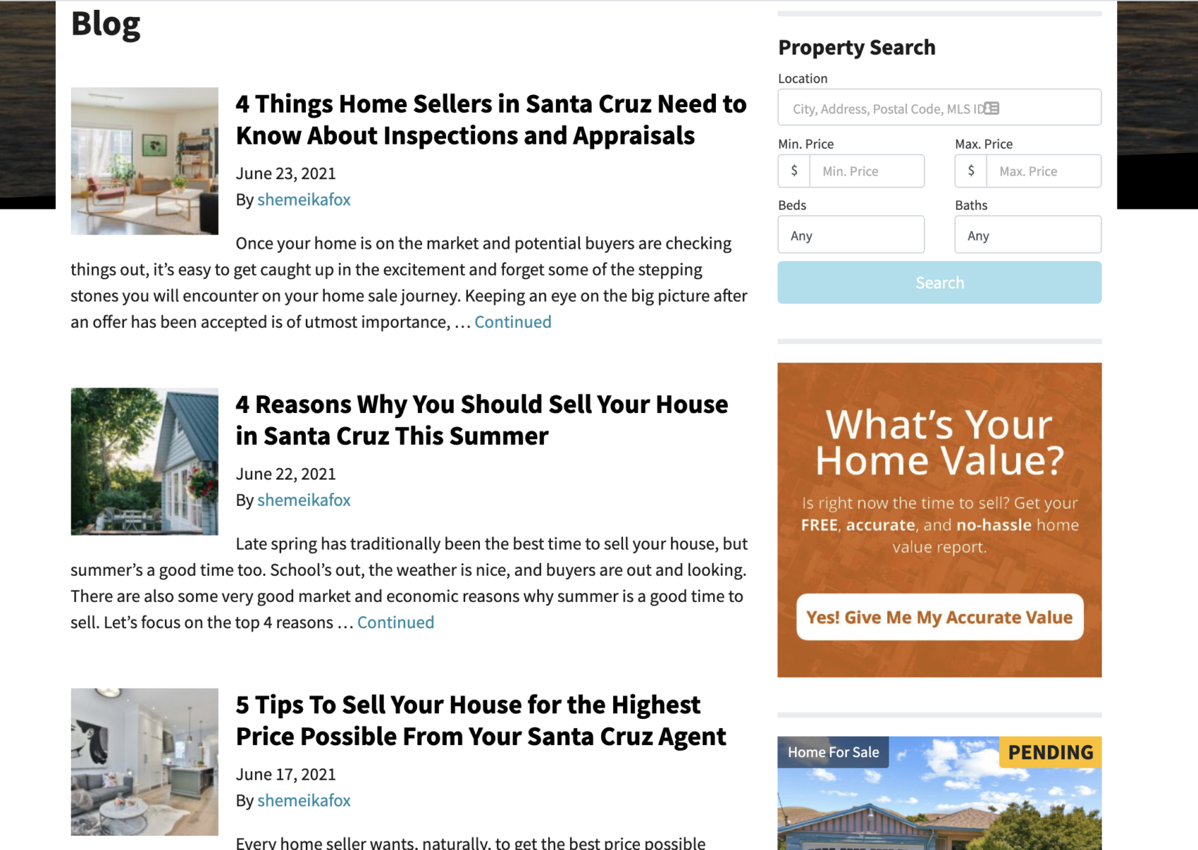
Fox Realty
So if you have more money than time, another way to differentiate your Carrot blog is by upgrading your plan.
Conclusion
We’re not going to sugarcoat this… Customizing your website takes work. Unless you outsource your website customization, you’ll need to invest time.
You now know how to customize your Carrot website design without sacrificing aesthetics or conversion rate. Use these 14 ways to differentiate your website and stand out from the competition – even if that competition consists of other Carrot members.
Many people don’t customize their website with the above simple changes, so if you do, you have a far better chance of standing apart and cutting through the online clutter – to be seen by your target market faster and more often.
If you don’t have the time to make these changes, check out our Concierge Setup Service, where we’ll do it for you.
Either way, happy customizing and happy converting.

