At the risk of being obvious … as a real estate investor, your business lives and dies by two things.
Number one, your ability to generate leads. Number two, your ability to close deals.
And one way to increase the amount of online leads you get is to…
… do a lot of testing and make your website convert more visitors into qualified leads.
How a small increase in performance can put tens of thousands in “found” profits in your pocket.
An increase in “conversion rate” on a real estate investing website from 5% to 8% means an extra 3 leads per 100 visitors. If you get 100 qualified visitors per month to your site… that’s an extra 36 motivated seller leads per year (3 x 12). If you close on average a deal per every 15 qualified seller leads and net on average $10k per deal… that’s an extra 2 deals and $20k in profits per year.
Just by doing some testing and improving the performance of your website.
Pretty cool eh? That’s assuming NO extra traffic. Free money.
We spend so much time split testing and optimizing our pages here at Carrot because we know so many people go to the web first to get information about buying or selling their house.
According to the 2015 National Association of Realtors Home Buyer and Seller Generational Trends Report, the very first step buyers from all across the generational spectrum take is to “look online.”
In fact, a whopping 43% of home buyers start their purchase process online compared to the second-place first step — contacting an agent — at 15%.
In other words, if you want to meet leads where they are, fill your sales funnel, and start converting like crazy … hands down the best way to do that is online.
A New Page Design We Tested That Yielded Up To 38.54% More Leads
See how and why this page design increased lead flow on some sites up to 38% more…
This post is going to go into a lot of the methodology and “backstory” on how to create a real estate investing or agent page that performs at a high rate. One that converts more visitors into leads than your current website may (for sure your competitors) and one that squeezes out an extra margin of leads and deals without you increasing your traffic (assuming you are getting solid traffic right now).
Below we’ll actually give you the “Stacked Hero” landing page and if you’re not a Carrot member you can even download the raw HTML files to upload and use yourself online. If you are a Carrot member, great! As of our last update, you now have this design available to launch NEW websites within your Carrot account in under 10 seconds with no tech hassle. We like to make your life easy :-)
To do that, I’ll share how our “Stacked Hero” design converted 38.54% more real estate leads than our best performing previous design.
Even better — after guiding you through a handful of optimization principles — I’ll share how you can implement the very same template in your own business.
Let’s dive into the story of why this page design performs so well and the marketing principles that cause most real estate investor websites to perform so bad.
And if you’re NOT yet a Carrot member, download the HTML files of this landing page at the bottom of this page for FREE. Carrot members, this design is now in your account and you can launch a new site with it in under 10 seconds.
Real Estate Lead Generation Today: Thou Shall Test … or Die
If you’re not familiar with Carrot, our business is simple: to help real estate agents generate more leads online. We’re not a real estate company ourselves; instead, we’re an inbound marketing agency built specifically for real estate agents:
This means we’re constantly testing and improving elements on our client’s websites to improve their results.
For the last year we’ve had a mission: to create a lead generating page that could beat our highest performing control.
This meant running tests across a select number of current Carrot websites throughout the country; ones that were getting a good amount of traffic and already converting leads. In fact, we ran 7 months’ worth of tests and dozens of page variations to tens of thousands of motivated house sellers and buyers.
This sort of real-world optimization gives us both a baseline to work from as well as data-driven insights most real estate agents simply can’t generate on their own.
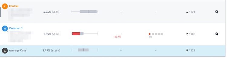
Our testing software informs us when we have a clear winning test variation. You can see below what one of those looks like:
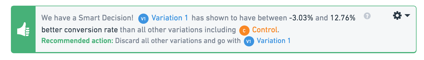
Our testing software lets us know when we have a winning test variation
Before jumping into the details of our tests themselves, let’s start with some of the guiding principles of online lead generation.
Online Real Estate Lead Generation Principles
To keep things as clear as possible, three principles are essential to your online lead generation: (1) your goal, (2) your content, and (3) your form.
1. Your Goal
By far, the biggest mistake you can make on a lead generating page — regardless of the industry — is complication.
Simplicity isn’t just essential to online lead generation. It should be the cornerstone of all your marketing, period.
Why?
Because as Harvard Business Review reports — after reviewing data from “multiple surveys of more than 7,000 consumers” as well as “interviews with hundreds of marketing executives and other experts around the world”:
The single biggest driver of stickiness [that is, a lead or customer’s likelihood to follow through on an intended purchase, buy the product repeatedly, and recommend it to others] was “decision simplicity.”
What consumers want from marketers is, simply, simplicity.
The first step to simplicity is knowing exactly what you want to achieve for each and every piece of customer-facing content you create.
Whether you’re working on a home page, landing page, email campaign, pay-per-click advertising, or even just a physical mailer … you have to begin and end with “a single, all-consuming question: ‘What is your goal … the one, smallest, easiest thing you want your reader to do?’”
As KlientBoost recently put it in their Landing Page Optimization Guide: Find Heaven By Saving Your Visitors From Hell:
Start with your ultimate goal and then … work backwards.
In other words, to increase conversions, your pages need to be ruthlessly free of clutter. Anything that doesn’t move a visitor closer to the one action you want them to take … must be eliminated.
Ironically, this is precisely where most real estate websites fall down. Placester’s Guide to Creating Killer Content for Real Estate Marketing very first “basic note of things to look for in your website/blog design” is:
Keep it simple.
Don’t feel [like] you have to fill all the empty or “white” space on your site with extra icons, or images. Avoid fancy animations and drop down menus. These are more likely to distract users from your content, rather than attracting them to it. Keep the look clean and uncluttered.
This warning comes with good reason.
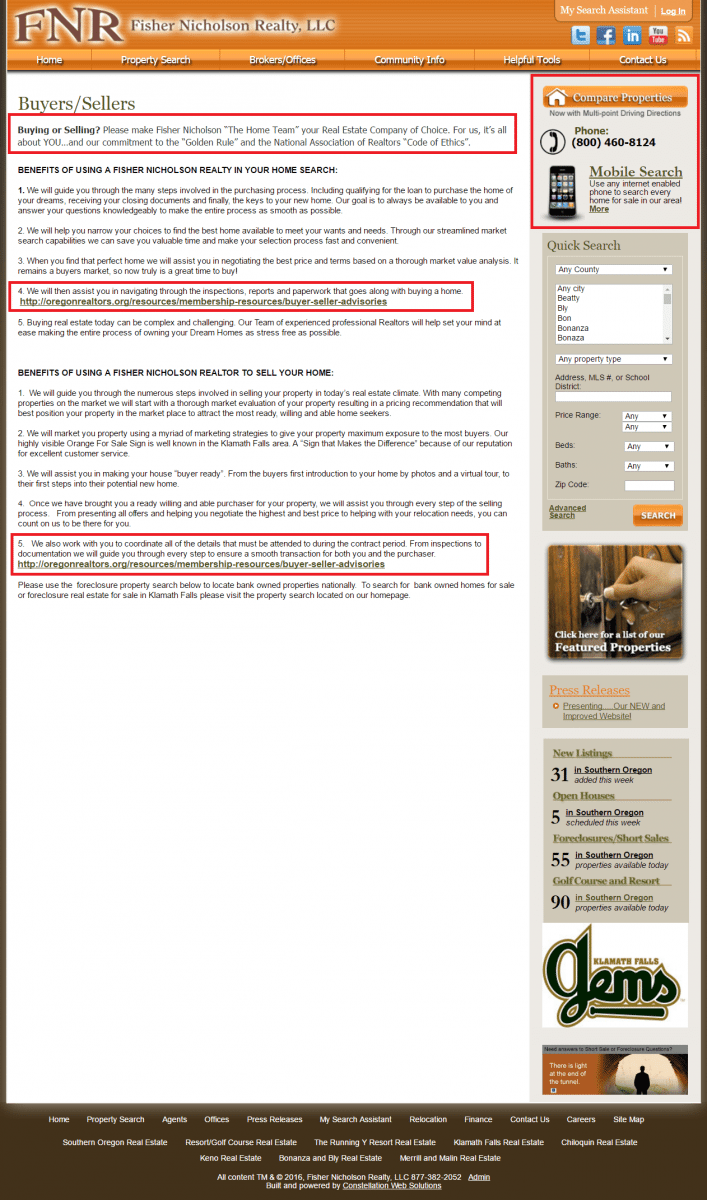
For example, take a look at the following home page for Fisher Nicholson Realty. Notice that there are no less than 22 possible actions a visitor can take (and that doesn’t even include the dropdown menus that appear if you hover over the navigational bar nor the additional 19 options in the footer):
Way Too Much Distraction And Choices At The Top Of This Site
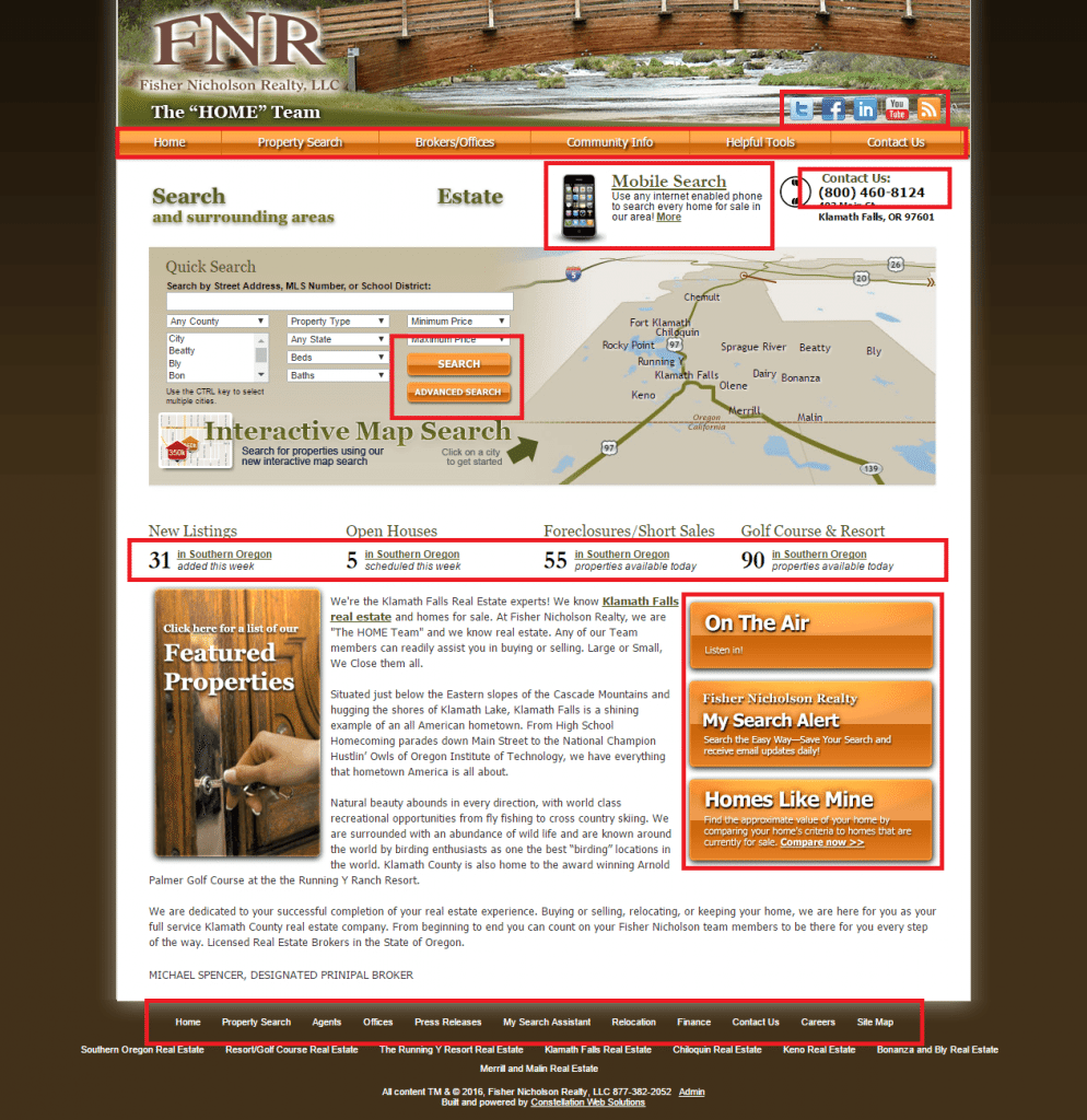
All told, there are a whopping 68 links, buttons, navigational options, and calls-to-action on that one page alone.
Compare that quagmire with our own homepage. Excluding the header and footer, only four clickable buttons exist:
Even better, three of those four buttons send visitors directly to our Pricing and Plans page.
If you’re designing a landing page … things need to be even simpler.
The golden rule is just one call to action.
That doesn’t mean you can only have one button, but it does mean every button you have should guide visitors toward the same, singular something.
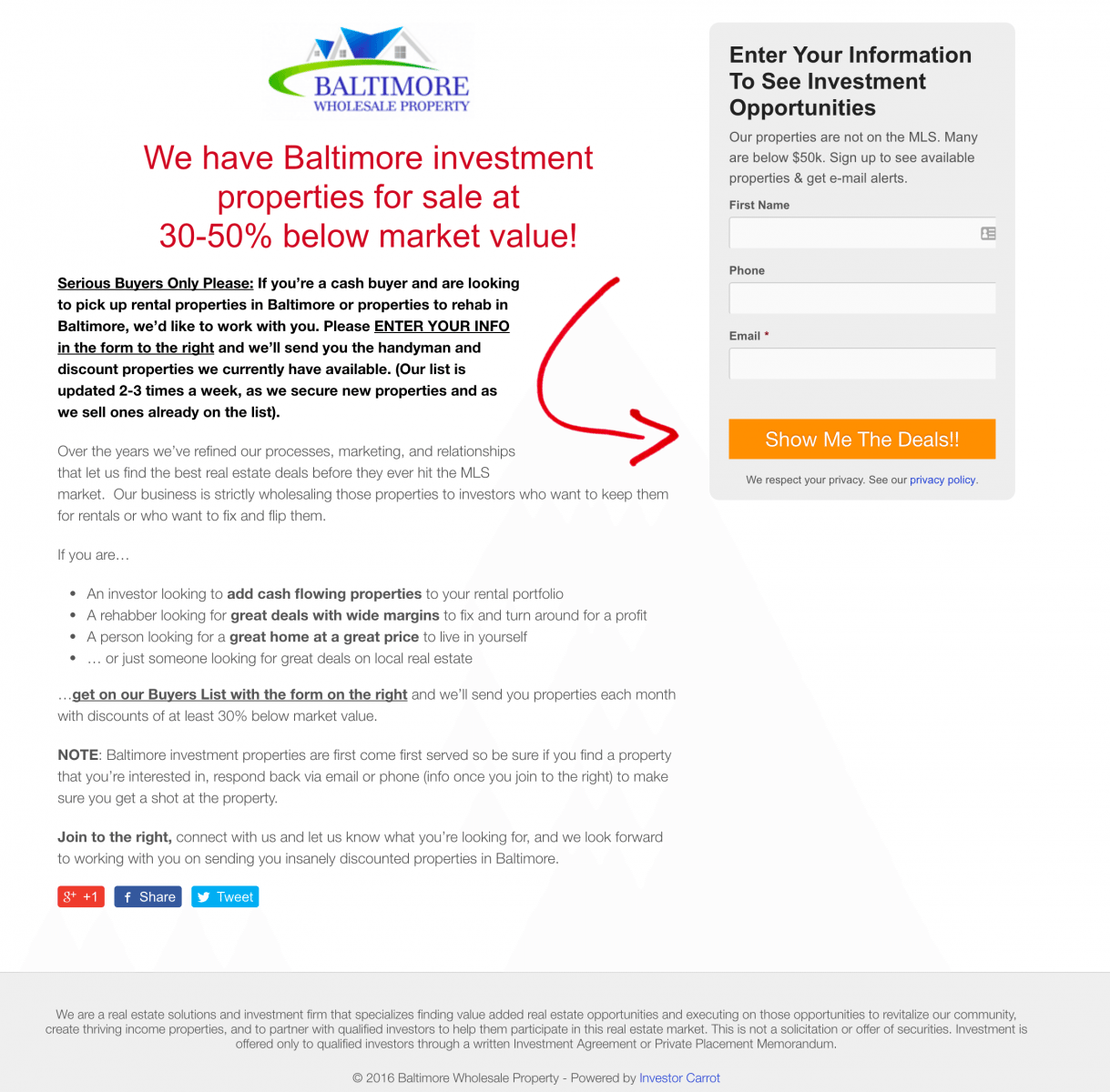
Going back to our first bad example — Fisher Nicholson Realty — clicking through to the “Buyers/Sellers” page you find this:
While the page opens with a call to action — “Buying or Selling? Please make Fisher Nicholson ‘The Home Team’ your Real Estate Company of Choice.” — the only clickable links are to non-related sites, property comparisons, search options, or featured properties.
Tragically, even if a visitor wanted to give them their contact information to “make” Fisher Nicholson their “Real Estate Company of Choice,” there’s literally no place to submit their contact information on the page itself.
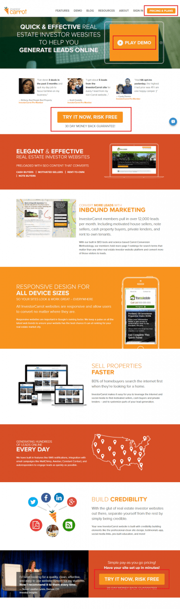
Compare that to one of our highest converting landing pages, the cash property buyer default landing page built into our cash buyer and main company websites here at Carrot.
Visitors can only take one of two actions: either “Show Me The Deals!” or to call you on the phone.
Technically speaking, the website design we used for our Hero Stacked test is not a landing page; it’s a home page that plays the best of both worlds…
… landing page but engages those not quite ready to convert with great content and credibility. This “mini-site” format actually turns into more leads than squeeze pages according to our vast testing over the years.
But the focus is still on getting email signups for lead generation. So while landing pages should eliminate all distractions, a home page will still need to have navigational links and other clickable areas and all focus on ONE CORE call to action.
However, the same principle applies: the above-the-fold area of any home page should be uncluttered, simplified, and targeted.
Does The Main Call To Action Jump Out Or Do You Have To Hunt For It?
Above-the-fold area of a website
As ConversionXL drives home:
The most notorious place for clutter is the home page. Given the diversity of audience your home page gets, the desire to give them plenty of “what if” options is natural.
Resist that temptation.
In test after test after test, the principle of simplicity — that less truly is more — has proved itself.
2. Your Content
Naturally, given how central simplicity is to your real estate lead generation process, all the content on a page should exist to support the one goal you want your visitor to take: to sign up.
This means placing the most important information — especially your page’s copy — at the top of the page in the hero section. When a visitor lands on your website, you’ve only got a matter of seconds to capture their attention.
If you make it too difficult for your visitor to figure out how you can help them, there are plenty other websites who will be easy to understand … and compelling.
A compelling headline must hit your visitor above all with value.
As we stressed in 16 Point Real Estate Investor Website Conversion Rate Checklist, having a “clear, benefit-oriented headline” is vital.
Your headline can address a pain-point the visitor needs answers for or instill a positive emotional reaction … but either way, it has to touch the heart.
Matthew Bushery’s Drive Real Estate Website Traffic with These 10 Expert Blog Headline-Writing Technique and 44 Ideas For Catchy Headlines Taken From Blogs Outside of Real Estate are phenomenal starting points to get your headline muscles pumping.
By way of summary, prioritize the following elements in your headlines:
Numbers:
“71+ SEO Keywords For Real Estate Investors and Agents – SEO Bible 2015”
Guidance:
“10 Tips On How I ‘Networked’ My Way To My First Million Dollars”
Intrigue:
“How A Pumpkin Farmer Changed My Perspective On Life And Business”
“The Most Overlooked But Important Page On Your Website (Backed By Science)”
Having all said that, you don’t need to load all the benefits in the main attention-grabbing section, like this personal training website has done:
Too Many Conflicting “Benefits” Crammed Into The Top…
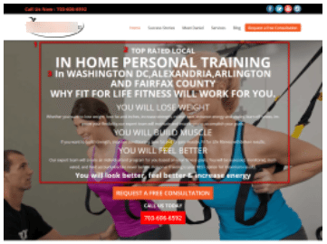
Limit what you want to say in this most important part of your website
Geek Estate Blog highlights just how bad trying to pack an exhaustive list of benefits can be by using a landing page for townhomes in Bothell as a test case. This is how it reads:
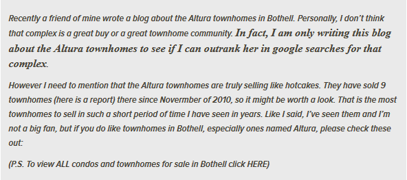
I wonder how many conversions this website got…
Image Credit:Geek Estate Blog
In addition to overcrowded copy, also be careful of useless images
Example of useless images on a website
Image Credit: Smart Insights
You may not be able to see it properly, but the example above is a website about weight loss. Unfortunately, all the images are useless because they don’t support the page’s goal. After all, what’s the point of a car photo on a weight loss website?
On a homepage or landing page, the chief piece of visual content is called a “hero image.”
Adding an oversized “hero” image is incredibly popular. This stems from a hero image’s ability to add appeal, relevance, and what we might even call “sexiness” to a page.
The right hero image can also have a massive impact on overall conversions.
Have a look at this test from French snowboarding ecommerce site Salomon:
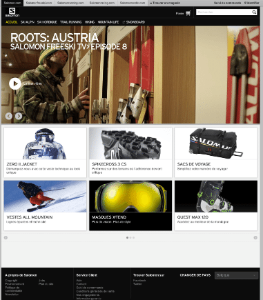
The original design on this landing page does not include an oversized hero image
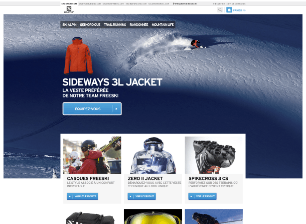
The new look includes an oversized hero image
Image Credit: Crazyegg
Crazyegg reports that the version with the oversized hero image, as well as a few other tweaks, increased sales from French shoppers by 39.8% and sales by global shoppers by 29.7%, both at a 99.9% confidence rate.
If you add an oversized hero image, bear these four points in mind:
- Make sure the photo is responsive so that it behaves when the page is viewed with mobile devices.
- Avoid stock photos which can put people off and can lose credibility on your site. Use “real” people or high-quality original product image.
- Make sure your photo doesn’t cause eye tracking confusion.
- And of course, test the page and keep tweaking for continual improvement.
3. Your Form
High-performing forms are the holy grail of online lead generation.
And — once again — less is more.
Wufoo co-founder Kevin Hale reports that the less fields on a signup form, the better the conversions:
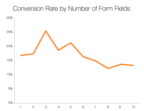
Image Credit: VWO
Keeping the form short ‘n sweet also makes it easier for mobile users to complete it, and this is important because there are now more mobile than desktop users on the Internet.
Not to kick Fisher Nicholson Realty while they’re down, but here’s what their contact form looks like on desktop:
Too Many Form Fields Reduces Performance In A Big Way…
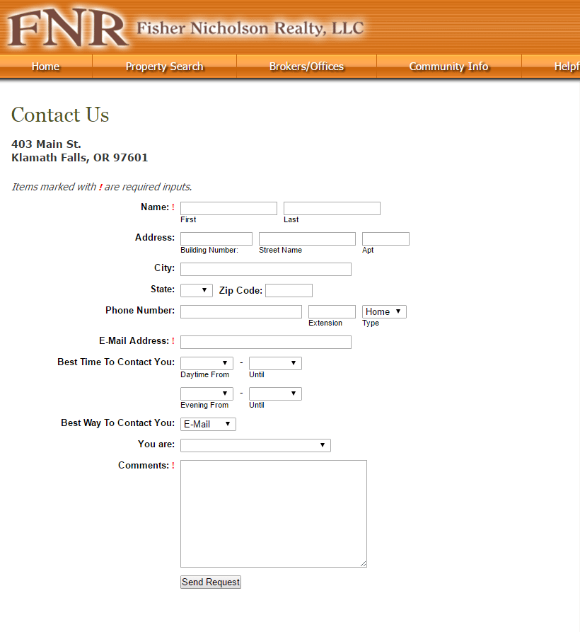
There are a total of 19 forms fields … only four of which are required.
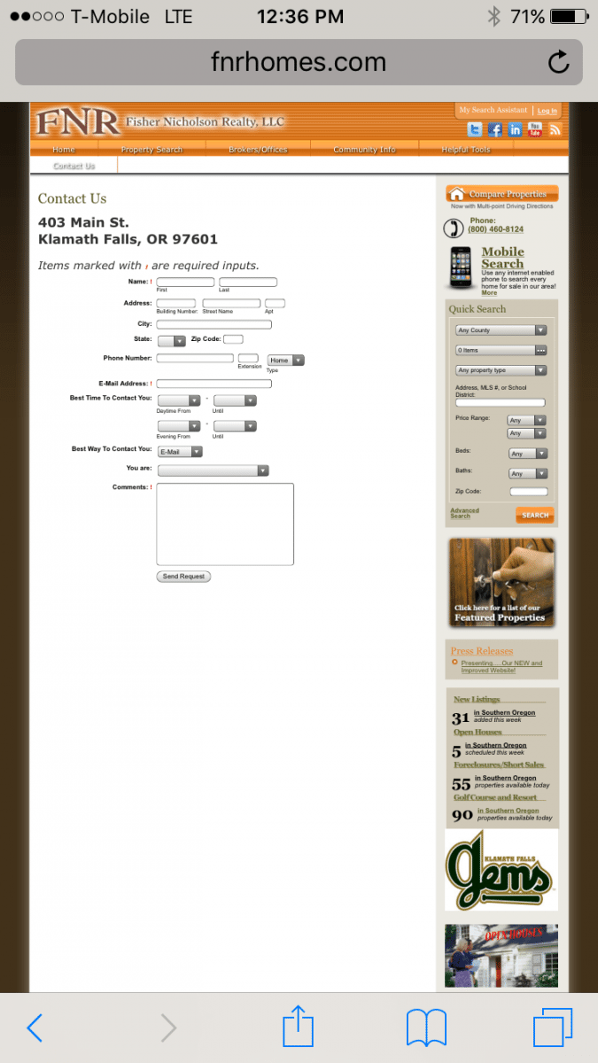
On mobile, the form itself is virtually illegible:
Even more detrimental, there is absolutely zero incentive for a visitor to submit their contact information.
The “Send Request” button promises no pay offs, offers no benefits, and it isn’t even an enticingly worded action. Afterall, who wakes up in the morning thinking to themselves, “Gosh, I can’t wait to ‘send a request’ today”?
Be sure not to neglect this part of your form: “What will the visitor get?”
Inman provides a host of ideas for creating compelling and click-worthy real-estate lead magnets: “a lead magnet is an irresistible bribe offering a particular chunk of value to a prospect in exchange for their contact information.” The list includes:
- Home sellers’ guides.
- Relocation packets.
- Neighborhood market reports.
New listing email registrations. - Property comparative market analyses.
- “How-to” e-books or videos — how to stage a home, how to increase curb appeal, how to buy foreclosures, and so on.
- Reports — neighborhood, school, crime and more.
- Lists — bank-owned properties, short-sale homes, 203(k)-eligible properties, etc.
- Real estate-related e-books or videos — landscaping, remodeling, investment opportunities, flipping a house, and so on.
Making forms convert is a complex business, because what works for one site may not work for another. The truth is that you have to keep testing and checking the data to see what’s working for your target audience or not.
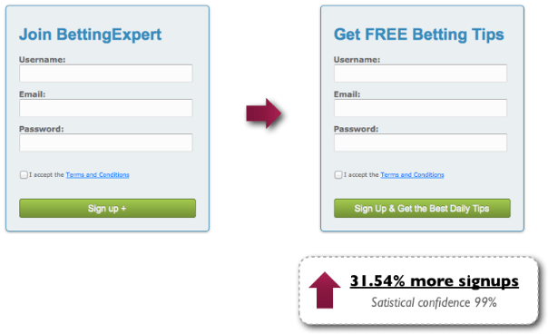
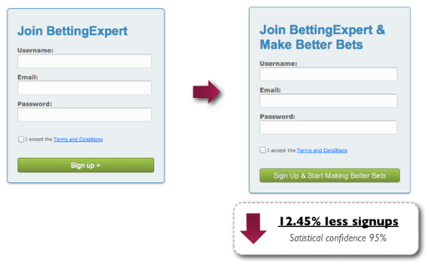
To drive this home, Michael Aagaard presents two seemingly contradictory button-copy tests on Content Verve. In the first, adding “Get the Best Daily Tips” increased conversions by 31.54%. In the second, adding “Start Making Better Deals” decreased conversion by 12.45%:
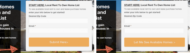
We found the same thing with our own test showing a 49% improvement on a rent to own site just with the words we had in the button.
49% More Leads Because Of The Words On Your Buttons…
Knowing this is precisely why we test so relentlessly at InvestorCarrot.
Lastly, when it comes to your forms … does size matter?
Yes.
Large forms get more signups, maybe because they’re so “in-your-face.” Our own tests have shown that having a large form in the middle of the page that contrasts the surrounding elements can help improve conversions substantially.
All those form tips can be a lot to take in. So here’s a quick rundown of best practices from our own extensive testing:
- Keep the form fields short
- Have the call to action button take up the entire width of the form
- Include value-driven language in your call to action button itself
- Make the information around the form draw the reader down the page
A Template to Get 38.54% More Online Real Estate Leads …
Enough about principles and best practices.
What you really want is a proven template you can use to get more online leads.
Here’s exactly how we built one that does just that.
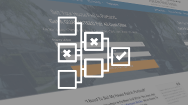
Test #1: Three Columns (this test failed)
We started with our high-performing lead-generation page, which already included a number of optimization wins we’d learned from previous tests.
For instance, one the rules we’ve proved to our clients over and over again is that changing the words on the call to action button from a “descriptor” (“Click to Continue” or “Submit”) to a “mental commitment” increase conversions. Here’s just one example:
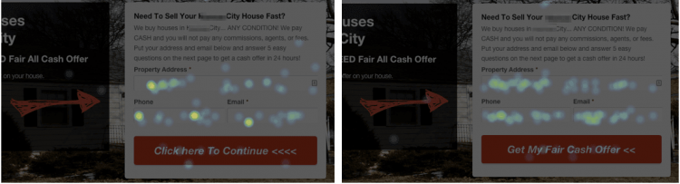
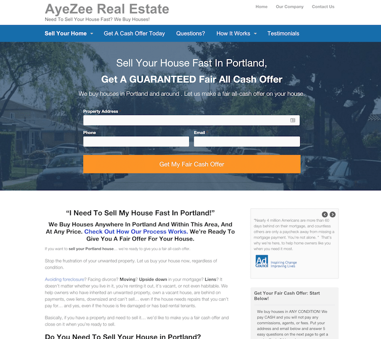
The Variation on the right — “Get My Fair Cash Offer” — showed an improvement in 49.5% at a 12.55% conversion rate compared to the first — “Click Here to Continue.”
To put a bit of context around that, out of every 100 visitors who land on your website, using the “mental commitment” language would produce 12.5 leads rather than 8.3.
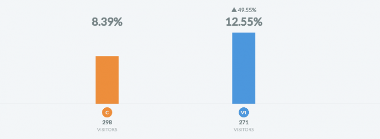
That might not sound like a huge deal. But even if your site only gets 1,000 visitors a month, that translates into 40 additional motivated seller leads.
Even if you close 1 out of every 20 leads (which is a low percentage for many of our customers) and only net on average $7.5k (which, again, is much lower than many of our customers average):
That’s $15,000 in extra revenue every month all without having to generate any additional traffic to your website.
Still, we knew we could do better.
So, we took that page as our control and began by testing a three-column layout with no sidebar to limit the amount of links on a page. The idea was to make it simpler for a user to consume the page’s information:
Version #1 Of This Test – 3 Column Layout
Unfortunately, our first test was not a success.
The results were less than spectacular, but we learned a lot
It actually reduced the performance on the page.
As a result, we decided to get more intentional and focus on the main element a user sees when they first land on a home page: the hero section.
Test #2: The Stacked Hero (this test was a huge success)
Our first priority was to zero in on the page’s goal.
As you can see, the information in the last column on the right is unnecessary. It’s about the real estate agency themselves and adds no value to the visitor. Instead of moving them closer to signing up, it only distracts:
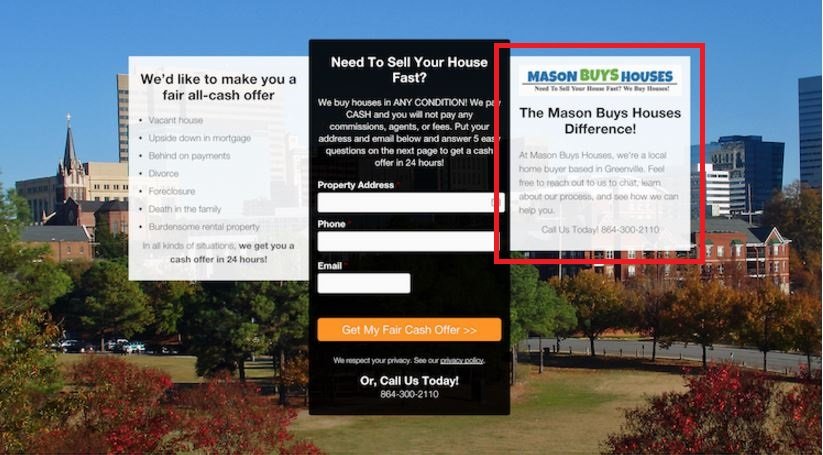
The 3rd column on the right is not necessary in this all important above-the-fold section
This time we predicted — i.e., our hypothesis was — that adding better imagery and a larger form focus the core message of the page.
The second test, then, was all about improving the conversion rate of the site’s home page hero section. This section is incredibly important because a lot of traffic passes through this page, and this is the first thing a lead sees.
Not only that, but research proves that the attention span of people has become so short that your website has a few seconds to grab attention before the visitor clicks away.
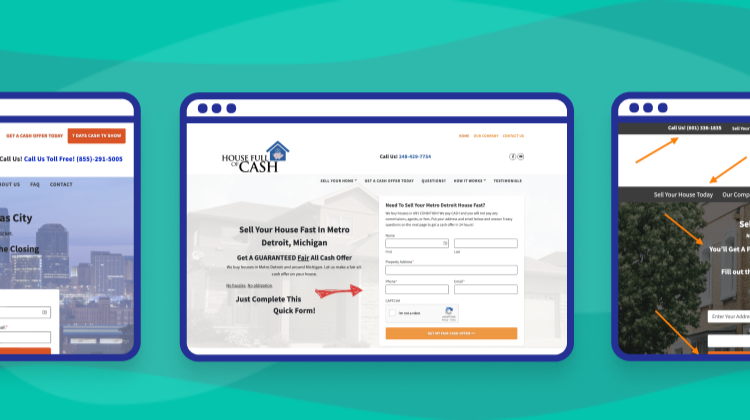
The following test page ran for a month across 15 InvestorCarrot websites and received over 1,600 visitors:
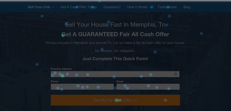
Version #2 – The “Stacked Hero” (38% more leads)
Pay special attention to the differences between the two pages:
Control
- Three columns
- Light Hero image
- Three headlines
- Narrow form fields and button
Headline:
“Need to Sell Your House Fast?”
Includes phone number
Six lines of text below
Headline:
No location in the headline
Variation
- One Column
- Dark hero image
- One headline
- Page-wide form fields and button
Headline:
“Sell Your House Fast in Portland. Get a Guaranteed Fair All-cash Offer.”
Excludes phone number
One line of text below
Headline:
Location included in the headline
In addition, by center aligning every element, having a dark background to create contrast between both the text and the button, and filling up a good portion of the screen with the hero, visitors automatically see what’s most important to complete the call to action.
The heat map below, which measure users mouses and eye-movement, validated this belief. Notice that the majority of user engagement is happening on the headline and form fields … exactly where you want their focus to be:
This heat map shows where a user is focused when they are looking at the hero section
In other words, the hero test incorporated nearly all of the principles we covered above.
And the results?
A good representation of how the test performed individually can be seen from this specific test from a member in the Alabama market.
The Test Results Speak For Themselves…
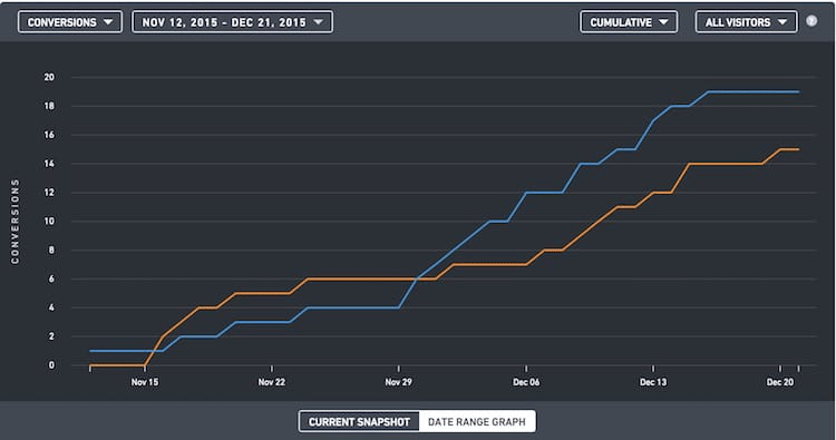
This graph represents a stacked hero test (for motivated seller leads) where the control and variation were close … until the end.
The cumulative total was what really knocked our socks off:
A 38.54% increase in online real estate lead generation across the board.
If you’re in the real estate sector, we at InvestorCarrot have a simple way of increasing your real estate leads; we’ve already done the testing for you by creating website templates like the one used in this test study.
And you can have it for free.
Carrot Members: You can dive into your account and launch a new website… then dive into the “Design” tab for the site and select the “Juniper” design to put this design to work for your business. But, you may be asking… “Is this design higher performing than the original Carrot design?” The answer is… in some cases it boosted performance up to 38.54%, in a few, it decreased performance a tad, in several, it was a wash. It did provide a performance boost in most of the 20 or so sites we tested it on but on some, it didn’t… so our advice is if you have a Carrot site up already that is pulling leads consistently to keep it how it is. Our original design is still our most consistent design. This new one just adds another option to get a different look while still retaining GREAT performance.
Non-Carrot Members: If you know HTML and have some time and want to hack through some setup stuff… You’ll need your own hosting, some programming knowledge to hook up a form, and to write your own content on the page. Or you can skip all of that and join Carrot and launch this design along with all of the other benefits Carrot customers enjoy within seconds.
(Already a Carrot member? Great! Launch this design in your account in just minutes! Log in, create a new site, and choose the “Juniper” style.