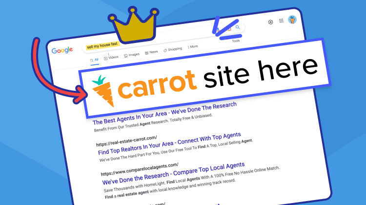
Your real estate landing pages could be costing you $10,000, $20,000, $50,000. That’s only one lost deal.
Relative to other popular 21st century industries (e-commerce, info product selling, affiliate marketing, etc) real estate is unforgiving. In many of those other industries, one lost deal might amount to $10 or $1,000 lost. But in real estate, players tackle each other on the pavement…
Without knee pads…
Or helmets…
Or teeth guards…
You get the point – one lost deal hurts. And it hurts bad.
But, that also means that one gained deal has an equally massive impact. And the fewer deals you lose to savvy market competitors, the more deals you gain.
In other words, you can turn that lost-deal dilemma into massive cash flow by transforming your real estate landing pages from an underperforming duds into a visitor-converting machine.
This is exactly why I’m going to show you how to optimize your real estate landing pages for conversion.
Follow these rules in your own market.
But first, a quick note about why your website isn’t converting as you want it to (the answer is simpler than you think).
What are Real Estate Landing Pages?
A real estate landing page is a standalone page, created specifically for a marketing campaign. It’s where a buyer, seller, or partner “lands” after they click on a link in ads, emails, or possibly organic SEO rankings.
The anatomy of a real estate landing page is pretty simple. You might be thinking:
- Is there a specific design that always works the best?
- How can we tell if a landing page is really working well?
- What do I use to build my own real estate lead pages?
First, no, there isn’t a specific design that always works the best. What works really well for your real estate business and your market may not work as well as another design (or message) on another real estate website. But, there are elements that usually work well.
- A clear and concise headline at the top of the page
- A short description of what they’re about to get in exchange for their email address
- A few bullet points listing out benefits of what they’ll get when they “opt-in”
- An opt-in (a box where people can put their information in and submit it to you)
Really, those are the only elements that are extremely important and pretty much are needed on any landing page. Yes, you can use pictures and videos. Definitely test the video versus just the text with no video because you might find the one with just the text converts works better.
Are Your Real Estate Landing Pages Missing the Mark?
Someone arrives on your website…
Let’s imagine that they’re your ideal client.
They need the service you offer, they’re motivated, and they’re just looking for the right person to work with. After all, selling or buying a home is a big decision and they don’t want to make a mistake.
So they’re browsing around your website.
One of two things will happen in the end.
- They’ll leave your website and find someone else to work with.
- They’ll work with you.
Those are the only two options.
Assuming that this person needs your service, they’re going to work with someone.
Only one question remains to be answered, then…
Will that someone be you?
Or will it be your competitor?
How will that person make a decision?
Well, someone who needs your service – a motivated buyer or seller – is going to ask only a single question:
Why should I work with you?
That is the same question that builds empires…
And topples monopolies…
For instance, as Forbes reports…
“45% [of consumers] said they have found something in an online search that made them decide not to do business with the person.”
If your business never gains trust, it’ll never get off the ground. If your business gains trust and then loses it, it’ll die a swift death.
But if your business gains trust and keeps it, the competition won’t stand a chance.
Not only will word-of-mouth springboard your business into next-level revenue, but online case studies and testimonials will create the same buzzing effect online – where growth potential is multiplied many times over.
So why aren’t people working with you?
If you’re getting website traffic (whether paid or through SEO) and those visitors rarely convert, then this is going to hurt…
People don’t trust you.
Sure – there’s a small chance that you’re attracting the wrong audience – that you’re not attracting your target market. If that’s the case, then check out our article about real estate marketing and how you can drive the right traffic.
More than likely, though, you’re having a different problem.
Namely, website visitors don’t trust you. They spend time browsing around your website and decide internally, “I’m not convinced.”
The good news, though, is you’re not doomed to repeat that trust-killing mistake over and over again.
There are tried-and-proven ways to build more trust, faster on any landing page.
6 ways, to be exact…
The 6 Rules of High-converting Real Estate Landing Pages
Rule Number 1 – Write an “I Have to Read More” Headline
Copyblogger reports,
“On average, 8 out of 10 people will read headline copy, but only 2 out of 10 will read the rest.”
If you’re going to convince someone to work with you, then you have got to start with a compelling headline. It’s the first thing website visitors read and it might be the last thing they read (especially if it sucks).
But, what constitutes a “good” headline?
Well, of course, a headline that makes people read more – that makes them feel like they have to read more.
To do that, your headline needs two elements.
- Ambitious problem-solving offer.
- Believable enough that your offer doesn’t sound too good to be true.
Strike those qualifying chords and visitors will keep reading.
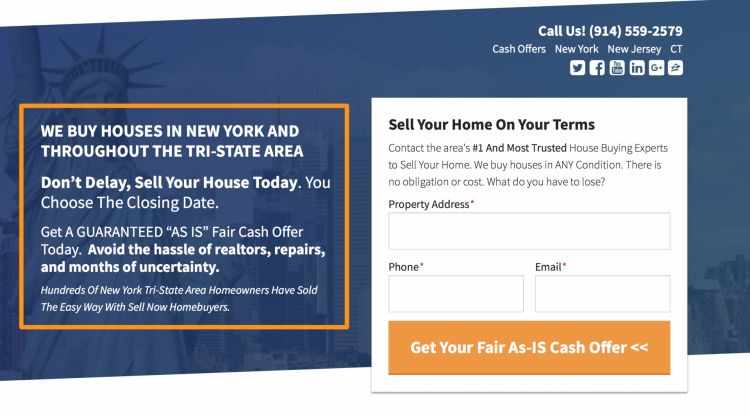
Consider, as an example, this headline on Dave Brown’s website a top-performing Carrot member. Learn more about Dave’s Carrot success… “Getting More Motivated House Seller Leads Online – David Brown Case Study“
Phrases like “You choose the closing date” and “Get a guaranteed ‘AS IS’ fair cash offer today” keep the headline ambitious and problem-solving enough to maintain the visitor’s interest, while phrases like “We buy houses in New York and throughout the Tri-state area” and “Hundreds of New York Tri-state area homeowners have sold the easy way with Sell Now Homebuyers” keeps it believable enough that the person will continue reading (or opt-in immediately).
It keeps interest and avoids the too-good-to-be-true curse of many other landing pages.
We do the same thing on our website.
Ambitious problem-solving: “Stop losing leads” and “Our real estate investor websites drive more qualified leads than any other platform.”
Believability: “Our members generated 60,088 real estate leads last month”
Don’t breeze by your headline without thinking much about it.
This is the most important part of your entire landing page. So make sure you include these two critical elements: ambitious problem-solving and believability.
Rule Number 2 – An Iconic Local Video or Image
Put yourself in the shoes of your target market for a moment.
Imagine that you type into Google, “Sell my house fast in Western Oregon.”
You click the first result and browse through the landing page. But something odd catches your eye…
There are pictures of palm trees…
And you know – being from Oregon – that there aren’t many palm trees here.
Is this person even from Oregon? you think to yourself.
Trust. Dead.
Well, the same thing can happen on your website, even if it’s not as big a mistake as putting palm tree pictures on an Oregon-based real estate website.
Something as simple as pictures that are irrelevant or unfamiliar to your target market can kill trust. This is why, for every city, you operate in, set up a new landing page with market-specific sales copy, images, and videos.
This is exactly what Dave Brown does on his website…
Or, here’s and real estate listing example. They use an image of the actual property as the background…
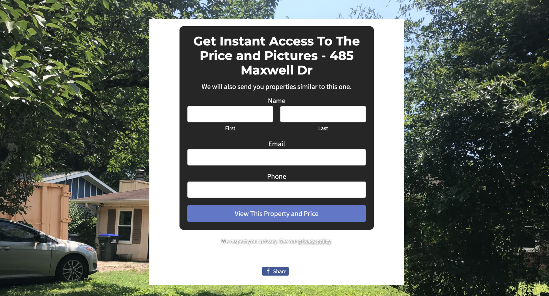
Even if you don’t live in the area, you operate in it.
And when people arrive on your website, they want to know that you’re familiar with the local market and capable of helping them in their specific situation.
City-specific images, videos, and landing page copy build far more trust than their vague or outright irrelevant counterparts.
Rule Number 3 – Sales Copy that Won’t Let the Reader Stop Reading
Your headline isn’t the only line that should make your visitor keep reading.
All of your sales copy should be like a slippery slope that people feel they have to keep sliding down. Each line leads to the next like meal cuisine at an Italian restaurant.
You just keep wanting more.
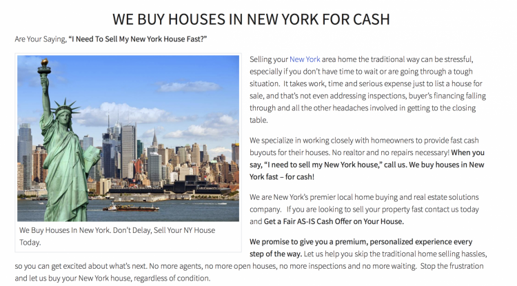
Here’s what this looks like on Home Downsizing Solution’s (another Carrot member) website:
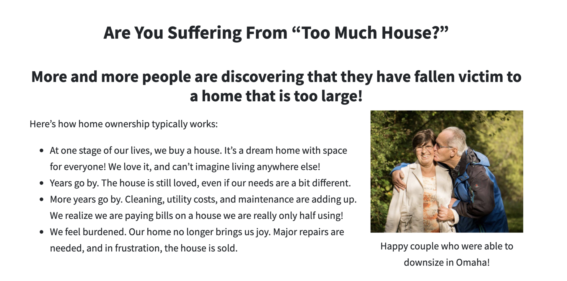
Each phrase leaves the reader with a question… which naturally guides them into the following sentence… which then does the same thing. So on and so forth.
Before the reader knows it, they’ve read all of your sales copy and they’re convinced to work with you.
If you’re writing the words on your landing page and you start to get bored, so will your reader.
Change it up – use a surprising word or phrase, use a funny metaphor, or ask a compelling question.
Whatever you do, don’t let the website visitor lose interest.
Rule Number 4 – Big-promise Bullet Points
Everyone loves bullet points. In fact, a website’s visitors’ eyes tend to spring right to these helpful nuggets the moment they’re on screen.
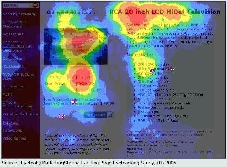
Why?
Because, traditionally, bullet points tell us exactly what we’re going to get and that’s really what we all want to know when we’re going to open our wallets for something…
Okay okay… but what am I going to get?
Well, your target market is wondering the same thing.
This is why bullet points like this are so darn effective…
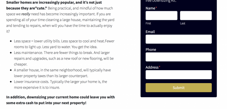
And this…
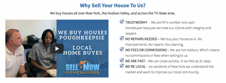
These easy-to-add (but crazy effective) black dots and blue checkmarks build massive credibility and make ambitious promises.
Remember, people, visit your website because they need a problem solved. And a bulleted list is one of the best ways to tell them how you’re going to solve their problem and why they should work with you.
Rule Number 5 – Proof of Concept
With a bulleted list, a compelling headline, and some unstoppable sales copy, you’ve made some big promises. Promises that – so thinks your target market – won’t be easy to keep.
Which is where proof of concept comes in.
You need to prove to your website visitors that the way you work, the promises you make, and the business you’ve created are all worthy of trust.
How do you do that?
Well, the best way is by using a past customer testimonial (video is best, but writing will do).
Consider, as an example, Dave Brown’s case study video… (WATCH)
Skip this step at your own risk.
The truth is… you can make all the ambitious promises in the world, but if you don’t back up those claims with cold, hard facts, people won’t believe you.
People are bombarded by more than 4,000 ads per day, which puts your target market’s trust for marketers at an all-time low. Everyone is making big promises and few people are keeping those promises.
Put another way, proof of concept is likely the most vital part of every single landing page you’ll ever create (in conjunction with a great headline).
Don’t skip this step.
Rule Number 6 – Include a Clear and Low-risk CTA
According to Protocol 80, Inc, 90% of people who read your headline also read your CTA (call-to-action)…
Because here’s the thing: after people know what you’re offering, they want to know what to do.
How do they take action? If they want what you have, how do they dive right in?
And a low, or no, risk CTA is exactly what they’re looking for. They don’t want to spend hundreds of dollars. They want to get started without pulling out their wallets and probably without even giving you a call…
Baby steps…
That’s why, at Carrot, we recommend a CTA that is something like this…
When someone fills this out, our system will send a lead notification via SMS text message straight to your phone. Then you can call the person and close the deal.
But you won’t be able to close much of anything if people land on your website, learn to trust you, and don’t opt-in because there isn’t a clear and risk-free CTA.
You can gain people’s trust all day long…
But that trust isn’t gonna make you any money until you ask those committed prospects to take action in your favor.
Conclusion
One, two, three lost deals…
It all hurts in the same way that gambling away $50,000 hurts…
Except you’re not gambling – you’re running a business.
And fortunately, running a business is far more predictable than visiting the casino. At least, it should be.
Remember, selling is science. And all you have to do to give your website a selling boost is add these 6 trust-building elements to each landing page, whether you’re a Carrot member or not…
But if you’re not…
We can get you moving in the right direction by giving you a high-converting website right now…


