Category: Real Estate Investor Web Design

  • Why The “2-Step Opt-In Process” Increases Conversions and Lead Quality By Up To 46% On Real Estate Investor Websites

    Why The “2-Step Opt-In Process” Increases Conversions and Lead Quality By Up To 46% On Real Estate Investor Websites

    Welcome to another edition of the Carrot Test Kitchen… where we break down our recipes and show you how to create insanely great lead generation sites for your real estate business.

    Our sites get insanely high conversion rates… you just have to customize them to your business and your local market, then send traffic to them! (Don’t worry, we’ll show you how – it’s easier than you think. :)
    (Of course, this stuff is baked right into our sites, and our prices are so low that it’s impossible to do it cheaper yourself… if you’re not already a member, head over and check out our demo right now).

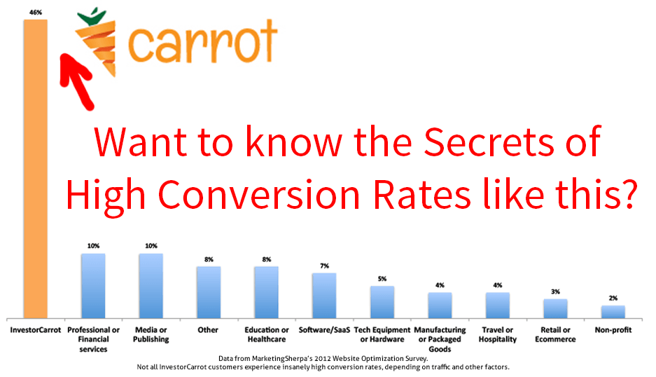
    Today we’re gonna show ya the exact trick that improved conversions by 46% right when we started implementing it years ago.

    It’s so simple that once you learn it, you get it… in fact, I bet you’ve seen versions of it used before. While we didn’t invent it, we’re perfecting it for real estate investors.

    It’s called the 2 Step Opt-In Process, and I’ll tell you how it works and what you need to know to make money from it.

    The first step of the opt-in process happens on the Lead Page – there are many lead pages built into every InvestorCarrot website, and you can create unlimited additional Lead Pages. It’s super cool.

    Step 1: Research Shows A Form With 4 Or Fewer Opt-In Fields Increases Opt-Ins On The Front End

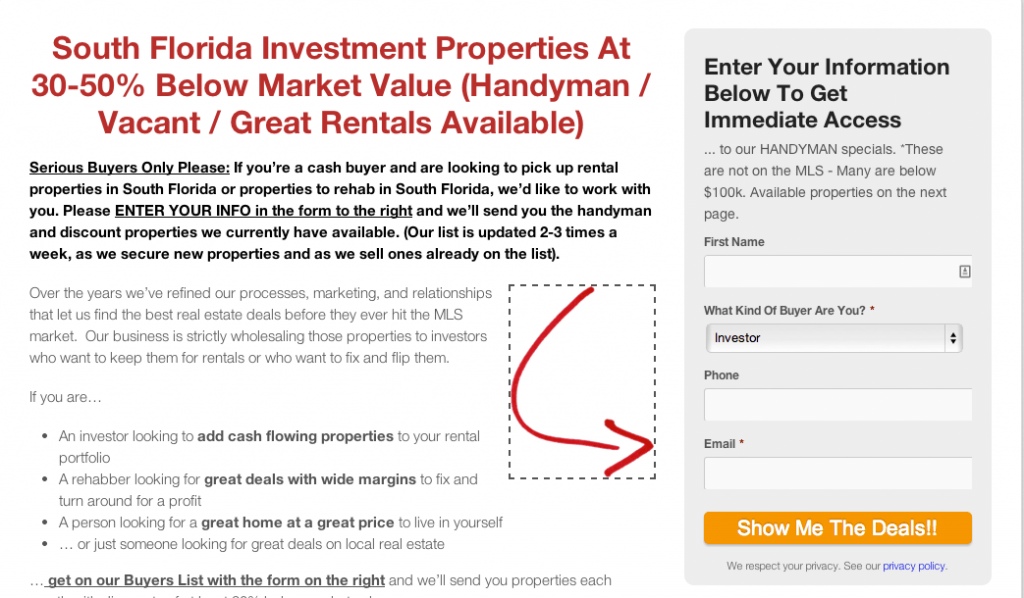
    Below is an example of a lead page on a Cash Buyer site on the InvestorCarrot system. It’s a great landing page for advertisements on Craiglist, Backpage, Zillow, Google, Adroll or many other sites and converts consistently high across our member’s sites too. :

    Heatmap____Visual_Website_Optimizer

    COPYRIGHT NOTICE: All of the content on our websites are 100% Copyright protected and owned by our company. Only active paying InvestorCarrot members can use the content on our websites. If we find people copying our content off of our customer’s websites or from our images on this page, we will pursue violators for copyright infringement. 

    As you can see, there are only a few quick questions to answer – name, email, phone and type of investor.

    Lots of testing has shown that 3-4 form fields are ideal for conversions – any more or less actually drops the rate of performance. This graph from HubSpot’s research on over 70,000 forms shows why 3 is the magic number for conversions:

    fields-resized-600
    Want to Increase Your Leads? Make your first opt in form have 4 or fewer fields. – Source for Graph:  HubSpot

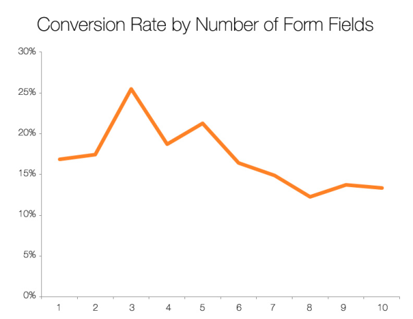
    We’ve tested the number of things our forms ask for on the first opt in box for both buyers and sellers… and once you start to get past 3-4 on your first form… your conversion rates go way down.

    You’ll see lots of real estate investor websites that are killing their conversions by asking for way too much information on the first chance.

    Like this one…

    real estate investor website conversions
    Too Many Fields Kills Conversion: This particular form we found on a random real estate investor motivated seller website has 13 fields. How many does yours have?

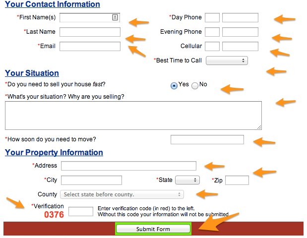
    Can you imagine being a motivated seller who really needs to sell… but just isn’t ready to give up all of your info quite yet on this first form… yet almost every field on that form is required for you to get to the next step?

    However, when a motivated seller does submit this form… you know that they’re VERY QUALIFIED.

    Long forms are terrible for conversion… but increase the quality of your leads.

    So we melded the two into…

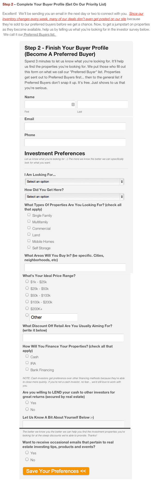
    Step 2: The Best Of Both Worlds – High Conversions AND Qualified Leads

    A short-form upfront to increase lead conversion… and a long-form on the second step to increase your lead quality.

    To get the highest conversion and the most qualified leads (the ultimate goal), the key in the 2-step opt-in process is a short and sweet “Step 1” form… that leads to a longer more qualifying “Step 2” form.

    Once the buyer (or seller) completes the first form… the shorter form, he or she will see a more detailed Buyer Profile to fill out before seeing the properties. This Buyer Profile Form further qualifies the buyers. The same goes on our motivated seller websites… we have a short form upfront that gets the lead… then a longer form on the back that qualifies the lead further:

    second-page
    Hidden Elements: There are many “under the radar” strategies being used on this form that you probably don’t even notice that further qualify the lead and increase conversions. For instance, notice that we’ve strategically made some fields “required” and some not required. Why? We reveal this kind of deep strategy to our InvestorCarrot members on our weekly LIVE coaching calls with our CEO Trevor. Not a member? Join :-)

    COPYRIGHT NOTE: Again, please be creative and write your own content. The content above is owned and written by InvestorCarrot… and only available for use by our active paying members. We actively monitor the internet to find people infringing on our copyright and pursue action. We have to do this to protect our active members and the investment they and we have made. If you’d like to leverage our system, our content, see our pricing and plans and come aboard, we’d love to have ya! 

    Do People Actually Fill Out A Form This Long You Ask?

    We get pushback from many InvestorCarrot members who want to change this step 2 form because they think it asks for too much info and the buyers and sellers won’t fill it out.

    Our answer to that is this… we’ve tested it… and it works.

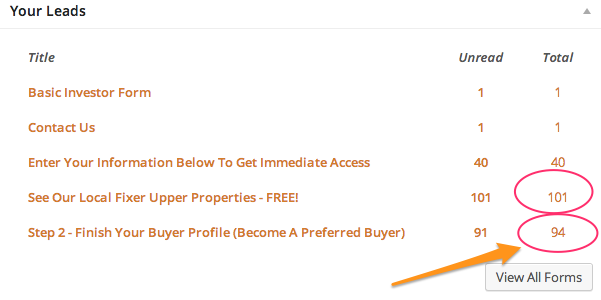
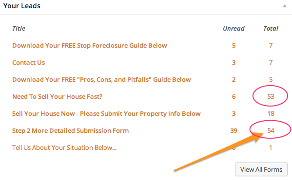
    Here’s real-life data to prove the way we’ve set up OUR Step 2 forms (every word and every line on our forms and the other words on the page that the forms sit on… which isn’t shown above… are crafted and tested to increase conversions… and your leads).

    93% Of Cash Buyers Filled Out The “Step 2” Form

    Dashboard_‹_Hot_On_Wholesale_—_WordPress-4
    93% of Buyers Filled Out The Step 2 Form: In this screenshot on an Carrot members cash buyer website 93% of every cash buyer who filled out the first form went on to also fill out the 2nd longer form. It’s no accident… the way we craft our 2 step opt-in process plain works.

    99% Of Motivated Sellers Filled Out The “Step 2” Form

    Dashboard_‹_Real_People_Real_Property_—_WordPress-3
    99% Of Motivated Sellers Filled It Out: It works even better with motivated sellers.

    Again, it’s not just the fact of having 2 steps that’ll optimize your conversions and quality of your leads… it’s what you ask for on your forms and how you frame that “Step 2” form on your page that makes it work.

    If you’re an InvestorCarrot member, rest assured… this is already built right into all of your websites (your seller websites, cash buyer, rent to own, apartment rental, main company, etc.).

    Years ago, we found that the 2-Step Opt-In Process improved conversions by 46%… with dramatically improved lead quality.

    We’ve been using 2-Step Opt-Ins on all of our sites ever since.

    If you’re trying to build a real estate investing website from scratch to capture seller and buyer leads for your real estate investment business, you’re probably missing a few other key aspects of the formula that allows us to get insanely high lead capture rates for our members.

    Want to just leverage our research and our platform and save time and money?

    Join InvestorCarrot below… all of our websites come pre-built with the “2 Step Opt-In Process”.

    Want to see what else Carrot’s sites can do? Watch the demo now!

    Are you a paying Carrot Member wanting to improve your marketing results?

    Join our Live Coaching Call <– click<<<<<<

    Each week we answer specific questions from our members to help them solve their toughest marketing challenges.

    Space is limited, so sign up now! It’s free for Carrot members.
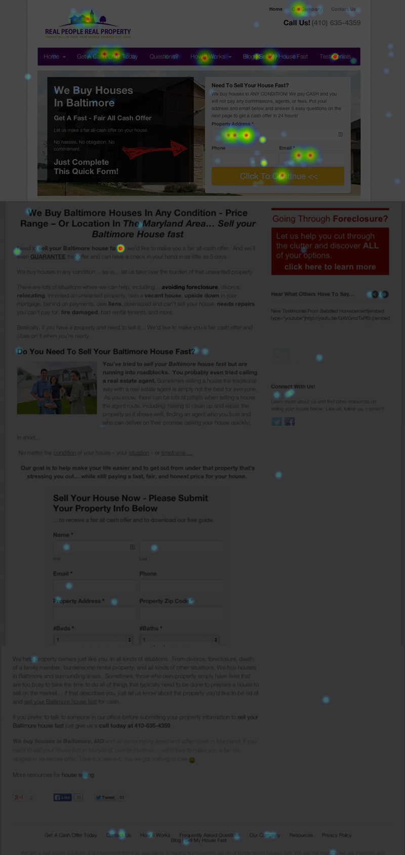
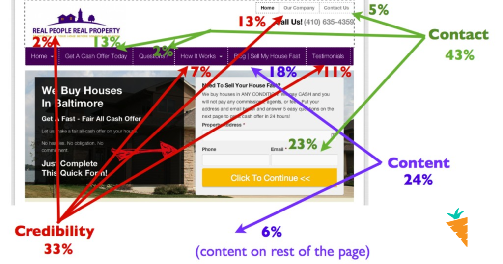
    If you’re not already a Carrot Member, joining is easy <—– Click that now to get started!

  • [Real Estate Heat Map Results] Where Are Sellers Clicking On Your Real Estate Website

    [Real Estate Heat Map Results] Where Are Sellers Clicking On Your Real Estate Website

    This article is the first in our Carrot Test Kitchen series – it’s a series of posts that help you to dissect the secret recipes we use to generate thousands of leads for real estate agents and investors across thousands of websites around the USA.
    heatmap-results-header
    Ever heard of “real estate heat maps”? We’ll show you how motivated sellers interact with your website and how to make your website more effective…

    Are you putting lots of effort into building a high-converting real estate website to pull in buyers, sellers or investors… but not getting the results you want?

    There are two main problems that we often see on real estate sites:

    1)   The site is getting no visitors, and

    2)   The site’s visitors aren’t submitting their information.

    The first problem is usually solved with SEO content when:

    1)   The site doesn’t have good content,

    2)   The content is not optimized to reach the search terms that people in the local market are actually using, or

    3)   The site’s competitors are ranking higher in a search.

    There are quite a lot of other tricks to boost traffic to your site, and we’ll be talking about that again real soon…. But today, I want to help you out with the second main problem we see:

    What are people doing on your real estate website?

    It’s critical that the design of your site is set up to actually convert visitors to leads.

    Although it’s utterly crucial, conversions are often overlooked when average people are putting together their websites. Too often they hire designers who are obsessed with aesthetics… rather than results.

    Those folks need to quit calling themselves marketing experts… because they’re artists. Most art doesn’t sell. It hangs there, looking pretty… but it’s not selling your business.

    Are you trying to create art, or are you trying to get real estate leads?

    Listen, I get in this argument with designers a lot… so please don’t send me a bunch of angry emails about how design matters… I know it matters. It’s just that it doesn’t matter if it’s pretty… it matters if it works. Like with my accountant – I don’t care if my accountant is pretty, I care about what happens if I get audited.

    When you’re setting up your real estate site, it’s not how it looks… it’s how it works.

    That’s the really cool thing about real estate heat maps – one of the many tools that we use at Carrot to test out our theories of web design… because we don’t even trust ourselves – we want to know that our system is built on proven data about what works before we commit your hard-earned cash – and more importantly before you shift the marketing of your business to our system. We know your business is super important to you… just like ours is to us.

    So what’s a real estate heat map anyway, and how can you use it to generate more leads online??? 

    Back to the point, thanks… in this context, a heat map is a generated picture of where visitors to the website move their mouse and where they click on the page.

    Below I’m gonna put a few examples of a heat map that we generated for a user’s site, and give you a few key points on what works so well on this design.

    Brittany sent us a quick email after watching one of our webinars, asking for help getting more leads… we were able to double her conversion rate with just a couple of simple changes that I’ll get to soon.

    Check out these heat maps (the site is greyed out, with little points of light showing where people have lingered with their mouse or clicked – the “hotter” the click spot, the more often it’s clicked).

    real estate investing website heat map

    What did you notice on that heatmap?

    See all of the bright spots? The Orange and Yellow spots are where a lot of people click… indicating things that the motivated sellers felt were really important.

    …94% of clicks happen on the top of the page…

    First off, 94% of clicks happen on the top of the page. The vast majority of web visitors to any given site don’t bother to scroll down – in fact, they make the decision to stay or go on to another site within 2.3 seconds.

    Side note: That statistic is valid across websites in general – on our investment sites, we tend to get about 8 seconds per page on average – 4 times more engagement than average, but still a lightning-fast choice to stay or go. You only have microseconds to reach your target audience – just another reason that your content and design matter so much.

    There are a few great lessons to learn right away from this click map…. 

    1)   People are clicking in many spots. The clicks aren’t just happening in one spot… visitors to this real estate website are clicking through to find information that answers their questions. The site is designed to appeal to a specific audience (sellers), so it’s validating to know that different visitors to the site are finding what they’re looking for on the site – and then submitting their information.

    2)   Titles matter a lot. Check out the title of the top menus – these titles are designed to appeal directly to people who need to sell. “We buy houses in Baltimore”, “Get A Cash Offer”, “Sell My House Fast” and a contact form right on the front page that asks people to put in their address, phone, and email first thing.

    3)   Customers want to know about the company before they submit their info. Check out how red the spot over the testimonials is – not only are people clicking a lot on that page, but they’re thumbing through the testimonial mini-display on the bottom right of the page. Testimonials are a huge way to create credibility for your business… more on that in a minute.

    Where is your credibility on your own real estate website?

    It’s a really common problem that hurts a ton of great real estate agents and investors… when people get to the site they need to have a compelling reason to give over their personal information. Think about it… real estate is the largest investment most people ever make in their lives. There’s no piece of real estate more intimate than someone’s home.

    And yet…

    So many real estate sites don’t build trust or credibility.

    In fact, there are 3 key factors that I wanna mention that are critical to successfully designing a site that converts – and I’ll tell you how we’ve used them to design the Carrot sites like this example that are generating great leads.

    Credibility, Content, and Contact

    Check out this graphic – I’ve broken down the links on the page into numbers, so you can see the percentage of page visitors that clicked on each link or form.

    Even more great lessons here… 

    As you can see, 33% of the clicks are for Credibility, 24% is on the Content (which is written to develop trust and credibility while reducing the fear and anxiety that most people who need to sell now are feeling), and 43% of the clicks on the home page are actually converting – they’re contacting members using the forms.

    Now, keep in mind that the percentages are recording just clicks on the home page – a lot of other conversions happen on the lead pages that we’ve optimized for the local market.  That means that people are most often giving their info over to get a free report or another valuable tool… 43% of the clicks on the home page isn’t always the main source of leads. It just depends on how the site is being promoted, and where the majority of traffic is directed.

    I really want to emphasize that the mix of those 3 factors is critical to a successful lead generation site.

    Content pulls people through search engine traffic, but it has to create Credibility once people arrive… or they just won’t Contact you.

    BONUS: 1 Minute Tweak That Doubled The Conversion Rate To Leads

    One more thing… I promised that I’d tell you the simple fix that we did on this page that doubled conversions… it’s so crazy simple that we were totally surprised that it worked so well.

    We increased the size of the bar that says “Click to Continue” on the opt-in form and changed the color to Orange.

    Yup, that’s it.

    When this Carrot member got in touch, her site was converting well… but she’d made the size of the Continue button pretty small and black… so we ran a split test – half of the visitors to the site saw the small button, and the other half saw the larger button (we also changed the color to yellow).

    In just one month of running the test, visitors to the large-button site submitted their info twice as much as those who saw the small button. Wow!

    Even after doing this stuff for years, it’s crazy to see what a big difference such a small change can make.

    That’s why we’re constantly testing different sites. We love to learn the nitty-gritty details that make all the difference… we don’t rely upon assumptions, and we certainly don’t make our websites to be pretty – although we do think they look nice. Most important – we design them to be effective.

    For marketing folks who love data, real estate heat maps are a fantastic tool.

    This Is All Built Into Your Carrot Websites Already!

    The beauty with everything we walked through in this post is that everything is already baked right into your Carrot websites. We’re constantly running tests with our members and making tweaks to improve how well our system works for you.

    We get paid up to $6,000/mo by large companies to do this same kind of work for them… but you get this as part of your Carrot membership for no extra cost. Why? Simply because we believe in results over anything else and are continually improving our system to help you get better results.

    Keep An Eye Out For More Articles Like This!

    We’ll be posting lots more info on the tips, tricks, and techniques we use to improve SEO, conversions, and get great results for Carrot customers… so if you’re not already getting our emails, make sure you sign up now! And if you want a website that truly generates leads for your business, go check out our different member plans to join Carrot and leverage our marketing knowledge and testing to generate more leads for your own real estate investing company. 

    Not An Carrot Member? Take A Tour Of Our System >>

  • REItheme – Here we are!

    It’s been 2 years in the making… over 350 beta tester real estate investors later… and we’re officially releasing REItheme real estate investor websites to the whole world (at least… the whole real estate investor world ;-).


    The Story

    The story of how we came to be over the last 2 years is really pretty simple.  We ourselves are real estate investors and own rental properties still today.  In addition, we’ve worked with thousands of real estate investors around the country through our free tools and content at our sister site thereibrain.com.  Through working with our subscribers and students there was one common need that they all voiced…

    “I need a simple but effective website to use. Do you have a recommendation?”

    We got that question over and over… so in 2010 we decided to create the first version of the REItheme sites just for those initial members.  That group was our “beta” group which is over 350 members strong now. Giving us feedback, testing the sites, using them for their own real estate investing businesses… the whole shibang.

    Then, finally… after enough procrastinating and delaying (because we’ve been so darn busy growing our other companies)… we decided to finish out REItheme so the entire real estate investor community can have access to the website system we’ve developed over the last 2 years.

    Why We’re Different

    The real estate investor website market has been a pretty stale market over the past 5 years. No real innovations, no one really deciding to take the leadership role in the market, and no one really focusing on what is best for the customer for running their real estate investor websites.

    Above all… here are the main reasons why we’re excited about REItheme (and so are our customers):

    • Customization:  No two real estate investing businesses are the same, so why should you use the exact same website as 1,000+ other investors?  That’s not the recipe for success in any business. You have to differentiate your company from the rest.  With REItheme we’ve worked hard to make it so you can easily customize virtually every aspect of your website.  From the branding, colors, and look/feel of your website… to the content… lead capture forms… properties… and more.  You can put your own personal touch on your real estate investor website so it’s not like thousands of others… and you take control over every aspect of your website and no longer have to rely on a web guy or someone else to update your content for you.
    • Stellar Member Experiences:  Over the past several years our team has built multiple successful companies, combined reaching into the 7 figures… and a huge thing we’ve learned is that the better we’re able to create great customer experiences… the more our customers love us… and the more people flock to our services.  So, we’re not just about amassing as many customers as we can… we’re about making using REItheme the best possible experience for you… from the signup to using your website day in and day out.
    • Leveraging Social Media and the Search Engines:  A HUGE drawback of most other real estate investor website templates on the market is that they look like they were built in 1987 and haven’t been built with the new technologies in mind.  We’ve been able to generate over 30,000 real estate related leads directly from the search engines by ranking our pages and sites high for competitive search terms.  Most website systems today in the real estate investor world never crack the top few pages of search results mainly because they weren’t built from the ground up with search engine optimization in mind.  The same goes for social media.  We want to make it easy for you to get the benefits of social media sites like Facebook… right from your own website.
    • Credibility:  Credibility is a big thing in any business… especially as a real estate investor.  So, it’s very important what your website looks like and what it says when your prospects and clients find their way to your site.  Our top notch design and copywriting team has put together great looking and professional websites that give a great first impression… and we’ve added in credibility elements that’ll help you relay the right message to people you want to work with.  Easily add in testimonials, tell your story about your company on your about page, and more.
    • Continual Improvements:  We have a dedicated team focused on continually making REItheme the best website system for real estate investors today… and in the future.  As new technologies come and go… we’ll continually update the system so you get those benefits without having to hire a web guy every time things change.  Also, we’re continually testing our websites and finding new ways to make them rank higher in search engines, generate more leads, and be easier for you to use… and we always push those results down to your websites automatically.  With REItheme you won’t have to worry about being left behind the technology curve… we’ll help you stay ahead of it.

    The Future

    We’ve got big plans for REItheme and the growth of this company and the growth of our customers businesses.  We have no intentions of building REItheme into a “one stop shop” for real estate investor tools.  There are already great systems out there that will calculate your offers on properties, manage your deals, run comps, and other great things.

    That’s not our focus.

    Our focus is to be the single best system for managing your web presence for your real estate investing business… with the features that help generate more traffic and leads as the main focus… and keeping the system simple and not packed with features 95% of investors don’t need.

    Getting Started

    So, if you’re a real estate investor and are looking for a better way to manage your online presence, generate leads, and regain control over your websites… check out REItheme to see if its a fit for you.

    Also, if you know other investors who could use a website system like REItheme… check out our referral Partner program where you can earn 25% commissions on ever new REItheme member you refer (for the life of their account).

    Enjoy and we look forward to working with you!

    – Trevor and the REItheme Team