Demo Carrot: How many deals are you losing to your competitor’s website?
Take a Free DemoVideo Transcript
Hey, y’all, it’s JT with Silver Street Marketing. Today, we are going to be talking about how to create some graphic CTA Facebook Ads, so some graphic call to action ads that you can see on Facebook and in quite a few different places.
This is really good for top of funnel, advertisements that are trying to get that instant, low hanging fruit to click and get over to your website or to fill out a lead form. I test this in every market, because a lot of markets respond well to it.
I honestly prefer face-to-face videos, but this is a really good backup option, and definitely a good test option for people. We’re going to be going over how to create this professional CTA Facebook ads, so that you’re able to do this yourself and do it in your own account, and be able to see the benefits from that and capture some more leads.
Go to canva.com. This is a free service. This is a really good one to use if you want to create some ads and you don’t necessarily have the information possible to be able to do that or the software possible to do that.
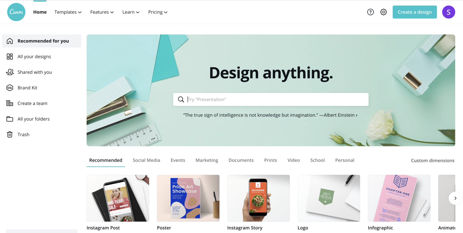
This is a really good place to do it because it’s got a lot of preloaded designs and sets, and it’s really easy to use. It’s just really, really simple, and it can help you cut down that time it takes to create the actual media for your ad.
Once you get into canva.com, you’ll need to create your account. We’re going to create a design.
Now, I like to do custom dimensions. They do have preset Facebook dimensions, but for my Facebook ads, just because I know that square images tend to perform best, and then I can be in multiple different placements, I like to do a 600 x 600, just make sure that the PX is selected for pixels. We’re going to go ahead and create this new design.

Are You Fumbling Your Way Through FB Ads? Or, Simply What to Get Started?
Let the expertise of Silver Street do the leg work for you. They will create an account as if it was their own.
We’re going to bump up here. I am going to go ahead and move this up here to the top. What we’re going to do here is, we are going to set this up to be kind of a graphic image.
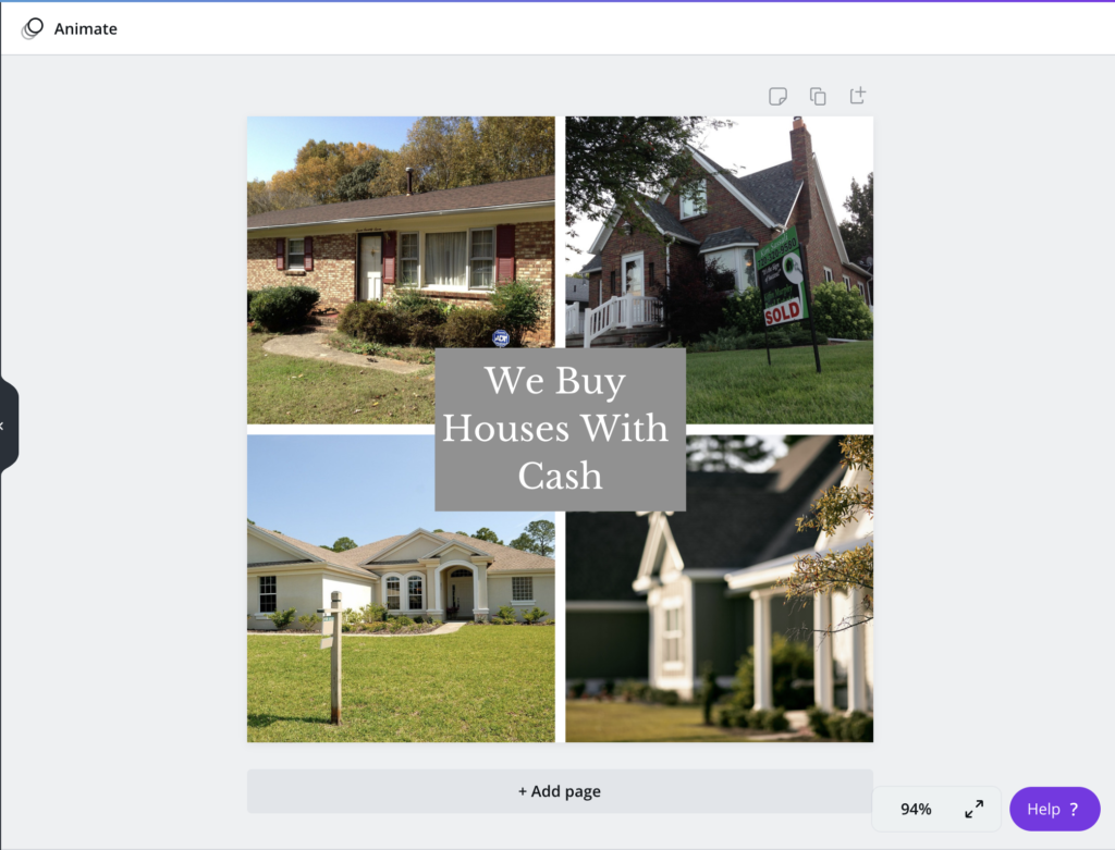
I like to kind of set it so I’ve got multiple images, so for this one, we’re going to do multiple images. A lot of people use this instead of bandit signs, because they look a little bit better than bandit signs. You don’t have to have a fake Photoshop box in front of somebody’s house to make it look like a sign. You can do this a little bit, it looks a little bit nicer, a little bit easier.
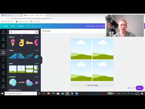
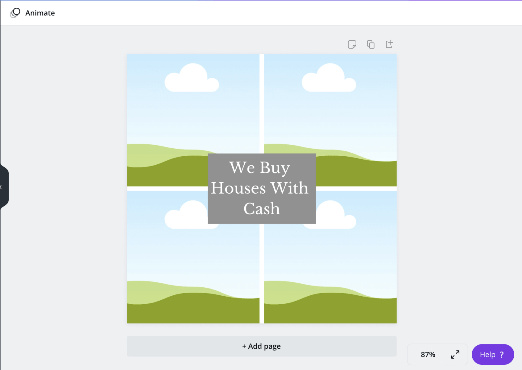
What I like to do is, you can either come in here to the actual element screen. What we’re going to do is, we’re going to go into grids, which you can find in the elements tab if you just scroll down a bit, and we’re going to click right here. What we’re looking for is a four picture grid, typically, is what I like to use.
We’re going to grab this one right here, pull it up, perfect.
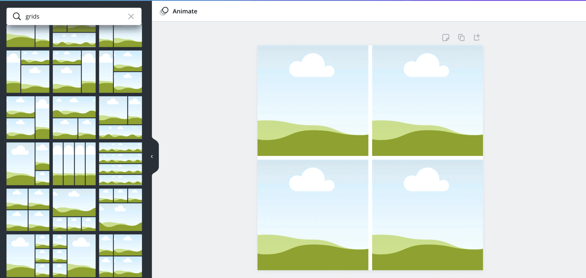
Then what I’m going to do is, I am going to go back to the elements screen, and I’m going to just search rectangle. I’m going to pull this up. I’m going to take this down a little bit. I’m going to put this right here in the center.
Next, we’re going to go down to the text and we’re going to add a heading. I am just going to use this as the font, and we’re going to go ahead and put “we buy houses with cash.” I’m going to shrink this down to about the same size, move this up here, and we got to make sure that it’s going to be white because it’ll stand a little bit more and give it a little bit more pop, so we got that.
We buy houses with cash, and you can do anything on here. You can do sell your house fast, sell your house for cash. You can try different call to actions, but this is our call to action.
That’s why this is called graphic CTA. This is our call to action here. We want that right in the center.
Next, we’re going to upload some photos, or you can search for stock. If you’re going to search for stock, you can type in homes and you can pull up stock. I don’t like using these.
Most of the motivated house images are more like you have to have the premium accounts to use different ones.
If you’re doing a free account, you won’t get a lot of these. Plus, I don’t really think that they have a lot of stock images that work well.
What I like to do is use past photos from our actual solds, the ones that we’ve worked on within the area is always a good thing to do. The other thing you can do as well is you can go to pexels.com.
They have a lot more pictures that could fit what you’re looking for. Or you can just grab some from the area that you’re in, which I prefer. We’re going to go ahead and we’re going to grab some of these. Typically, vertical images or square images are going to work better for these, but you can do landscape as well.
You can play around with this and decide if you like that or not.
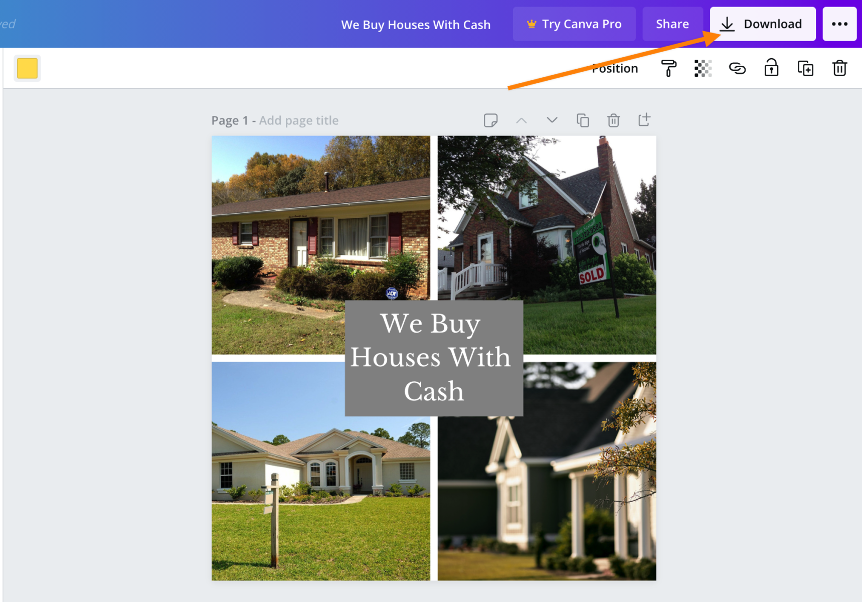
All right, and then we take this here, and we’ve already got our template set up, and we can go ahead and download that.
The way that you would do that is you just come up here in this box right here, hit download, and you just want to make sure it’s a PNG, and you can select the page and you are good to go.
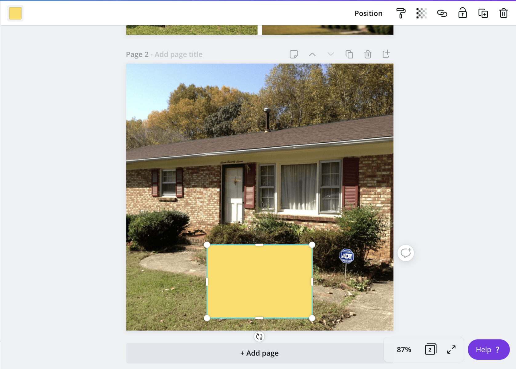
This is how I create a lot of the ads that are with stock images or you want to have little banners on it. It’s really simple and really easy. If you wanted to do just like a bandit sign like this too, I know a lot of people do this where they go ahead and, we’ll just take this image, for example. They bring it over. They set the image as the background, and now we’ve got a square image that’s perfect for Facebook, 600 x 600. That’s great for CTA Facebook ads.
If you need to remove the background of the image to make it more suitable for your ad design, you can use an online background remover tool to get the job done quickly and efficiently. Then, we can go back into our elements, and if you want to do a bandit sign, you can create that right here, nice and easy. Throw it down in the middle, you can change the color.
You’d go with the yellow bandit sign method with “we buy houses in Florida with cash.”
If you wanted to be a little bit different or add different elements to it, you would just come up into this elements section and they have all these different free things that you can throw in here; charts, images, you can get moving images, all sorts of different stuff that you could throw in that would make your ad a little bit more different.
You can have arrows pointing, so quite a few things that you can do here that is a free tool, and you’re able to create these call to action ads within a few minutes. Feel free to check it out. Remember, it’s canva.com. Sign up for an account, and go ahead and start making some more media that you can use and test for all your areas.

Are You Fumbling Your Way Through FB Ads? Or, Simply What to Get Started?
Let the expertise of Silver Street do the leg work for you. They will create an account as if it was their own.


